

Had an oops during ink work this week on my coloring book poem “How to Draw A Dragon” here’s how I fixed it. Despite the mistake all of the hand written text as well as all of the illustrations have now been completely inked!
Here’s how: first I drew the whole book in pencil which sounds straightforward but it actually means draw, redraw each page multiple times. I do a complete draft in pencil and go through it again and again redoing elements so the story flows a certain way, to make sure setting and characters are consistent and to create the foreshadowing. This is very like a writer’s process of drafting and editing a novel. I lost count of how many drafts I’ve gone through.
Before beginning this book I knew it would be a 32 page manuscript so I made sure I had at least 84 sheets of the same kind and size of drawing paper. (Now after finishing the inking I have perhaps 8 useable sheets of blank paper left – if that gives you an idea.)
After the images were more or less set in pencil I penciled in the poem text. The poem text is spaced rhythmically to rhyme, so to speak, with the illustrations. The words and the images dovetail tightly together. This requires more drafting to get the pacing right. Then after I had a complete manuscript in pencil I partially inked each of the illustrations and adjusted the word spacing of the poem on each page in pencil.
Before starting to ink the poem text I read through it looking for grammar and spelling. I asked my spouse to look critically with fresh eyes. Then I inked the text with an ink brush pen.
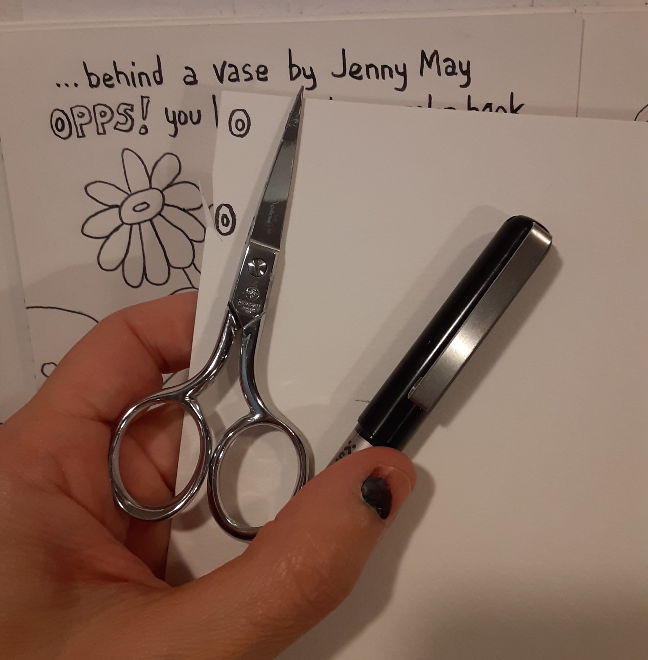
Even with all that drafting and all the editing and proofreading, even with a fresh set of eyes looking, there’s a mistake! Do you spot it below?

Yes, I misspelled “oops”! Of all the things to misspell!! 🤦♀️ Oh well! When I ink words like this I’m really focused on drawing the shapes of the letters and the spaces on the page rather than writing a word. So mistakes often happen. But 95% of being an artist is knowing how to fix mistakes! The remaining 5% is being willing to keep going!
So to fix my oops on the word “oops” I got another piece of the same paper and drew a couple of “O’s” while holding the new paper next to my mistake so I can draw it the proper size. Then I cut out the newly drawn letter as close as possible not leaving much white paper showing around the letter.
Then I paint opaque white gouache on the ink mistake as smoothly as possible.
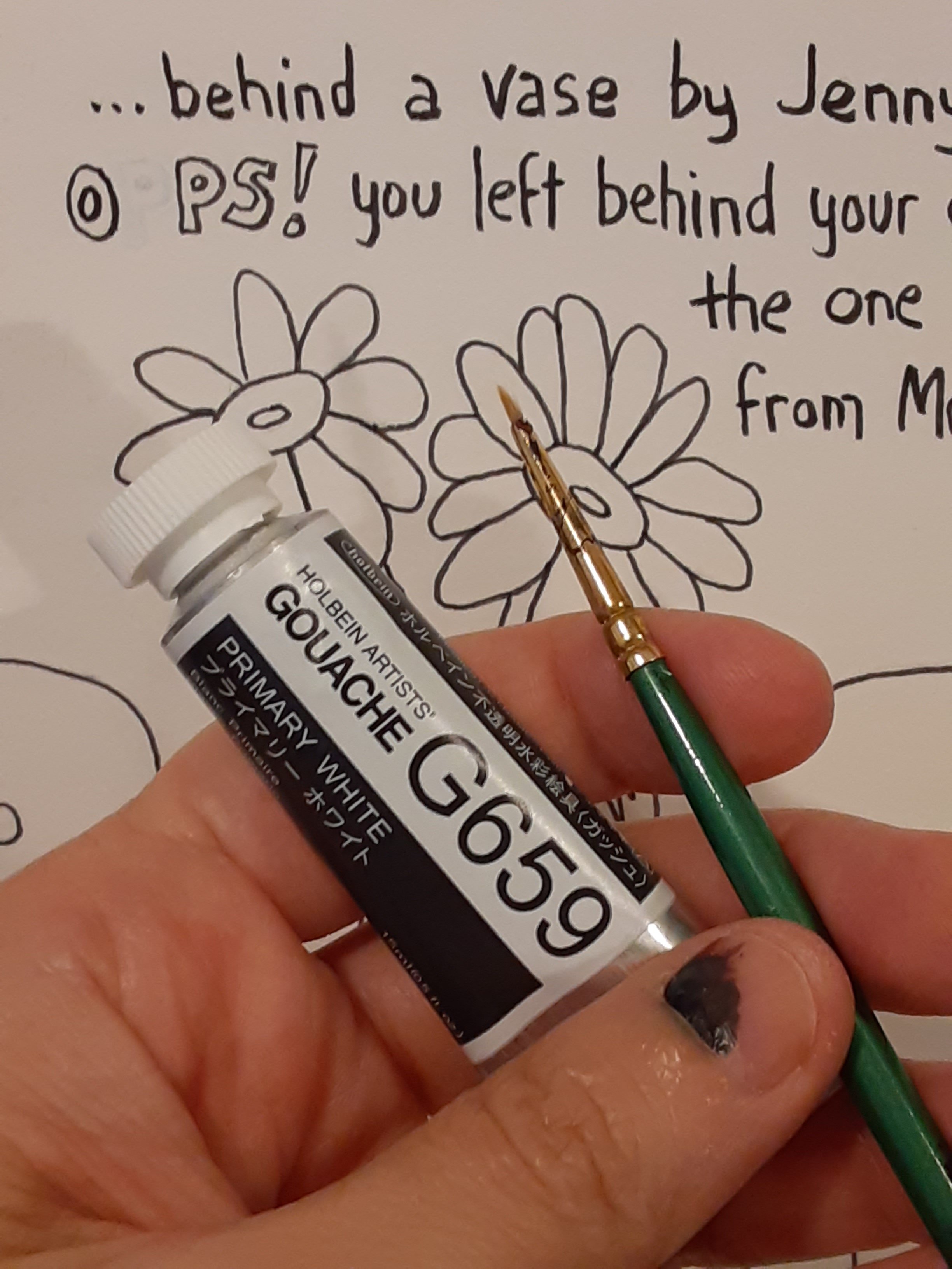
I let that white gouache dry completely. If there’s any bump in the dry gouache I use a tiny bit of fine grit sandpaper to smooth it.

I lightly apply archival paper glue to the back of the cut out letter and affix it to the whited out mistake area. I use tweezers to place the glue-y letter.
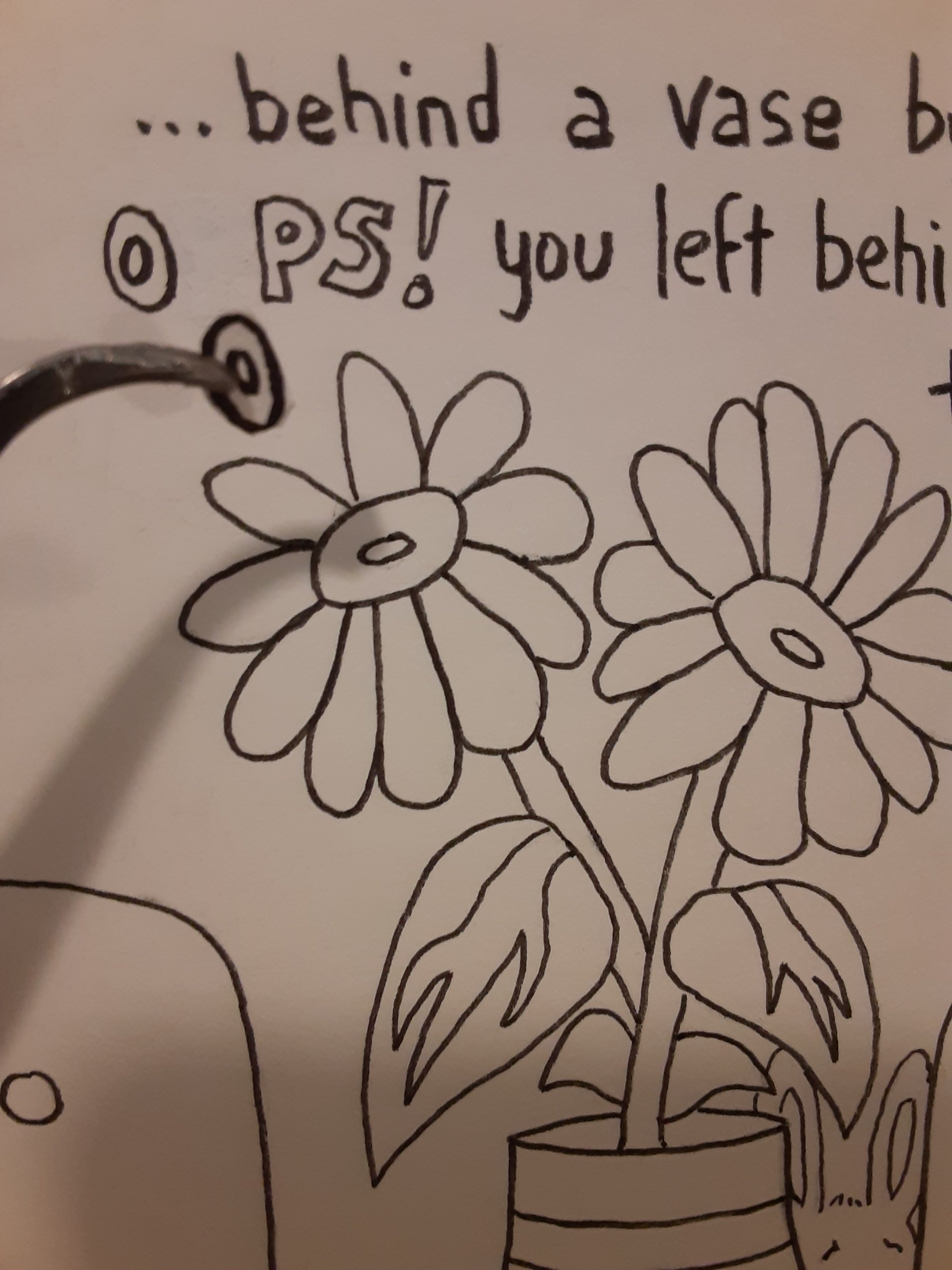
Now it’s fixed! When I scan these pages for publication I will look closely at this area on the digital file to make sure it looks like a seamless repair. Other than possibly on that “oops” the digital scans of these pages will *not* be digitally manipulated. What you’ll see in the published book will be what I made by hand.
After all the inking is done and dry I erase all the pencil marks on the manuscript.

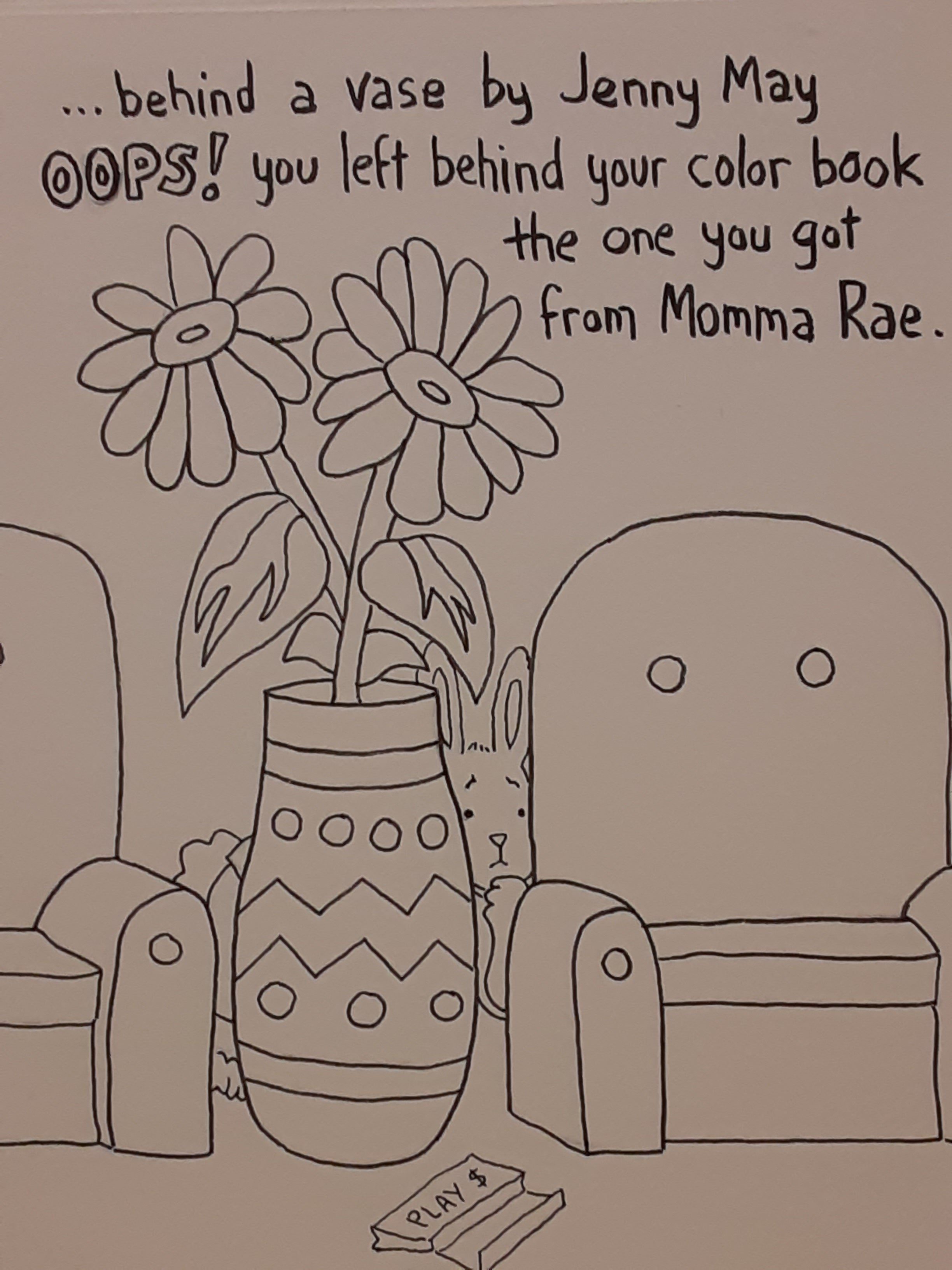
Foreshadowing happens on every page. There are even indications about time: at first the dragons coffee is very hot and steaming but on subsequent pages there’s less steam. These pages below are possibly the pages with the heaviest foreshadowing. Each of the “art examples” presage or refer to something in the rest of the book.

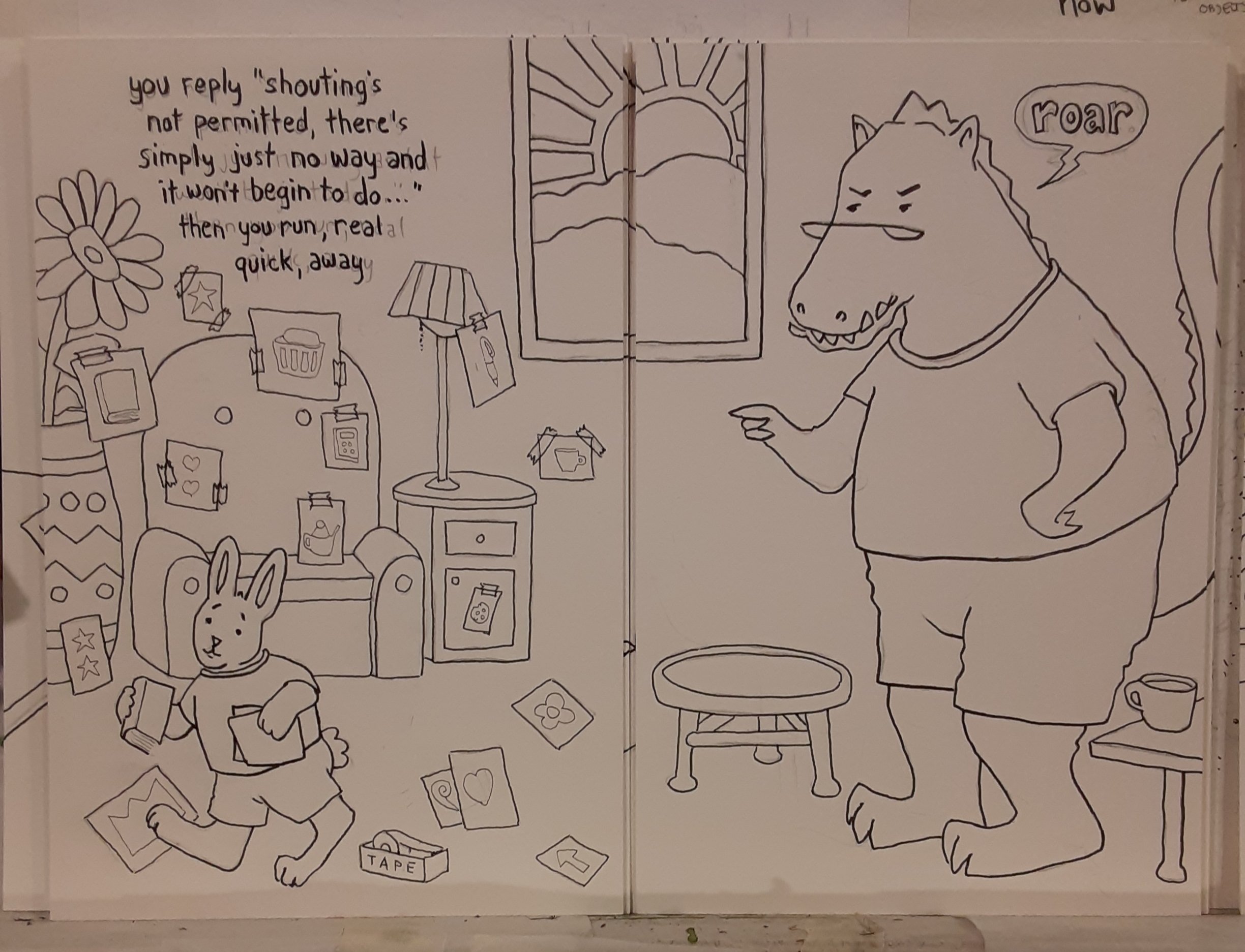
The foreshadowing is complex. Matching the characters and scenery from one page to another is complex. Matching the edges of the pages together is complex. Getting the rhythm of the poem to flow (rhyme?) with the images … it’s hard to even describe how convoluted and complex (that word again) this project is…
And then there’s that it’s a coloring book. All that I have to tell the story with is a single ink line. That line has got to be right. I can’t cover over it with other sketchy lines like I do when I draw in my sketchbook or cover a line with paint as I do when I draw lines as a foundation for a painting. The single lines I draw for this project must be clear or it ceases to be a coloring book.
This coloring book poem has been one of my most complex books and yet it is so deceptively simple to look at and read. It reminds me of one of the iceberg memes about success in that the visible part of a project is the smallest element of it and the huge part is unseen.
Anyway, also this week I worked towards the continuation of my Odditorium exhibit. The Caplan Art Designs Gallery will exhibit the Odditorium works from earlier this summer as well 7 new paintings in this series. One of the new paintings is below. It was inspired by a friends photo of her ranunculous flowers. From the flowers I thought of a rhinoceros and a dress…

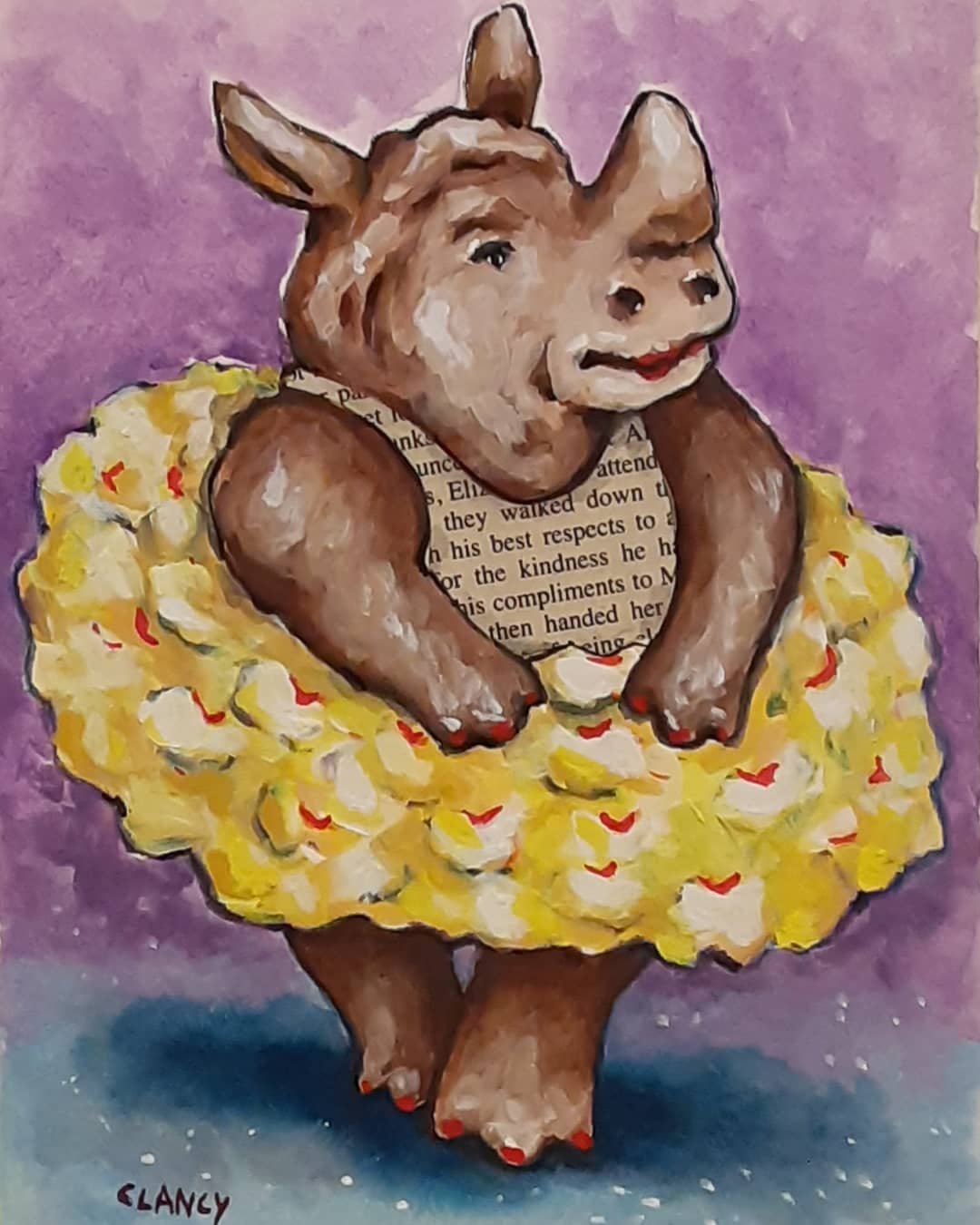
Yes, my household surrealism continues…
As I wrote in my last post I hoped this week to try some of my new butterfly palette paints so I did try them in my sketchbook!!


It will be fun to try doing a painting with them next!
This week we got a few cards in the mail and added them to our mantel. I realize that I really love sending and getting cards in the mail. I’ve loved it even more so since the pandemic. Since unfortunately covid is surging again I’ve been thinking I want to make more cards.

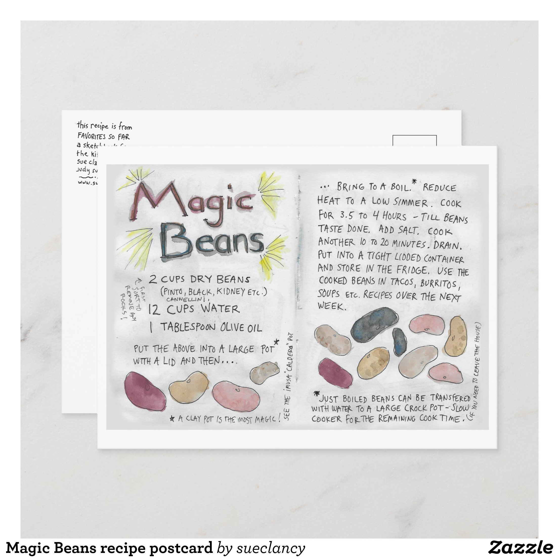
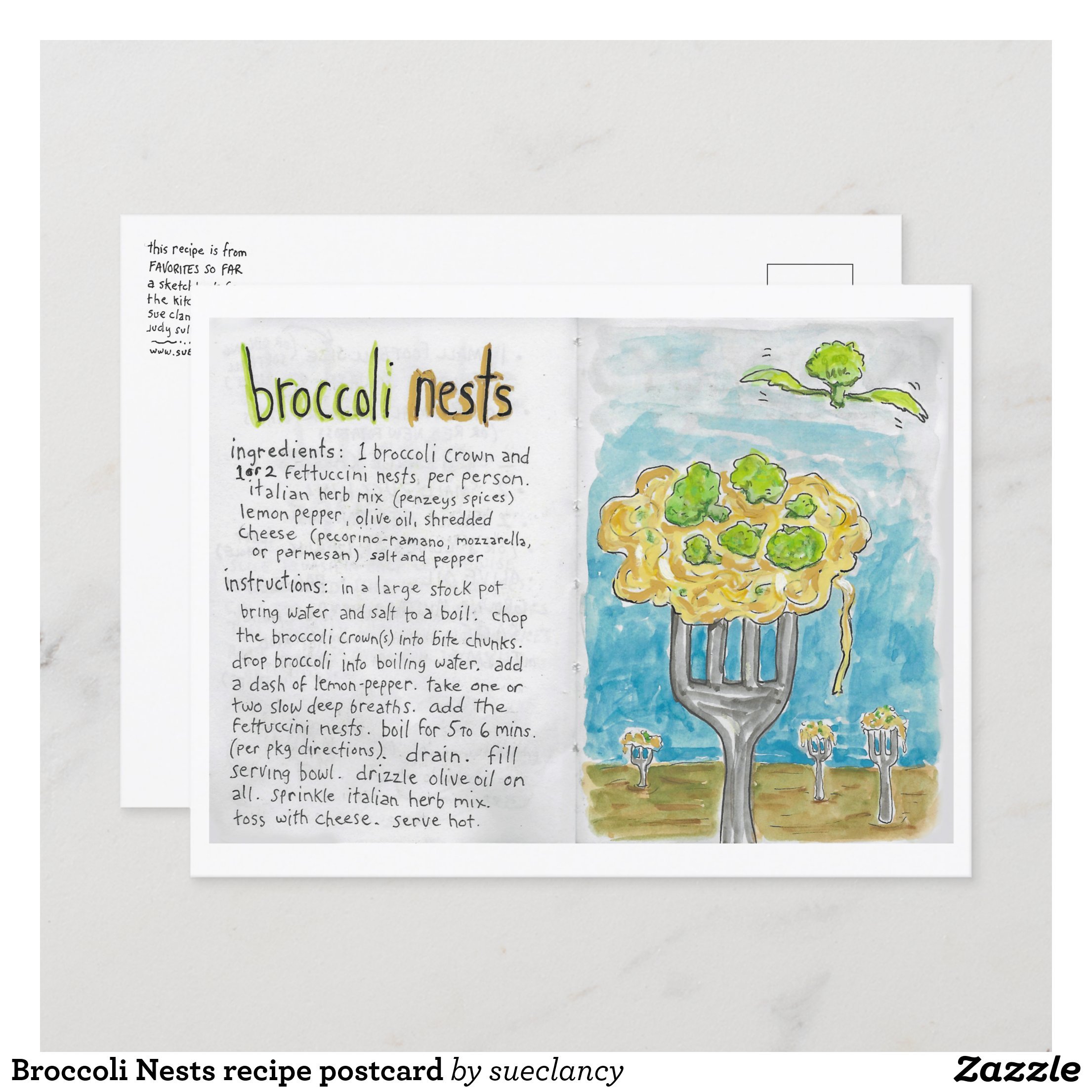
About the time I’d had that thought I heard from Bernadette who had recently blogged on New Classic Recipes my recipe for Magic Beans along with the story of how I got the recipe. Bernadette wrote suggesting that I create some recipe cards. I thought this was a great idea and merged the recipe card notion with the idea of sending postcards. You can see all of the recipe postcards I’ve made so far here. I’m thinking these will be fun to send to friends and family.

As far as food this week goes I ate so much when family was here (last post) that this week has had small salads and bowls of cereal as the feature meals. So never mind about food I cooked this week because it didn’t happen. Oh well.
Nevertheless major progress happened on “How To Draw A Dragon” – a whole manuscript completely inked! Yippee! Next up…scanning the pages and book design! See you next Monday?

17 responses to “Dragon, an oops, a rhino and recipe postcards”
You are amazing. I don’t know how you juggle so many projects at the same time.
LikeLike
Aww you’re so kind! Thank you!
I make to-do lists and check them twice. 😊
LikeLike
Thanks for showing how you fixed your opps–I mean oops! I love the new Odditorium painting!! (It is rather odd, surreal, in fact.) The recipe postcards are such a great idea!!!
LikeLike
Lol!! You made me chuckle!!! So glad you liked the new Odditorium painting and the recipe postcards idea too!!! 😊 Thank you!!
LikeLike
You’re most welcome, Sue! 😀
LikeLike
Very funny place to make an “oops,” and I love that you showed us how it was fixed! Your recipe cards are adorable, Sue. For me, in rhyming texts the rhythm/beat is always the most challenging part!
LikeLike
Yes it was a very funny place for a mistake and when it happened I laughed and thought “I’ll blog about this! Lol!” I’m glad you liked the recipe cards! And yes, getting the rhythm right is a challenge!!
LikeLike
Guess that’s an example of making lemonade when life gives you lemons, or however that saying goes:)
LikeLike
Lol!!! Exactly! And perhaps even making a lemon cocktail!!❤🍋🍹
LikeLike
Even better yet!!!
LikeLike
Yes!!!❤
LikeLike
Genius! I’ve patched errors before but never with this degree of finesse. Using the gouache layer to eliminate the transparency factor is a great idea as is using tweezers for placing the patch so that it can be teeny wee.
LikeLike
So glad you liked seeing my repair process! Sometimes all that’s needed is a teeny patch. The gouache drys to a matte finish so that helps…so does sparse application of the glue on the thing being glued rather than the surface being glued to – if that makes sense – so you avoid a shiny smooge of glue oozing out of the boundary of the repair
LikeLike
Glad you caught the error. How funny it was OPPS/OOPS!! I used to have similar issues when doing calligraphy. I’m generally a good speller, but indeed it’s easy to not see the forest for the trees when drawing and/or inking each letter carefully. I can relate to that focus on the shape rather than what it symbolizes. It’s necessary to let go of the meaning and just see the object. How interesting. Perhaps that’s why creating artwork is so meditative and freeing. It sets up a whole different view of things with different connections instead of merely gleaning a cognitive meaning from symbols on a page.
The recipe postcards are a wonderful idea. I can imagine them catching on to be very popular, and they would certainly be fun to receive and be inspired by.
LikeLike
Thank you for your wonderful comment!! When I made my mistake on the OOPS word itself I laughed so hard and had to post about it!! 🤣 We humans can so easily get stuck in the labels of things that we forget to actually look at the thing itself. And we can get caught up in looking/depicting the thing itself that we get the label wrong OPPS/OOPS! Traversing this paradox, I think, is what makes working with words sometimes and images other times such a good way to relax and care for ones mental health. So glad you like the recipe card idea too!! 😊
LikeLike
Yes, I agree a balance of words and images feels good to mental health. Brings ease and rest when they’re somewhat equal in measure.
LikeLike
So true!!! 😊
LikeLike