Professional dogs, books, Thanksgiving art and some about the holiday box!

A Creative Life, Abecedarian, art exhibit, art gallery, artist book, author illustrator, book design and layout, children's book, dog portrait, Dogs in Art, drinks in art, fine art, graphic design, greeting cards, handmade papers, illustrated gifts, illustrated recipe, pet portraits, printed books, publications - publishing, published art, small things, Sue Draws Dogs, The Professional Dog, whimsical art, words and pictures, writing and illustrating

Here’s news about The Professional Dog and all of my projects that I couldn’t talk about in my last posts! First, this weeks sequence of dogs.

Below is a closer look at the artwork of each of those dogs with the book text beneath.

The Kayaker’s dog is a kind dog.
The Lawyer’s dog is a laudable dog.
The Lender’s dog is a lucky dog.

As I mentioned in another post I tend to work first and talk about the work later. This means all of the artwork is finished for The Professional Dog and I could work hard this past week on the book layout. Here’s a photo of me at my laptop doing the book layout.

I wanted this book to be able to be shipped by Christmas so I focused on getting the book design done – and uploaded – which altered my posting about the artwork itself or about my creative process surrounding the book but I think that’s okay. If you have questions just ask.

But here’s the cover for The Professional Dog and a link where you can preview the entire book and order a copy if you wish.

https://www.blurb.com/b/10926040-the-professional-dog

There’s a lot still to do for this project but the publication on the 16th of Nov was a big deal. There are 40 portraits in the book and this is the most pages I’ve created for any of my books so far! So I’m celebrating! Wahoo!

Because I made portraits of my friends dogs I plan to keep posting each dog in alphabetical sequence so that each dog gets to be featured and each friend has a chance to share the portrait of their dog if they want to. Mainly it’s just a bit of cheerfulness from me over the Thanksgiving holiday.

Speaking of small cheerful things: I took some more of my books, mug mats and postcards to the Aurora Gallery at their request.

The Caplan Art Designs Gallery did a studio visit and selected some artwork from my studio stash for the special Thanksgiving event the Gallery is doing Nov 26, 27 and 28th. Each of the artworks Caplan selected are autobiographical. I’ve been sharing details on my Instagram page for each of these pieces but generally speaking each painting is about some aspect of my life here in the Pacific Northwest. Like the time we went hiking in Forest Park and my bootlace broke and we discovered a wonderful coffee shop that also sold bootlaces! Or the Rainier cherries we enjoy eating by the sea. Or the fine dining we’ve enjoyed…my feeling is reflected in my choice of dog breed depicted. And the bookstores… There are many more artworks selected by the Gallery than I’ve included below but perhaps this gives you the idea? The Gallery event happens the 26th, 27th and 28th in Portland Oregon.

Why were the above artworks languishing in my studio? They didn’t fit neatly into a theme or a unified whole for any of my exhibits. And also they were still there because I forgot about them. This is an example of when it’s helpful to have someone outside my head – in this case a gallery owner – look at things with fresh eyes.

Another example of the value of “fresh eyes” is that my spouse looked at my digital book layout of The Professional Dog and caught a major mistake I had made before it went to print!! (I had one out of alphabetical order 😱) I thank her on the book info page seen below.

The Professional Dog by Clancy

And now for what we’ve all been waiting for (drumroll please) the Holiday Box Project! The Box Project exhibit opens at Caplan Art Designs the first Thursday in December. That’s why we artists were asked to wait to post and to only do a “teaser” post now because the Thanksgiving gallery event happens first. We artists were each given by the Gallery a solid brown wooden box, 8 inches cubed, some time ago so we’d all have time to create art on them. Below are before and after photos of my box.

I’ve titled my holiday box “All The Chances” – what are the odds you’d find 21 dogs named Chance? Anyway, are you teased? Lol! I will tell more details about “All The Chances” including about my working process after Thanksgiving.

It’s been a super busy week (no time for Creativity Chats or for much cooking creativity either) and frankly I am very tired from all of the activities. But at the same time I’m very happy! So I’ll rest up and share more this week on social media and on next Monday’s blog post.

I hope your week is a good one. Thank you for your many kind comments and your support! I am grateful for you and for the blogging community! Happy Thanksgiving!

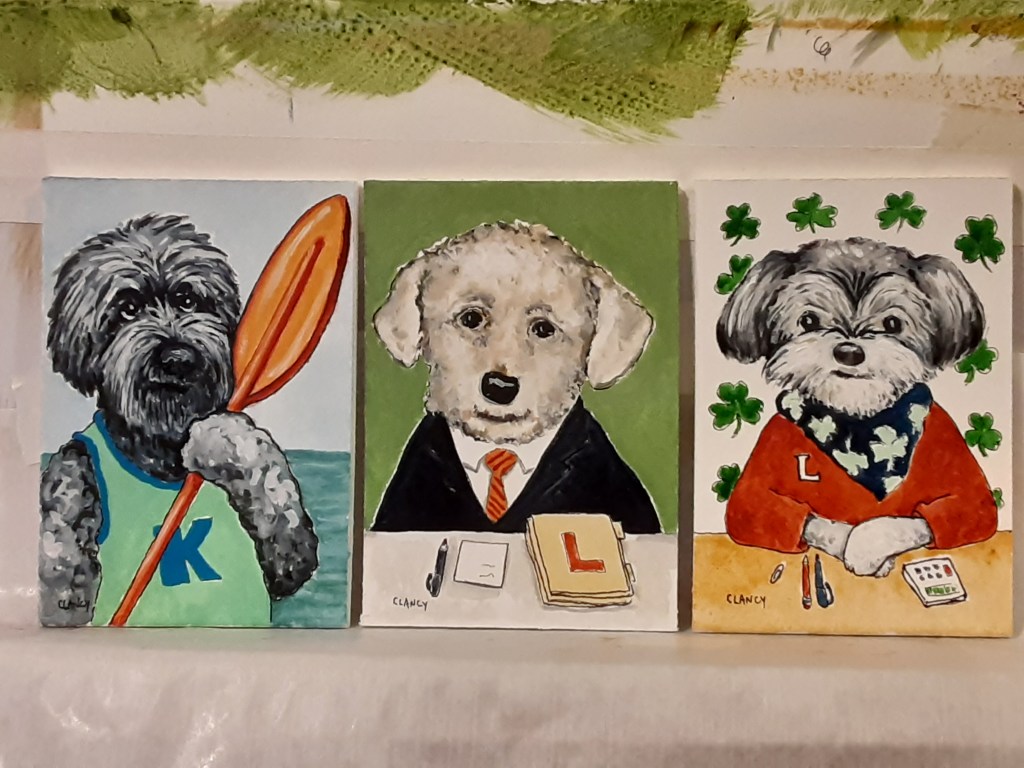
The professional dog and what’s in the cards

A Creative Life, animals in art, Art Licensing, art techniques, Art Word Combinations, artist book, artistic inspirations, author illustrator, children's book, greeting cards, household surrealism, pet portraits, visual thinking, whimsical art, words and pictures

I’m starting a new childrens poem project “The Professional Dog”. It’s an excuse to do a series of portraits of dogs owned by friends who have professions that fit neatly in an alphabetic format… accountant, botanist, chef…. (Yes, another abecedarian book!!)

Several friends – with dogs – have different professions that could fit for the same alphabetic letter. I know a botanist, a brewer and a baker. I know a chef, a councilor and a critic. Part of my work on this project is winnowing this list.

My book idea began in my small poetry sketchbook, the orange one in the picture, and is now in the messy draft stage on my legal pad.

I’m in the process of contacting friends and asking them to email or text photos of their dogs – and asking questions about their profession. These responses will help me narrow things down.

Here’s a few of the dog photos I’ve gotten from an Accountant, an Underwriter, an Inventory Manager, a Poet, a Nurse and an Entrepreneur.

In addition to this new book project I’ve been thinking more about greeting cards. Last year during the holidays it felt weird getting or sending cards that touched on pre-pandemic style large gatherings. I found I preferred getting and sending the cards that had winter scenery or literary poems or food/drink recipes. I did enjoy the family photo cards and “seeing” everyone that way.

So as I think of the upcoming holiday season I’m starting work on painting a short series of winter, food and book themed artworks intended for cards on my Zazzle shop. Here’s a sketch in my sketchbook with one of my winter theme notions.

Here’s a look at the finished art. I used my new butterfly palette that I’ve talked about in a prior post. These colors are literally based in scientific studies of butterflies and other bugs. It was fun to paint winter scenery using the butterfly colors! The color palette you see in this photo is what I call my “butterfly box”.

Below is a closer look at my finished artwork. After I get a few more for-cards artwork pieces finished then I’ll upload all of the images and design the cards. I’ve titled this piece below “Crowshoes”

Crowshoes by Clancy

This week my spouse made homemade sugar cookies. Seriously comforting and yummy cookies! Cookies and a coloring book are two of the good things in this life, I think, so I posed this photo for use in telling on social media about my recent coloring book “How To Draw A Dragon

https://www.blurb.com/b/10815467-how-to-draw-a-dragon

Many of the baked goodies my spouse makes – like the sugar cookies in the photo above – are from recipes in “How To Bake Everything” by Mark Bittman. As an eater of baked goods I can vouch for this book!

As per my last post I am thinking seriously about doing more videos and have even ordered a thingamajig to hold my phone steady while I talk. It’s a fun – and a bit scary – to entertain the idea of talking on video generally about being creative and include things from my own creative life. I’m thinking I might call these short videos “Creativity chats” with a subtitle of the topic of that particular chat. 🤔 We’ll see. I heartily thank you for your kind encouragement to do more videos!

While I wait for the video apparatus to be shipped to me I’ll work towards “The Professional Dog” and will tell you more about what inspired this idea in future posts.

I hope your week is full of dog (or cat) cuddles, cookies and many other comforting things! See you next Monday.

How To Draw A Dragon, fine art and postal whimsy

A Creative Life, art exhibit, art gallery, Art Word Combinations, artist book, book design and layout, children's book, creative thinking, ebook, fine art, greeting cards, household surrealism, Odditorium, Sustainable creativity, visual thinking, whimsical art, words and pictures, writing and illustrating

If you got a post titled “Dragon postal whimsy” I accidentally hit a button. Here’s the real post about “How To Draw A Dragon“! After a week spent creating cover art and scanning 36 pages there’s now a coloring book poem that exists in the world!

This is the book description:

“How do you draw a grumpy dragon? This coloring book story poem written and illustrated by the artist sue clancy shows you how.

This whimsical poem is also about how creativity works, how our creative child selves and our analytical adult selves can work together.”

Below is a look at the original manuscript.

I used the computer to put the text on the front and back covers. I thought long and hard about handwriting it all but I learned when I did Patch La Belle that handwritten text on a cover isn’t “searchable” and could be harder for people to find. That searchable issue isn’t a big concern for me coming from the art world as I do where one-of-a-kind things are the norm. But after thinking a while I opted to type the cover text for “How To Draw A Dragon” even though I hand drew and hand colored everything else.

So here’s the cover becoming…

And here’s what the cover became.

https://www.blurb.com/b/10815467-how-to-draw-a-dragon

I’m especially pleased that my book layout “thinking in page spreads” turned out so well! They line up in the middle when bound! In the first photo below you see my original art. Below that you see the printed book.

Since we’re still in a pandemic I have added a free printable pdf file for this book to my “shop” page where I have several of my free downloadable artist books. It’s on my to-do list to make a portfolio page for How To Draw A Dragon and have everything in one spot.

Storyberries will, eventually, also do a free ebook version of How To Draw A Dragon and have a link to the free printable pdf too. But that’s still in progress. I will update my still-to-be -made portfolio page and this blog when it’s been set up at Storyberries.

On another topic: My Odditorium exhibit will open in September at Caplan Art Designs with some additional new art for the series!

Since we are still in a pandemic the Gallery is doing all the prudent safety measures and I’m doing my part as best I can. Besides doing the virtual page about Odditorium I have done a series of videos on my YouTube channel about this exhibit as well as about why I do this work. I’ve made 5 videos in all but here’s the one about this exhibit. The Gallery will post my videos and share them with clients digitally thereby minimizing everyone’s exposure. I’m glad and grateful to work with a gallery that cares about the health of both their artists and their clients.

On still another topic: A friend recently enjoyed getting a card from me and called it “postal whimsy”. I like that phrase and asked for and was give permission to use it! So I’ve updated my Zazzle collection of odd greeting cards both with the “postal whimsy” phrase and some new card designs. I am getting serious about sending postal whimsy and helping cheer people. Below is one of my favorite cards…

https://www.zazzle.com/hare_in_the_sink_postcard-256418650416992132

This week was so busy that while I did make sure to eat meals of fruits, vegetables and whole grains – more often than not – I didn’t do any sketches or photos of the food. I just stuffed my quiche-hole and got to work.

Despite all of the busy-ness I still did drawings in my sketchbook in the mornings and my evening reading of books before bed. Makes for nice creative bookends, pun intended, to a day.

However busy your week is I hope it is bounded by pleasant things. See you next Monday? Or before then if I hit a wrong button again…

Dragon, an oops, a rhino and recipe postcards

A Creative Life, art exhibit, art gallery, art techniques, artist book, artistic inspirations, book design and layout, fine art, greeting cards, household surrealism, illustrated poem, illustration, Odditorium, poetry, recipe illustration, Sustainable creativity, words and pictures, writing and illustrating

Had an oops during ink work this week on my coloring book poem “How to Draw A Dragon” here’s how I fixed it. Despite the mistake all of the hand written text as well as all of the illustrations have now been completely inked!

Here’s how: first I drew the whole book in pencil which sounds straightforward but it actually means draw, redraw each page multiple times. I do a complete draft in pencil and go through it again and again redoing elements so the story flows a certain way, to make sure setting and characters are consistent and to create the foreshadowing. This is very like a writer’s process of drafting and editing a novel. I lost count of how many drafts I’ve gone through.

Before beginning this book I knew it would be a 32 page manuscript so I made sure I had at least 84 sheets of the same kind and size of drawing paper. (Now after finishing the inking I have perhaps 8 useable sheets of blank paper left – if that gives you an idea.)

After the images were more or less set in pencil I penciled in the poem text. The poem text is spaced rhythmically to rhyme, so to speak, with the illustrations. The words and the images dovetail tightly together. This requires more drafting to get the pacing right. Then after I had a complete manuscript in pencil I partially inked each of the illustrations and adjusted the word spacing of the poem on each page in pencil.

Before starting to ink the poem text I read through it looking for grammar and spelling. I asked my spouse to look critically with fresh eyes. Then I inked the text with an ink brush pen.

Even with all that drafting and all the editing and proofreading, even with a fresh set of eyes looking, there’s a mistake! Do you spot it below?

Yes, I misspelled “oops”! Of all the things to misspell!! 🤦‍♀️ Oh well! When I ink words like this I’m really focused on drawing the shapes of the letters and the spaces on the page rather than writing a word. So mistakes often happen. But 95% of being an artist is knowing how to fix mistakes! The remaining 5% is being willing to keep going!

So to fix my oops on the word “oops” I got another piece of the same paper and drew a couple of “O’s” while holding the new paper next to my mistake so I can draw it the proper size. Then I cut out the newly drawn letter as close as possible not leaving much white paper showing around the letter.

Then I paint opaque white gouache on the ink mistake as smoothly as possible.

I let that white gouache dry completely. If there’s any bump in the dry gouache I use a tiny bit of fine grit sandpaper to smooth it.

I lightly apply archival paper glue to the back of the cut out letter and affix it to the whited out mistake area. I use tweezers to place the glue-y letter.

Now it’s fixed! When I scan these pages for publication I will look closely at this area on the digital file to make sure it looks like a seamless repair. Other than possibly on that “oops” the digital scans of these pages will *not* be digitally manipulated. What you’ll see in the published book will be what I made by hand.

After all the inking is done and dry I erase all the pencil marks on the manuscript.

Foreshadowing happens on every page. There are even indications about time: at first the dragons coffee is very hot and steaming but on subsequent pages there’s less steam. These pages below are possibly the pages with the heaviest foreshadowing. Each of the “art examples” presage or refer to something in the rest of the book.

The foreshadowing is complex. Matching the characters and scenery from one page to another is complex. Matching the edges of the pages together is complex. Getting the rhythm of the poem to flow (rhyme?) with the images … it’s hard to even describe how convoluted and complex (that word again) this project is…

And then there’s that it’s a coloring book. All that I have to tell the story with is a single ink line. That line has got to be right. I can’t cover over it with other sketchy lines like I do when I draw in my sketchbook or cover a line with paint as I do when I draw lines as a foundation for a painting. The single lines I draw for this project must be clear or it ceases to be a coloring book.

This coloring book poem has been one of my most complex books and yet it is so deceptively simple to look at and read. It reminds me of one of the iceberg memes about success in that the visible part of a project is the smallest element of it and the huge part is unseen.

Anyway, also this week I worked towards the continuation of my Odditorium exhibit. The Caplan Art Designs Gallery will exhibit the Odditorium works from earlier this summer as well 7 new paintings in this series. One of the new paintings is below. It was inspired by a friends photo of her ranunculous flowers. From the flowers I thought of a rhinoceros and a dress…

His Best Respects – by Clancy – 7 x 5 inches – ink, gouache and collage on board.

Yes, my household surrealism continues…

As I wrote in my last post I hoped this week to try some of my new butterfly palette paints so I did try them in my sketchbook!!

It will be fun to try doing a painting with them next!

This week we got a few cards in the mail and added them to our mantel. I realize that I really love sending and getting cards in the mail. I’ve loved it even more so since the pandemic. Since unfortunately covid is surging again I’ve been thinking I want to make more cards.

About the time I’d had that thought I heard from Bernadette who had recently blogged on New Classic Recipes my recipe for Magic Beans along with the story of how I got the recipe. Bernadette wrote suggesting that I create some recipe cards. I thought this was a great idea and merged the recipe card notion with the idea of sending postcards. You can see all of the recipe postcards I’ve made so far here. I’m thinking these will be fun to send to friends and family.

As far as food this week goes I ate so much when family was here (last post) that this week has had small salads and bowls of cereal as the feature meals. So never mind about food I cooked this week because it didn’t happen. Oh well.

Nevertheless major progress happened on “How To Draw A Dragon” – a whole manuscript completely inked! Yippee! Next up…scanning the pages and book design! See you next Monday?

postcard from the dogs with 4 tips to avoid being sick

A Creative Life, books, Dogs in Art, published art, Sustainable creativity

As you know I’ve a new book being formally released Feb 17th titled “Dogs by Sue Clancy”. This means in addition to creating the art that is in the book, designing and creating the book itself, arranging for its publication… now websites about it are rolling out: There’s the bit about “Dogs…” on my website, there’s this web page here: https://store.bookbaby.com/book/Dogs-By-Sue-Clancy and there’s now an entry over on Amazon.com (search for “Dogs by Sue Clancy”).

It’s been a long long long car ride…and we’re not even there yet!

Now I’ve done a postcard about the book. Yep, did the graphic design for the card all by myself too.  Here’s a photo of the front and back of the card:

dogsbookpostcard72

Postcard with details about “Dogs by Sue Clancy” https://store.bookbaby.com/book/Dogs-By-Sue-Clancy

So go on. You know you want to. Ask me how I avoid getting completely and heartily sick of a project by the gosh-darn-long end of it. Go on ask me.

Here are my 4 tips:

  1. At the start of a project when I’m all enthusiastic about it I write down in my journal all of my thoughts, hopes, dreams – what I’m excited about and why i want to do the project!  Then, later on, when my enthusiasm lags I re-read it. Usually that does the trick!
  2. I take care to remember that by the time the project has exited my head (i.e. there’s art to hang on a gallery wall etc.) that there are other people involved with my project now. And their salary depends on me doing my part well! In other words the project is no longer “all about me”!
  3. I make sure to spend quality time with my sweetie, my friends and my dog and cat who love me for other reasons besides artwork, books and whatever else my creative mind outputs. My sweetie and friends love my art stuff too but that’s not the ONLY thing! (Whew!) And we can talk about things besides my current project. (Whew!) And my dog and cat… well, my dog Rusty thinks I’m pretty darn special anytime I make a lap for him. And my cat Hawkeye thinks my ability to use my thumbs is swell – even if I do use them to draw those silly canines so much – I do come to my senses now and again and apply my thumbs in service to the CAT! (Whew!)
  4. I start work on a new art project pronto! I get curious about something in the world and get to self-educating… which involves books and art supplies…and creative appointments with myself…and…

And now I’m going to pull this car over for a bite of dinner.


Sue’s art speech text

A Creative Life, animals in art, Art Apparel, art commissions, art exhibit, art gallery, collage, fine art, psychogeography, visual story, words and pictures

On Oct 1st I gave a short talk during my fine art opening at the Daily In The Pearl arranged by Caplan Art Designs.  Since I’d recently written a blog post titled “on writing and giving speeches” I thought it only fair to share with you the text of my speech along with photos. This is a rough approximation of what I said as I can’t re-create the ad-libs and audience participation – it was a fun lively evening! Anyway here goes:

Speech given Oct 1st 2016 by Sue Clancy

Thank you for coming!

I create mixed media handmade paper collage.  I start off with white handmade paper and I give that paper color and pattern using a variety of art techniques; I dye the paper, I stencil it, I print on it, I marble it and use a variety of other methods. This is the “mixed media” aspect of my work.

Here are a few scraps of papers I’ve done so you can handle them, along with a postcard containing photos of me in action.

papersamples72

Paper samples Sue Clancy handed out during her speech; the paper on the far left is an example of the white paper she starts out with – the other 3 are examples of color/pattern she’s given the white paper

vidacardmestenciling72

Postcard Sue made, and handed out during her speech, that shows photos of her giving paper color and pattern.

Once the papers are dry I take an X-acto knife and cut shapes out of them. Then I take the cut-paper-shapes and glue them together to make my art images. There are layers of paper glued on top of other papers. Yes, tweezers are involved.

In “The Read Hat” I cut the chihuahua’s head, 4 paws and tail out of a medium brown paper – then other smaller shapes of darker/lighter brown papers were cut to make his face. The clothes the dog wears was cut out of a green dotted paper, the books out of yellow papers – and so forth – until the image was finished.

That’s my construction method.

TheReadHat72

“The Read Hat” By Sue Clancy 14 x 11 x 2 inches Hand dyed paper, handmade paper, hand stenciled paper, found paper and acrylic on cradled board

My ideas and the pattern designs within them come from my life. Take “The Read Hat” as an example again; 5 different life experiences went into this concept.

  • I saw some wet, weathered flyers stapled on some telephone poles during a walk on Hawthorne Street in Portland Or. the pattern of letters overlaying each other transparently made me think about the clarity and legibility of information. (This inspired the background of this artwork.)
  • I met a Chihuahua who has the habit of collecting most things found at floor level onto his dog bed. Yet he still showed a preference for some things over others.  So I began thinking about how I have to select which information in the world to spend time trying to understand since it is impossible to “collect all” the available information.(This inspired my choice of a Chihuahua character)
  • On a trip to the Oregon Coast I drove through Oregon wine country. The hills rise and fall so in several places I had an almost aerial view of the Oregon vineyards. (That inspired the green dotted pattern the Chihuahua is wearing.)
  • The “aerial view” of an Oregon vineyard reminded me of my favorite self-indulgence; I like to put on my pj’s early of an evening, have a glass of wine and read a book for an hour or so before bed. (This is why the character is wearing pj’s and not some other sort of outfit)
  • When I indulge myself this way I often take off my hearing-aids so as to completely relax and focus on what I’m reading. My deafness made me think of how important language is as a framework for understanding the world. Language is a container, a hat, that holds knowledge.

This is generally how I work: pattern designs become symbols in a visual story. When I do special commissions I use this visual story method too – only instead of my life experiences inspiring the pattern designs and story symbols it’s your life experiences that do that.

The titles I give my artworks, the “blurbs” and statements I write about them – or about my  exhibits – are clues to my personal thoughts.  But my use of pattern design symbolically and my use of the Animals in Art genre (it’s a classic genre of fine art like ‘still life’ or ‘landscape painting’) takes my work beyond the personal and into the mythological story or fable.

So this summer when a San Francisco company contacted me about licensing my designs for use as scarves, bags and other apparel I saw a chance to extend my ‘pattern designs as symbols’ concept into the real world. You can see my full apparel collection here: http://www.shopvida.com/collections/sue-clancy

Using the same pattern design in multiple symbolic ways – in different fine artworks, in art apparel and in artist books – is my way of thinking about aspects of nature, culture and other things in contemporary life. Thank you!

Here’s a photo of me giving the above speech.

14485101_10154440732708213_242047587380205460_n-1

Sue Clancy giving a short speech about her artwork