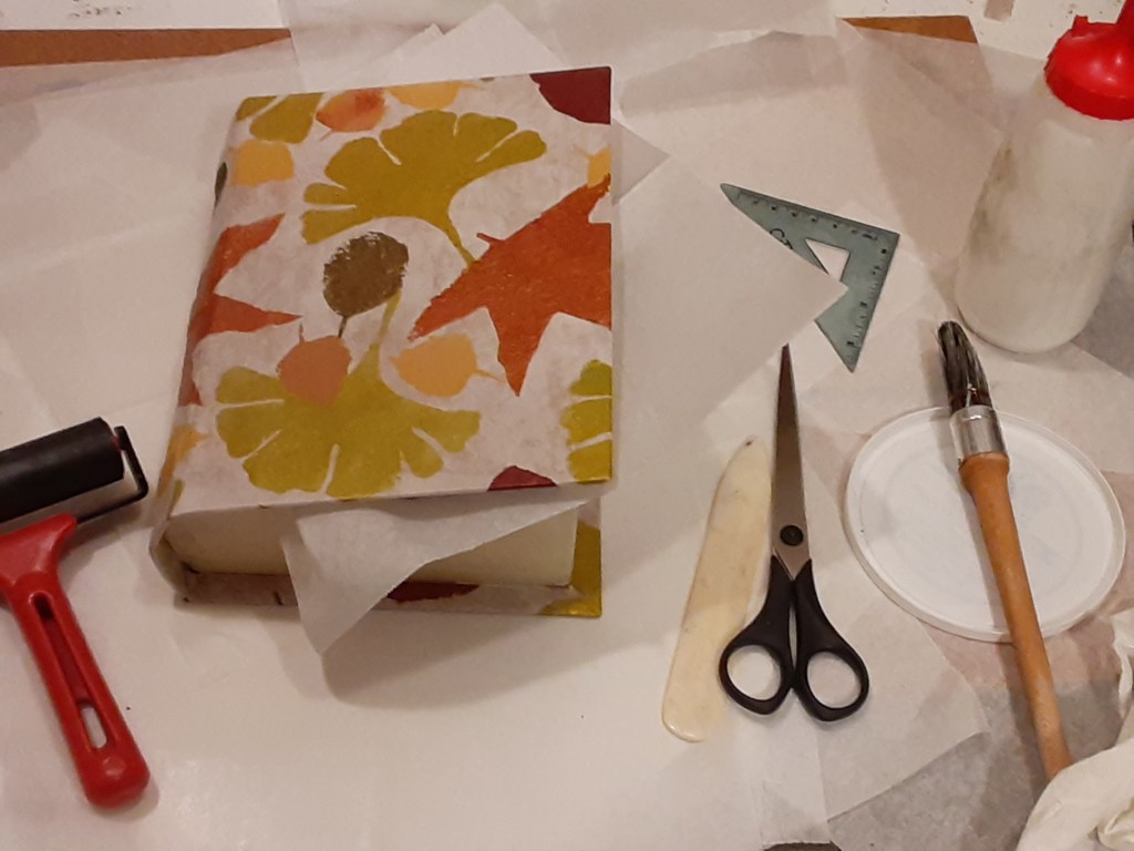
A box of leaves – Pembral Forgets

A Creative Life, art techniques, artist book, artistic inspirations, books, Books In Art, handmade books, handmade papers, Narrative Art, pattern design, Pembral Forgets, printed books, publications - publishing, published art, visual story, visual thinking, words and pictures

The inside of a book is made up of pages which are called “leaves”. The handmade box I’ve been constructing holds all of the “loose leaves” for Pembral Forgets. I love the pun…a story about fall leaves housed in a box covered with a pattern of leaves, containing loose leaf pages….

Yes, I know…🤣 … Anyway…

Pembral Forgets is a story, written by Steve Tubbs and illustrated by me, about fall leaves, good food and an absent-minded boy who forgets something very important.

Below is a photo of me remembering to spray fix all of the loose pages to prevent smudges.

When I talked with the writer, Steve Tubbs, he expressed concern about the pages being properly protected. So in addition to spray fixing them I slipped each page into an archival clear sleeve.

After making doubly certain that the pages in the archive sleeves would still fit in the book shaped box I set about giving the box an “old book” trompe l’oeil effect using layered acrylic paints over handmade papers.

Multiple layers were needed to create the well-thumbed golden edged book pages appearance to the box sides. (In the background of the photo below you can see some of my character sketches for this book. I keep all such sketches until a project is absolutely finished…just in case.)

Once my book-pages effect on the edges of the box was dry enough to handle I applied the cover title. I had hand lettered, with ink, the Pembral Forgets title onto some of the same tissue-thin delicate paper I had used to make the overall leaf pattern cover paper. [See my previous blog post for details] I applied my archival book glue to the back of the handlettered bit of paper and carefully placed it onto the box.

I wanted the lettering to have a matte look and blend into the cover so that the only shiny, bold, parts to the cover are the stenciled pattern of leaves. (The photos in this post are “in progress” pics. My portfolio page has more photos of the finished project)

Because the paper is thin the applied paper with lettering on it lies flush with the cover itself. Since this box/book may be stored on a shelf just like any other book I don’t want any edges sticking up to catch on anything.

In addition to showing the flatness of the cover the photo below also shows the box edges more clearly.

While the cover title lettering was drying I applied similar lettering to the spine of the book. And worked on a colophon page… more on that in a bit.

I use various sizes of paperweights to hold just-glued papers flat while they dry. (In case you’re wondering beanbags make great paperweights.)

While things dried I created another tree scene – with ink and gouache – this one with frost on the ground and a pond. This tree image is unique to this artist book box version of Pembral Forgets and doesn’t appear in the printed book reproductions.

There are many reasons for having unique pages in the box but the main reason is I have a more flexible page count in a one-of-a-kind book with loose leaves than I do when creating book reproductions.

The photo below shows my handmade box without the loose leaf content pages in it so you can see the bottom of the box. There’s a raised area (the leaf pattern to the right) that has a recessed “valley” near the box walls to allow fingers to pick up the last loose leaf page easily. Also attached to that raised area in the well of the box is a black ribbon for the pages to rest on so they can easily be lifted out.

Here’s the bookmark ribbon with the loose leaf content pages in place

Below is a close view of the colophon page. A colophon gives info about a book authorship, publication and any information that’s relevant to the book creation. I glued it onto the inside front cover aka the inside lid of the box. Since I handmade the box I signed the colophon page.

The box lid has a “tray” which fits inside the box when closed. (Yes, that was very tricky to measure and create. Have I mentioned that I like puzzles?)

Anyway, perhaps in the photo below you can see how that brown tray edge on the box lid fits into the inside of the box. Or perhaps clicking on the video link below the photo gives you a better idea.

Here is a video look at this project

https://youtu.be/p5By-g5AR6E

This week wasn’t necessarily calmer politically speaking than I wrote of in my last post but in a personal sense I stayed busier. So that in itself was calming. I was glad to see that Trump was impeached for a second time. I am nervous about the upcoming inauguration of President Joe Biden – I want his administration to be safe…

So I will do creative work, read, cook, go for walks and find solace anywhere I can while I wait and hope.

As it’s getting colder here where I live in the Pacific Northwest- and since I’ve been staying so busy – reheating a pot of soup was simply easier to manage. Here’s a link to the soup recipe I enjoyed. Lentil Lemon Orzo Soup

I finished the Theodora Goss novel that I’ve been reading during my last several posts. I liked the way Goss writes and I found her monsters a pleasant diversion.

A friend kindly sent me some books by mail – so I’m enjoying them now!

I’ve been requested to make some art prints of a few of the pages from Pembral Forgets so this week I’ll do that and will update my Pembral Forgets portfolio page with those details! What fun!

See you here next Monday. Hope your week is as good as it can be.

A box for Pembral Forgets

A Creative Life, art techniques, artist book, artistic inspirations, books, fine art, food in art, handmade books, handmade papers, illustration, mental health, Narrative Art, Pembral Forgets, printed books, publications - publishing, published art, sketchbook, surface design, Sustainable creativity, visual story, visual thinking, words and pictures

A horrible but predictable insurrection happened in the US last week. My book shaped box to hold the original artwork for Pembral Forgets was at the needs-to-dry stage the day before, so Wednesday, January 6, 2021, the day of the attempted coup, I nervously read a lot of news. And thought of how a seditious insurrection was the inevitable outcome of the right-wing rhetoric of the last several weeks, months, years. But I don’t want to blog on that…. after time spent on the news Wednesday I drew in my sketchbook and read fiction to give myself a mental space from the violent seditious insurrection, to calm down and think.

So on to a more pleasant topic: here’s a few photos of the printed and bound version of Pembral Forgets – you can see more on my portfolio page. The print book is available on Blurb here.

The printed book is slightly different from the original artist book. Same content just a different presentation and minor differences in the book-info pages and, most obviously, the cover. There’s several reasons for this: an original artist book can only be enjoyed in person. And we’re in a pandemic so going to galleries isn’t an option for most people. Multiple printed books can be mailed directly to someone and can be enjoyed by many.

Yet when I create a book to be printed and widely enjoyed I still end up with a physical one-of-a-kind set of paintings. Since I’m a fine artist first and foremost I gravitate towards making things that can be hung on walls or displayed on stands/shelves. But see aforementioned pandemic which has made the use of other means of art production and distribution i.e. Blurb.com or Zazzle.com or Society6.com or Spoonflower.com on-demand shops helpful.

Even so I love making handmade boxes and used to regularly make them for the artist Deloss McGraw and others. So I look for excuses to make boxes…and am loving this box for Pembral Forgets!

Below is a series of photos of the box for Pembral Forgets that you saw a bit of in my last post. In this first photo I have laid the naked box on the handmade hand stenciled paper that I’ll use to cover the box. I lay the box on the paper and try to position it so the paper will be placed well when I glue it on.

I “mark” my choice of placement by creasing the paper slightly. Pencil marks would show through this delicate paper.

Glue is applied to the paper within the crease “marks”, the open box is laid onto the glue, then the box now loosely covered with glue-y paper is gently closed. I use a roller to press the paper firmly in place, wiping away any excess glue. Next, as in the photo below, I add glue to the flaps of paper and fold them around the edges of the box using a bone folder to get the creases smooth.

Then after carefully gluing all edges I turned the box over to check the paper placement.

Inserting wax paper allows me to close the just glued box without accidentally gluing the box shut.

At this point, Tuesday evening, I let the book box dry for a few days. It will be dry to the touch within hours but I have learned the hard way that too much handling too soon can cause the paper to slip.

Then the next day saw the news of the insurrection…

Here’s the fiction book I read as a spirit restorative…

The beverage in the picture is Clancy’s Special Chocolate and here’s the sketchbook drawing I did about how to make it. Whenever I feel stressed it helps to draw whatever is in front of me.

In case you wonder: I get my archival glue and other book-box-making supplies from Twinrocker.com

A helpful technique book about making boxes by hand is by Franz Zeier titled Books, Boxes and Portfolios; binding, construction and design step by step.

There’s still more to do on this project. So I hope to see you here next Monday after, hopefully, a more quiet week – but I know it’s not likely to be quiet here in the US – but no matter what kind of week it is I wish you some calm creative moments.

Art for Pembral Forgets

A Creative Life, art techniques, artist book, artistic inspirations, creative thinking, ebook, fine art, illustration, Narrative Art, Pembral Forgets, publications - publishing, published art, visual story, visual thinking, words and pictures, writing and illustrating

I’ve illustrated Pembral Forgets written by Steve Tubbs and in my last post I talked about my process of creating the cover and my leaf motif that flows through the book.

Well here, below, are some of the finished illustrations with the text so you can see what I mean.

Later on in the story there are some really large leaves… but as you can tell from the images above I depict leaves from a distance as well as nearer to hand.

I also use leaf shapes as logos on story related objects… for example in the photo below look for the leaf on the sugar and the market sacks. I do this in multiple places within the story in order to emphasize the fall leaves aspect of the story – and to visually bring the leaf motif and good food motifs together.

There are illustrations on every one of the 38 pages of Pembral Forgets… lots of leaves blowing through this book!

Since the author Steve Tubbs was inspired by thoughts of himself as a kid and memories of his own mother – I wanted my illustrations to have a warm soft nostalgic feeling in addition to the colors of Fall. So I used a cream colored handmade watercolor paper for my ink and gouache illustrations.

If the pages above tempt you to see the whole story. You can see it for free on Storyberries.com where they’ve published both ebook and audiobook versions of Pembral Forgets! Here’s the link https://www.storyberries.com/bedtime-stories-pembral-forgets-short-stories-for-kids/

And here, below, is what the printed artist book cover looks like. My leaf pattern reproduced well and I’m very pleased with the color reproductions! You can access the printed books here https://www.blurb.com/b/10507043-pembral-forgets

Since the warm, creamy, yet fall colors are what I wanted for the pages in the artist book reproductions – I’m also making the original artist book box (talked about in my last post) have a similar cream color on the book-shaped box edges where pages are.

I still have lots of work to do on the one-of-a-kind artist book box that will hold all of the original illustrations and text. Also there’s a few more pages for the one-of-a-kind book to do…. more about that in future posts.

And I’m in the process of making a webpage about Pembral Forgets. It includes a short conversation with the author, Stev Tubbs, as well as images of more of the finished art. You can see it here: https://sueclancy.com/portfolio/pembral-forgets/

But in case you think I came up with the cover and these illustrations perfectly right from the first: Here’s a leaf motif pattern I tried before hitting upon the motif and color scheme I finished with.

I decided this leaf pattern was too green and too uniformly regular. Then I proceeded to do the pattern I showed you in my last post and what you see on the Pembral Forgets finished book cover. But as a pattern design goes this more-green autumn leaf pattern was fine – it just didn’t fit the creamy nostalgic vibe I wanted for Pembral Forgets.

But I decided the green autumn leaf pattern would be fun fabric for dinner napkins for a fall table setting. You can access this fabric on my Spoonflower shop here https://www.spoonflower.com/designs/6316427-autumn-leaves-by-sueclancy

Speaking of good food and the fall dinner table: I made this soup this week and it was satisfyingly heart and tummy warming. https://gratefulgrazer.com/home/vegan-potato-soup/

I’m still happily reading “European Travel for the Monstrous Gentlewoman” by Theodora Goss – and taking things a wee bit slower but I’ll see you here next Monday! Stay safe – and here’s hoping for a better new year for everyone.

Pembral Forgets and a holiday

A Creative Life, Alphapets, Alphapets Too, art techniques, Art Word Combinations, artist book, artistic inspirations, author illustrator, Authors, fine art, handmade books, handmade papers, illustration, Narrative Art, pattern design, Pembral Forgets, publications - publishing, published art, surface design, visual story, visual thinking, words and pictures, writing and illustrating

Mid November 2020 I was asked to illustrate Pembral Forgets by Steve Tubbs. It’s a story about fall leaves, good food and an absentminded boy who forgets something important.

In mid December I took a social media break in order to focus more intensely on my illustrations. (There’s 38 pages of illustrations!) I’m glad I took the break as I think my illustrations for Pembral Forgets are some of my best work so far. The story written by Steve Tubbs was great inspiration!

I finished the illustrations and uploaded the digital files for the artist book reproductions on December 21 and told the author Steve Tubbs that Pembral Forgets by Steve Tubbs was now available! (You can preview the reproductions of the artist book via this link here)

Then I shut off my screens and have since been recovering from my creative efforts. Reading books and cooking are my go-to restoration methods and it’s really helped to spend time deeply reading in a novel! And trying new-to-me recipes! Truth be told I’m still in this hibernate and recovery mode.

Still, because it may amuse, I wanted to share some of my working process on this artist book project.

Since fall leaves are a theme in Pembral Forgets I studied leaves I found in my yard and neighborhood. I both drew them in my sketchbook and photographed them….here’s two of the photos

Then out of thick mylar (a sheet of clear plastic) I drew the leaf shapes with a marker and then hand cut stencils in the shapes of several different kinds of leaves. The masking tape tabs on the edges of the mylar make it easier to lift and move the stencil when in use.

With a sheet of handmade paper taped to a board on my easel I set about using the 5 different stencils I’d made. I mixed acrylic paint colors and used a natural sponge to dab into the color and then onto the stencil. This overall leaf pattern was done over a multiple day period to allow for layers to dry.

My spouse snapped the above photos so they could be shared digitally with the author Steve Tubbs and his wife. The pandemic being what it is – the project discussions between the writer and myself were all virtual.

Here’s what the finished leaf pattern looked like while it was on my easel with still wet paint.

And here’s what the cover for the artist book reproductions looks like:

https://www.blurb.com/b/10507043-pembral-forgets

Variations of this leaf motif carries throughout Pembral Forgets….

When I create books I think of them, as an art object. With the attending artistic concerns about rhythm, balance, beauty and, in my case, pleasantness. For this project I was inspired artistically Steve Tubbs’s story Pembral Forgets and did my own artistic response to his story.

My way of working also means that most of the time my book creations have, in addition to the multiple print and ebook reproductions, a physical one-of-a-kind book-like-art-object.

Sometimes there’s a series of framed fine artworks related to the books – see my Alphapets and Alphapets Too projects for examples or my portfolio page generally.

Anyway, here’s the book-box for Pembral Forgets that I’m still in the process of constructing.

I will show pages and talk about my illustrations for Pembral Forgets in coming blog posts. My hand is still very tired so I will write more later…like next Monday.

If you’re curious: I’ve been reading the novel “European Travel for the Monstrous Gentlewoman” by Theodora Goss.

One of the meals I’ve enjoyed cooking recently is a pasta, cheese and pepper dish I’d read about on the Food In Books blog – https://wp.me/p75xYM-1bY – I don’t know if I’d read the novel talked about in that blog post but it’s fun to see the novel that inspired the blogger’s recipe. I can tell you, for certain, that the pasta, cheese and pepper recipe in the post is a winner!

Now, back to the novel I am currently reading!

finished Abyssinian cat with alphabet

A Creative Life, animals in art, art techniques, artistic inspirations, cat portrait, Cats in art, creative thinking, handmade papers, pattern design, visual thinking

Here’s the finished Abyssinian cat portrait with an alphabet pattern background – reflecting my thoughts of multi-lingual book readers, alphabetic “framing” of thoughts and… well, if you look at my last several blog posts you’ll see my thinking as I’ve worked on this one.

It’s titled “Alpha Betty” and is 20 x 24 inches.

AlphaBetty72

I’m particularly pleased with how the alphabet “shows through” subtly all over this piece with varying degrees of transparency or opacity – like our varying degrees of awareness of the linguistic framing of our thoughts.

You can see more of my cat-related thoughts in my ebook “Various Cat Sketches” here: https://sueclancy.com/shop/


cat thoughts with alphabets

A Creative Life, artistic inspirations, creative thinking, handmade papers, pattern design

I’ve been thinking a lot about cats; how they have their own “spaces” or territories. How each has its own frame of reference. My cat Hawkeye, for example, thinks that fleece throw blankets are unreasonable objects and seems offended when a fleece throw is on my lap. But a woven, cotton blanket is a thing of sense and reason in his opinion.

This got me to thinking about the alphabet. Each language has its own – and when we say “the alphabet” we immediately think of our native tongue. Sometimes this presumption can be dismissive of other languages and alphabets. But when we’re aware of bi-lingual people and have a general awareness of the multiplicity of this world – perhaps we are better able to remember that these frames of reference are just that, frames. And that frames can be adjusted.

I’m imagining a mouse-obsessed cat and her frame-of-reference, her possible reading preferences… and creating an all-over alphabet pattern on handmade paper. I speak both English and American Sign Language. I’m more fluent in English so I’m using the English alphabet to make my pattern.

StencilForAlphaBetty272

Now this paper will have to dry a while. So I’ll work on a to-scale drawing of my thoughts for the next several days. And I’ll practice drawing cats. You can see more of my cat-related thoughts in my ebook “Various Cat Sketches” here: https://sueclancy.com/shop/


what happened with the dog art on fabric

A Creative Life, animals in art, Art Licensing, artistic inspirations, dog portrait, Dogs in Art, functional art, pattern design, surface design

I’ve been inspired by many local coffee shops – as well as the local dogs – and I’ve been making notes in my sketchbooks and creating fine art in prep for my upcoming art exhibit opening June 2nd at Burnt Bridge Cellars www.burntbridgecellars.com. (Free downloadable eBook sketchbook full of my inspirations available via this link https://sueclancy.com/wp-content/uploads/2015/01/gladtobealivedrinkmusiced.pdf)

As part of my upcoming exhibit I’ve also created some dog-art-as… napkins and tea-towels. It fits with the dogs and drinks theme…

Here is a photo of the cloth dinner napkins – available via this link only https://roostery.com/p/amarela-cloth-dinner-napkins/6388800-two-dogs-coffee-by-sueclancy


The tea-towel looks like this (photo below) and is available via this link only:

https://roostery.com/p/orpington-linen-tea-towels/6388800-two-dogs-coffee-by-sueclancy

A photo of a fabric swatch with this pattern is on my blog here: https://sueclancy.com/2017/05/11/coffee-dog-art-on-fabric/

coffee dog art on fabric

A Creative Life, animals in art, Art Licensing, Dogs in Art, pattern design, surface design

You knew, I’m sure, that it was only a matter of time until I tried putting my dog drawings onto fabric… and you were correct!  Look what came in the mail just now – a fabric test swatch for my approval.  (I approve!!) Tea-towels and napkins here we come…

Here’s the swatch as it came out of the mail-envelope… the rulers are to show scale:


new art designs by Clancy for fabric

A Creative Life, Art Apparel, Art Licensing, pattern design, surface design

The grandmother I grew up with was a quilter. I spent many a childhood day going through Grandma’s carefully-organized-by-color fabric collection and re-sorting them into different color combos. (Not sure Grandma approved.) Later on my adopted mom was also a quilter.

In my fine art I’ve been designing the “fabric” my characters “wear” in my artwork (as well as the wall paper, the china tea cups, the clocks, chairs and whatever else is part of my visual story).

So it seems fitting that I begin doing art-designs for real-life fabric that can be available for quilters and seamstresses of all kinds. You can find my designs on Spoonflower here – https://www.spoonflower.com/profiles/sueclancy

More designs will be coming online soon – and I’m making more… I’ll keep you posted.

I figure I owe it to my grandmother – and my adopted mom – for all the times I “messed about” in their fabric collections! And I want to give my currently-using-fabric quilter/fabric artist friends something new to create with…

Here is a photo of my first test swatches (8 x 8 inches) with my designs on fabric. What you see is exactly as the swatches came out of the envelope a few minutes ago – they’ve not been ironed or anything. The ruler is there to show scale.

These designs, after I officially “approve” them in about 5 minutes, will be available as fabric cut by the fat quarter or by the yard.  Also these and other fabric designs I create – will soon be available for application on home-furnishings like chairs or tea towels via another Spoonflower related company.  But more about that another day.

what café art became

A Creative Life, Art Apparel, Art Licensing, pattern design

I blogged earlier about my café inspired pattern design in the process of being created – https://sueclancy.com/2017/04/25/cafe-art-you-and-me/

The rest of that story is that I’ve turned the “café you and me” design into a scarf and a clutch bag for my signature art apparel collection on VIDA https://shopvida.com/collections/sue-clancy

Now I need more coffee…