How the cow went over the moon, a dragon and got books that were banned

A Creative Life, animals in art, art gallery, art techniques, artist book, artistic inspirations, author illustrator, books, cat portrait, Cats in art, ebook, fine art, handmade books, handmade papers, humor in art, illustrated poem, miniature art, Narrative Art, pet portraits, poetry, printed books, publications - publishing, published art, whimsical art, wordless story, words and pictures

In my last post I shared my methods of making the original artist books “How The Cow Went Over The Moon” and “Tiny Notes”.  The handmade original one-of-a-kind books are the basis for a printed version, newly released, titled “How The Cow Went Over The Moon and Tiny Note To The Sun” (https://www.blurb.com/b/11033023-how-the-cow-went-over-the-moon-and-tiny-notes-to)

Almost exclusively I used to do unique books as art objects that were displayed in art gallery exhibits. My one-of-a-kind books were then sold and that was that. Well, in 2020 after the pandemic began the galleries closed to the public and I began publishing my artist books in an on-demand way. My book is printed at the time it is ordered and mailed to the buyer. I did this so I could still share my visual stories and they could still be fairly unique i.e. not printed in large quantities. And as my portfolio page attests that’s the way I’ve now done twelve different artist book projects. As the galleries have adapted to the pandemic since March 2020 allowing the public to handle one-of-a-kind books, wisely I think, hasn’t come back into vogue.

When making a printed version of my original artist books I try as best I can to maintain the look of the original work. I do very little – or ideally absolutely no – digital manipulation of my content. At most some text is typed. I even prefer to handwrite as much as possible. It’s important to me that people – especially kids – get to have a wide variety of homemade or handmade comforts whether it’s dinners, cookies, fine art or books.

Anyway, in the case of my new “How the cow…” book I typed the about the book and the dedication page text. But those pages and the covers are the only typed text. (I’ve learned the hard way that having these pages typed rather than handwritten helps the book be found via a search.)

I also scanned the handmade pattern I used for the cow book slipcase and the found sheet music I used for the tiny notes book cover. I scanned my handwritten text summary for the cow story. I did digitally “erase” the page number marks on my handwritten text because those numbers did not apply to the printed book. Other than erasing the pages numbers the handwritten page is the same in the printed book as it is in the original.

With those very few digital documents in my 28 page book layout I created end papers of a sort to flank or wrap each story within the printed book. The original artist books are themselves covered with these patterns.

https://www.blurb.com/b/11033023-how-the-cow-went-over-the-moon-and-tiny-notes-to

The scanned blue bubble pattern was the basis for the printed book cover.

As you can see the covers of both the original book and the printed version are similar.

The artwork in the cow story is just a bit smaller in the printed version than the original. But as you can see the colors are a very close match! Also the printed book is conventionally bound so I set up my layout like a comic book rather than in the folded concertina form of the original. I don’t yet know of any printer who prints and mails concertina style books. The two illustrations per page layout allowed me to fill the seven inch square printed pages. (In the photos below the original handmade book is at the top)

The “Tiny Notes” original artwork is reproduced at a much larger size in the printed book. The original book is 2.25 inches square. The printed book is 7 inches square. Again the colors printed are pretty close to what’s in the original!

So you can see the scales of the books in relation to a human. My spouse took these photos of me and the books…

The original concertina format cow book unfolds to four feet long. Almost as tall as me!

The original concertina tiny notes book is only 20 inches long unfolded.

You can see more of these book pages and details on my portfolio site. I’ve no idea if these original artist books will someday go to an art gallery even for display under glass.

For now I’m having fun making books intentionally for printing and mailing directly to people. It may sound odd to say this but this new way of sharing my books feels more personal and I feel like many more people are able to see and own my work this way.

And adding to my fun is that Storyberries.com will distribute, next week, free ebook versions of “How The Cow Went Over The Moon” and “Tiny Notes To The Sun“. More details in my next blog post.

This week my coloring book poem “How To Draw A Dragon” was read aloud on Kidz Stories And More !!! You can see it here
https://youtu.be/EUVeDjqiz30 When we were discussing the creation of this video Kidz Stories and I decided to make my book pages so they could be downloaded for free so kids could color along with the video! The download is available here and the directions are also in the video link. I’m seeing this as possibly another fun new way to share my artist books!

Kidz Stories And More https://youtu.be/EUVeDjqiz30

Speaking of interactive downloads: This weeks homemade yumminess was from the recipe by  @indianeskitchen called Budget Friendly Beef Stroganoff. Both my spouse and I liked it!! I didn’t have long flat pasta on hand so I used short pasta and…Yum!!
https://indianeskitchen.com/2022/01/23/budget-friendly-beef-stroganoff/

Also this week someone shared this photo saying how happy they are with a portrait I painted of their cat and how it has been framed by the Aurora Gallery!! That makes me happy!!!!!

“The King Of Hearts” by Clancy – 3.5 x 2.5 inches – ink, gouache and color pencil on board

My spouse mentioned the current news about book banning and that one of the titles banned is “A Light in the Attic” by Shel Silverstein. We have that book in our dining room poetry collection. It’s a favorite! Hearing that news led to both of us looking up what other books we have on our shelves that are banned. It was a fun scavenger hunt of sorts! 🤣 Turns out we have a large number of banned titles throughout our book collection. Two shelves in our dining room alone yield 4 books/authors who have been banned… even as recently as 2022.

Here’s one of the articles we read about banned books. Naturally we got online and ordered more banned books from our local independent bookstore. 😁 One of the banned books I tried to order was Maus by Art Spiegelman (here’s an article about that book) but all of my usual indy bookstores were sold out! But there were other banned books available which we happily bought.

I’ll leave some memes about book banning here just in case someone wants one.

I hope your week is similarly filled with subversive literary delights and some homemade comforts.

See you next Monday.

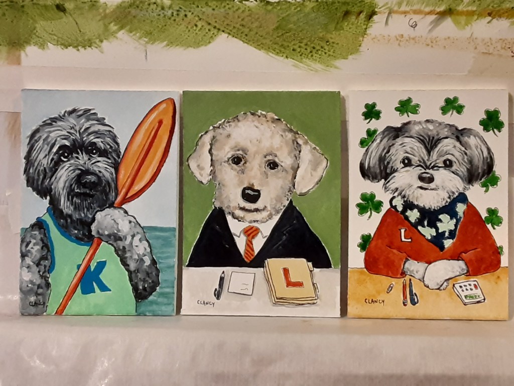
Professional dogs, books, Thanksgiving art and some about the holiday box!

A Creative Life, Abecedarian, art exhibit, art gallery, artist book, author illustrator, book design and layout, children's book, dog portrait, Dogs in Art, drinks in art, fine art, graphic design, greeting cards, handmade papers, illustrated gifts, illustrated recipe, pet portraits, printed books, publications - publishing, published art, small things, Sue Draws Dogs, The Professional Dog, whimsical art, words and pictures, writing and illustrating

Here’s news about The Professional Dog and all of my projects that I couldn’t talk about in my last posts! First, this weeks sequence of dogs.

Below is a closer look at the artwork of each of those dogs with the book text beneath.

The Kayaker’s dog is a kind dog.
The Lawyer’s dog is a laudable dog.
The Lender’s dog is a lucky dog.

As I mentioned in another post I tend to work first and talk about the work later. This means all of the artwork is finished for The Professional Dog and I could work hard this past week on the book layout. Here’s a photo of me at my laptop doing the book layout.

I wanted this book to be able to be shipped by Christmas so I focused on getting the book design done – and uploaded – which altered my posting about the artwork itself or about my creative process surrounding the book but I think that’s okay. If you have questions just ask.

But here’s the cover for The Professional Dog and a link where you can preview the entire book and order a copy if you wish.

https://www.blurb.com/b/10926040-the-professional-dog

There’s a lot still to do for this project but the publication on the 16th of Nov was a big deal. There are 40 portraits in the book and this is the most pages I’ve created for any of my books so far! So I’m celebrating! Wahoo!

Because I made portraits of my friends dogs I plan to keep posting each dog in alphabetical sequence so that each dog gets to be featured and each friend has a chance to share the portrait of their dog if they want to. Mainly it’s just a bit of cheerfulness from me over the Thanksgiving holiday.

Speaking of small cheerful things: I took some more of my books, mug mats and postcards to the Aurora Gallery at their request.

The Caplan Art Designs Gallery did a studio visit and selected some artwork from my studio stash for the special Thanksgiving event the Gallery is doing Nov 26, 27 and 28th. Each of the artworks Caplan selected are autobiographical. I’ve been sharing details on my Instagram page for each of these pieces but generally speaking each painting is about some aspect of my life here in the Pacific Northwest. Like the time we went hiking in Forest Park and my bootlace broke and we discovered a wonderful coffee shop that also sold bootlaces! Or the Rainier cherries we enjoy eating by the sea. Or the fine dining we’ve enjoyed…my feeling is reflected in my choice of dog breed depicted. And the bookstores… There are many more artworks selected by the Gallery than I’ve included below but perhaps this gives you the idea? The Gallery event happens the 26th, 27th and 28th in Portland Oregon.

Why were the above artworks languishing in my studio? They didn’t fit neatly into a theme or a unified whole for any of my exhibits. And also they were still there because I forgot about them. This is an example of when it’s helpful to have someone outside my head – in this case a gallery owner – look at things with fresh eyes.

Another example of the value of “fresh eyes” is that my spouse looked at my digital book layout of The Professional Dog and caught a major mistake I had made before it went to print!! (I had one out of alphabetical order 😱) I thank her on the book info page seen below.

The Professional Dog by Clancy

And now for what we’ve all been waiting for (drumroll please) the Holiday Box Project! The Box Project exhibit opens at Caplan Art Designs the first Thursday in December. That’s why we artists were asked to wait to post and to only do a “teaser” post now because the Thanksgiving gallery event happens first. We artists were each given by the Gallery a solid brown wooden box, 8 inches cubed, some time ago so we’d all have time to create art on them. Below are before and after photos of my box.

I’ve titled my holiday box “All The Chances” – what are the odds you’d find 21 dogs named Chance? Anyway, are you teased? Lol! I will tell more details about “All The Chances” including about my working process after Thanksgiving.

It’s been a super busy week (no time for Creativity Chats or for much cooking creativity either) and frankly I am very tired from all of the activities. But at the same time I’m very happy! So I’ll rest up and share more this week on social media and on next Monday’s blog post.

I hope your week is a good one. Thank you for your many kind comments and your support! I am grateful for you and for the blogging community! Happy Thanksgiving!

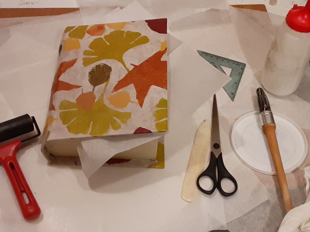
A box of leaves – Pembral Forgets

A Creative Life, art techniques, artist book, artistic inspirations, books, Books In Art, handmade books, handmade papers, Narrative Art, pattern design, Pembral Forgets, printed books, publications - publishing, published art, visual story, visual thinking, words and pictures

The inside of a book is made up of pages which are called “leaves”. The handmade box I’ve been constructing holds all of the “loose leaves” for Pembral Forgets. I love the pun…a story about fall leaves housed in a box covered with a pattern of leaves, containing loose leaf pages….

Yes, I know…🤣 … Anyway…

Pembral Forgets is a story, written by Steve Tubbs and illustrated by me, about fall leaves, good food and an absent-minded boy who forgets something very important.

Below is a photo of me remembering to spray fix all of the loose pages to prevent smudges.

When I talked with the writer, Steve Tubbs, he expressed concern about the pages being properly protected. So in addition to spray fixing them I slipped each page into an archival clear sleeve.

After making doubly certain that the pages in the archive sleeves would still fit in the book shaped box I set about giving the box an “old book” trompe l’oeil effect using layered acrylic paints over handmade papers.

Multiple layers were needed to create the well-thumbed golden edged book pages appearance to the box sides. (In the background of the photo below you can see some of my character sketches for this book. I keep all such sketches until a project is absolutely finished…just in case.)

Once my book-pages effect on the edges of the box was dry enough to handle I applied the cover title. I had hand lettered, with ink, the Pembral Forgets title onto some of the same tissue-thin delicate paper I had used to make the overall leaf pattern cover paper. [See my previous blog post for details] I applied my archival book glue to the back of the handlettered bit of paper and carefully placed it onto the box.

I wanted the lettering to have a matte look and blend into the cover so that the only shiny, bold, parts to the cover are the stenciled pattern of leaves. (The photos in this post are “in progress” pics. My portfolio page has more photos of the finished project)

Because the paper is thin the applied paper with lettering on it lies flush with the cover itself. Since this box/book may be stored on a shelf just like any other book I don’t want any edges sticking up to catch on anything.

In addition to showing the flatness of the cover the photo below also shows the box edges more clearly.

While the cover title lettering was drying I applied similar lettering to the spine of the book. And worked on a colophon page… more on that in a bit.

I use various sizes of paperweights to hold just-glued papers flat while they dry. (In case you’re wondering beanbags make great paperweights.)

While things dried I created another tree scene – with ink and gouache – this one with frost on the ground and a pond. This tree image is unique to this artist book box version of Pembral Forgets and doesn’t appear in the printed book reproductions.

There are many reasons for having unique pages in the box but the main reason is I have a more flexible page count in a one-of-a-kind book with loose leaves than I do when creating book reproductions.

The photo below shows my handmade box without the loose leaf content pages in it so you can see the bottom of the box. There’s a raised area (the leaf pattern to the right) that has a recessed “valley” near the box walls to allow fingers to pick up the last loose leaf page easily. Also attached to that raised area in the well of the box is a black ribbon for the pages to rest on so they can easily be lifted out.

Here’s the bookmark ribbon with the loose leaf content pages in place

Below is a close view of the colophon page. A colophon gives info about a book authorship, publication and any information that’s relevant to the book creation. I glued it onto the inside front cover aka the inside lid of the box. Since I handmade the box I signed the colophon page.

The box lid has a “tray” which fits inside the box when closed. (Yes, that was very tricky to measure and create. Have I mentioned that I like puzzles?)

Anyway, perhaps in the photo below you can see how that brown tray edge on the box lid fits into the inside of the box. Or perhaps clicking on the video link below the photo gives you a better idea.

Here is a video look at this project

https://youtu.be/p5By-g5AR6E

This week wasn’t necessarily calmer politically speaking than I wrote of in my last post but in a personal sense I stayed busier. So that in itself was calming. I was glad to see that Trump was impeached for a second time. I am nervous about the upcoming inauguration of President Joe Biden – I want his administration to be safe…

So I will do creative work, read, cook, go for walks and find solace anywhere I can while I wait and hope.

As it’s getting colder here where I live in the Pacific Northwest- and since I’ve been staying so busy – reheating a pot of soup was simply easier to manage. Here’s a link to the soup recipe I enjoyed. Lentil Lemon Orzo Soup

I finished the Theodora Goss novel that I’ve been reading during my last several posts. I liked the way Goss writes and I found her monsters a pleasant diversion.

A friend kindly sent me some books by mail – so I’m enjoying them now!

I’ve been requested to make some art prints of a few of the pages from Pembral Forgets so this week I’ll do that and will update my Pembral Forgets portfolio page with those details! What fun!

See you here next Monday. Hope your week is as good as it can be.

A box for Pembral Forgets

A Creative Life, art techniques, artist book, artistic inspirations, books, fine art, food in art, handmade books, handmade papers, illustration, mental health, Narrative Art, Pembral Forgets, printed books, publications - publishing, published art, sketchbook, surface design, Sustainable creativity, visual story, visual thinking, words and pictures

A horrible but predictable insurrection happened in the US last week. My book shaped box to hold the original artwork for Pembral Forgets was at the needs-to-dry stage the day before, so Wednesday, January 6, 2021, the day of the attempted coup, I nervously read a lot of news. And thought of how a seditious insurrection was the inevitable outcome of the right-wing rhetoric of the last several weeks, months, years. But I don’t want to blog on that…. after time spent on the news Wednesday I drew in my sketchbook and read fiction to give myself a mental space from the violent seditious insurrection, to calm down and think.

So on to a more pleasant topic: here’s a few photos of the printed and bound version of Pembral Forgets – you can see more on my portfolio page. The print book is available on Blurb here.

The printed book is slightly different from the original artist book. Same content just a different presentation and minor differences in the book-info pages and, most obviously, the cover. There’s several reasons for this: an original artist book can only be enjoyed in person. And we’re in a pandemic so going to galleries isn’t an option for most people. Multiple printed books can be mailed directly to someone and can be enjoyed by many.

Yet when I create a book to be printed and widely enjoyed I still end up with a physical one-of-a-kind set of paintings. Since I’m a fine artist first and foremost I gravitate towards making things that can be hung on walls or displayed on stands/shelves. But see aforementioned pandemic which has made the use of other means of art production and distribution i.e. Blurb.com or Zazzle.com or Society6.com or Spoonflower.com on-demand shops helpful.

Even so I love making handmade boxes and used to regularly make them for the artist Deloss McGraw and others. So I look for excuses to make boxes…and am loving this box for Pembral Forgets!

Below is a series of photos of the box for Pembral Forgets that you saw a bit of in my last post. In this first photo I have laid the naked box on the handmade hand stenciled paper that I’ll use to cover the box. I lay the box on the paper and try to position it so the paper will be placed well when I glue it on.

I “mark” my choice of placement by creasing the paper slightly. Pencil marks would show through this delicate paper.

Glue is applied to the paper within the crease “marks”, the open box is laid onto the glue, then the box now loosely covered with glue-y paper is gently closed. I use a roller to press the paper firmly in place, wiping away any excess glue. Next, as in the photo below, I add glue to the flaps of paper and fold them around the edges of the box using a bone folder to get the creases smooth.

Then after carefully gluing all edges I turned the box over to check the paper placement.

Inserting wax paper allows me to close the just glued box without accidentally gluing the box shut.

At this point, Tuesday evening, I let the book box dry for a few days. It will be dry to the touch within hours but I have learned the hard way that too much handling too soon can cause the paper to slip.

Then the next day saw the news of the insurrection…

Here’s the fiction book I read as a spirit restorative…

The beverage in the picture is Clancy’s Special Chocolate and here’s the sketchbook drawing I did about how to make it. Whenever I feel stressed it helps to draw whatever is in front of me.

In case you wonder: I get my archival glue and other book-box-making supplies from Twinrocker.com

A helpful technique book about making boxes by hand is by Franz Zeier titled Books, Boxes and Portfolios; binding, construction and design step by step.

There’s still more to do on this project. So I hope to see you here next Monday after, hopefully, a more quiet week – but I know it’s not likely to be quiet here in the US – but no matter what kind of week it is I wish you some calm creative moments.

Pembral Forgets and a holiday

A Creative Life, Alphapets, Alphapets Too, art techniques, Art Word Combinations, artist book, artistic inspirations, author illustrator, Authors, fine art, handmade books, handmade papers, illustration, Narrative Art, pattern design, Pembral Forgets, publications - publishing, published art, surface design, visual story, visual thinking, words and pictures, writing and illustrating

Mid November 2020 I was asked to illustrate Pembral Forgets by Steve Tubbs. It’s a story about fall leaves, good food and an absentminded boy who forgets something important.

In mid December I took a social media break in order to focus more intensely on my illustrations. (There’s 38 pages of illustrations!) I’m glad I took the break as I think my illustrations for Pembral Forgets are some of my best work so far. The story written by Steve Tubbs was great inspiration!

I finished the illustrations and uploaded the digital files for the artist book reproductions on December 21 and told the author Steve Tubbs that Pembral Forgets by Steve Tubbs was now available! (You can preview the reproductions of the artist book via this link here)

Then I shut off my screens and have since been recovering from my creative efforts. Reading books and cooking are my go-to restoration methods and it’s really helped to spend time deeply reading in a novel! And trying new-to-me recipes! Truth be told I’m still in this hibernate and recovery mode.

Still, because it may amuse, I wanted to share some of my working process on this artist book project.

Since fall leaves are a theme in Pembral Forgets I studied leaves I found in my yard and neighborhood. I both drew them in my sketchbook and photographed them….here’s two of the photos

Then out of thick mylar (a sheet of clear plastic) I drew the leaf shapes with a marker and then hand cut stencils in the shapes of several different kinds of leaves. The masking tape tabs on the edges of the mylar make it easier to lift and move the stencil when in use.

With a sheet of handmade paper taped to a board on my easel I set about using the 5 different stencils I’d made. I mixed acrylic paint colors and used a natural sponge to dab into the color and then onto the stencil. This overall leaf pattern was done over a multiple day period to allow for layers to dry.

My spouse snapped the above photos so they could be shared digitally with the author Steve Tubbs and his wife. The pandemic being what it is – the project discussions between the writer and myself were all virtual.

Here’s what the finished leaf pattern looked like while it was on my easel with still wet paint.

And here’s what the cover for the artist book reproductions looks like:

https://www.blurb.com/b/10507043-pembral-forgets

Variations of this leaf motif carries throughout Pembral Forgets….

When I create books I think of them, as an art object. With the attending artistic concerns about rhythm, balance, beauty and, in my case, pleasantness. For this project I was inspired artistically Steve Tubbs’s story Pembral Forgets and did my own artistic response to his story.

My way of working also means that most of the time my book creations have, in addition to the multiple print and ebook reproductions, a physical one-of-a-kind book-like-art-object.

Sometimes there’s a series of framed fine artworks related to the books – see my Alphapets and Alphapets Too projects for examples or my portfolio page generally.

Anyway, here’s the book-box for Pembral Forgets that I’m still in the process of constructing.

I will show pages and talk about my illustrations for Pembral Forgets in coming blog posts. My hand is still very tired so I will write more later…like next Monday.

If you’re curious: I’ve been reading the novel “European Travel for the Monstrous Gentlewoman” by Theodora Goss.

One of the meals I’ve enjoyed cooking recently is a pasta, cheese and pepper dish I’d read about on the Food In Books blog – https://wp.me/p75xYM-1bY – I don’t know if I’d read the novel talked about in that blog post but it’s fun to see the novel that inspired the blogger’s recipe. I can tell you, for certain, that the pasta, cheese and pepper recipe in the post is a winner!

Now, back to the novel I am currently reading!

pop-up pet portraits

A Creative Life, art commissions, art techniques, artistic inspirations, cat portrait, Cats in art, dog portrait, Dogs in Art, fine art, handmade papers, public art, sketchbook

Dec 7th during my pop-up shop at Vintage Books https://www.vintage-books.net/ from noon to 4 I’ll be doing some “live drawing”; I’ll work in my sketchbook and if anyone wants a small portrait of their pet I’ll happily do one using a phone photo as inspiration.

PortraitPractice

These portraits I’ll do at the pop-up shop are what I call “quickie sketches” – less complex than the portraits I’m often commissioned to do via the Caplan Art Design Gallery or the Joseph Gierek Fine Art Gallery – more like what I do in my sketchbook and still a fun gift for the holiday.  Each portrait I do will take about 20 minutes more or less.  A command performance art piece! (What fun!!!)

Since I’ll be doing these portraits on-site at the Vintage Books bookstore I’m currently in the process of testing my portable art kit to make sure I’ll have everything I need.  A dear friend let me come to her house with my art kit and do a practice session – on her kitchen table – with a pic of her dog on her phone! (pictured in this post)

I’m using my ink pens, my Pentel Water-Brushes (to minimize the need for a water source) color pencils and my gouache colors on handmade paper. During the practice session I discovered I need to pack a few more items – like more paper towels, some wax paper… –  so I’ll practice some more between now and Dec. 7th!

specially commissioned portrait

A Creative Life, animals in art, art commission, art commissions, artistic inspirations, dog portrait, Dogs in Art, fine art, Fine Art Commission, handmade papers, Sue Draws Dogs, visual story

Most of my artwork is me telling visual stories inspired by data from my real-life. A kind of “creative nonfiction”. When I do art commissions the client provides the life-data and I tell their story. A kind of “biography”. Elements from a persons real-life are woven into the portrait of their dog or cat. I love helping people tell their stories!

Like this commission I recently finished… pictured below… the coffee cup is special to the owner, the tee-shirt logo is important… and of course the dog looks like their very special dog, Potter.

I had such fun drawing this dog – (those ears!!!) – and working with the client who commissioned this portrait. They gave me such good data to work with!

PotterByClancy72

“Potter” by Clancy (ink and gouache on handmade paper)

If you’re curious about some of my other commission work you can see them here.

portrait commission of two cats

A Creative Life, animals in art, art commission, art techniques, cat portrait, Cats in art, fine art, Fine Art Commission, handmade papers, visual story

This time of year most of my art commissions are gifts and are top secret. No blogging about them. Well this time a couple asked me to create a double portrait of their two cats and since it’s a gift to themselves they’ve let me blog about it! (Happy Holidays to all of us!) Here’s how it went:

In September Sue and Dean asked me via Caplan Art Designs, my Portland gallery, to create a double portrait of their two cats.  They were pretty sure they wanted it to be 12 inches by 18 inches and on handmade paper to be framed.

A time to meet to discuss the commission was arranged and my wife, Judy, and I went to dinner at Sue and Dean’s house.  I brought an example of the 100% cotton handmade paper that I’d use at the size they’d requested and a few other sizes just in case. I also brought my camera, a note pad and an extra pen.

After we’d been there a short while the cats came out. So did my camera. As the cats got used to me, and over the evening, I took over 41 photos of them. Here are two of the photos I took.

I asked questions of the humans about the cats favorite places, toys and habits. I asked questions about the humans favorite places, drinks and memories. On my note pad I wrote down the answers. Where possible I photographed the answers .  For example on of my questions was: “What drink do you reach for most often when you want to relax? And what kind of glass do you have it in?” Here was the answer:

Drink

Generally we just talked about one thing and another. You know, dinner party talk. I asked questions, kept my ears open, and my notepad ready for recording things that might be relevant to the commission. I like to include in any pet portrait elements from the humans’ lives: favorite objects, drinks, food, anything that sparks pleasant memories. Helpfully, Sue and Dean both volunteered lots of information about themselves such as a favorite artwork that was meaningful to them.

backgoundart

They told of past travels that were particularly memorable. Famous people they’d met in Hawaii.  All kinds of things were talked about and without interrupting flow I asked  more questions  and made as many notes as I could. Without being too obvious I also looked around their house noting colors and patterns, writing those notes down too.  This is what I call the “data dump” phase of a commission. At this point I have no idea what information will be relevant for the final artwork.

We relaxed into the evening; just talking, having a very yummy dinner with a good wine. Slowly as Sue and Dean talked I began to get ideas…  The cats got comfortable too and began doing their “normal” behavior.

Ollie likes to sit in a basket that holds magazines. Tony likes to sit on the couch and watch Nature on television.  The cats behavior prompted me to ask which human had the magazine subscriptions (Sue did) and what magazines were favorites. Dean has worked in technological fields…so technological advances (including TV) were discussed..

Later in the evening I floated a general portrait concept: Ollie reading magazines and Tony watching TV…perhaps the basket Ollie likes so much could become a “table” in the artwork, perhaps…   They both seemed to like my concept direction. They verified the size of artwork they wanted. I said I’d send them, via the gallery, a sketch for their approval before I began the finished artwork. We enjoyed a bit more conversation (and wine) – I glanced at my notes and racked my brain to make sure I had all the data I needed – and then we said our good-nights.

In the driveway pulling away from their house about 9:30pm I texted the gallery owner with the gist of what size artwork Sue and Dean wanted etc. Then my wife, Judy, and I discussed the evening in the car as we drove home. I still had my note pad out and was writing notes in the moving car by flashlight. (Judy was driving.)

Occasionally it had happened during the evening that I was talking with Sue in one room while Judy was in another room talking with Dean. So Judy filled me in on what I’d missed.  At this point I am still in “data dump” mode. I have a rough direction for my design. But the details are very fuzzy. (Over the many years I’ve done special commissions this kind of uncertainty is normal and I trust it as a part of the process.)

The next day I went over my notes and began making 4 x 6 inch size thumbnail sketches.  Over several weeks I did this; going over my notes and photos, drawing possible poses of the cats, possible objects, considering composition and colors. I also showed my sketches to Judy discussing the possibilities. At one point Judy said that they had both talked of Nova Scotia, Newfoundland and Hawaii enough that she was sure that they were important. I agreed and adjusted my drawings so that a reference to those travels was emphasized. Slowly an idea began to come together in the small thumbnail size anyway.  What works visually at a small size doesn’t always work at a larger size but it’s a place to start.

On my easel I put the 12 x 18 inch handmade paper. Then I covered that with tracing paper and drew a grid (you can see it in the photo below). Then I put tracing paper over the grid and drew one of the thumbnail ideas to that scale.  Then another tracing paper was put over that and that drawing tweaked…. And so it went, with multiple tracing paper overlays and re-draws, for a week or more. Tweak, tweak, tweak, until I had something I felt good about.  The “good drawing” I sent to the gallery and to Sue and Dean for their approval. Here is what I sent:

MorehouseCommPreApprove72

They approved the drawing! Yippee! I did a happy dance and then I got serious about colors.

Upon arriving home after the dinner with Sue and Dean I had gotten out one of my interior design color swatch books. Flipping through the pages I found a couple of color spreads that I felt had the “vibe” of Sue and Dean’s house. I showed the pages to Judy to get her input.  With those interior design book pages as a rough guide along with my photographs taken inside their house I began mixing colors and making color notes.  I used my thumbnail drawings to play with color schemes too, painting blobs of color here or there. Anyway, here’s a photo of the interior design book page as well as a few pages of my sketchbook color notes. I did 6 pages of color notes but this one photo will give you the idea.

ColorPaletteBlends

As I decided on the colors I made pencil notes on the approved to-scale drawing where the colors would go. You can see some of this in the photo above.

Then I began on the finished artwork.  The actual painting took about 10 days start to finish. As I say often – the sketching/drawing/planning is where the bulk of creation happens.  I transferred the approved sketch/drawing to the handmade paper I intended to use for the finished artwork.  Then I began to make tiny adjustments to the drawing directly onto the handmade paper in prep for painting. I also discovered gaps in my visual data base.

For example I realized that I didn’t know what the back of a vintage TV set looked like. Not well enough to paint it in detail anyway. Fortunately there are some vintage shops where I live – so a few visits downtown with my sketchbook and the problem was solved!

I also realized that I had an opportunity to make a portrait of Sue and Dean on the front cover of the “magazine” that Ollie, the cat, would be reading in the finished artwork. So I asked for, and got, a picture of the couple that I could use as a reference photo.  From the photo I did several pencil drawings on tracing paper to design the magazine cover and to get the humans to look like themselves. I drew until I had a cover design and human portrait that worked. Here it is:

MagCover

Once I had the magazine “cover” drawing ready (drawn to the scale needed in the artwork) I transferred it to the appropriate spot on the handmade paper.  At another point I realized that I could include the stain glass windows I’d seen in their house as part of the “back cover” of the magazine. But I hadn’t gotten photos of the window when we visited for dinner. And neither Judy nor I could remember the exact details of the windows. So I contacted Amy at the Caplan Art design gallery and she helped fill in the missing data! Whew!

Here’s what the finished artwork “Ollie and Tony” looks like. I’ve photographed it as it was on my easel when I finished it, so you can see the four deckled edges of the handmade paper.  I used acrylic, gouache, watercolor and ink.

OllieAndTonywithdeckles72

I sent the photo of the finished art to Amy the gallery owner to let her know it was done.  Then I spray varnished the piece with a removable varnish that has UV protection in it.

When that was dry I contacted Amy and arranged for a time to deliver it to the gallery.  The date was set and the varnish dry so I slipped the artwork into an archival plastic sleeve and into a cardboard portfolio to protect the artwork from being bent on its travels between my studio and the gallery or between the gallery and the framer.  (It rains in the Pacific Northwest – so artwork needs all the protection it can get.)

We delivered the artwork to the gallery and as a nice surprise Sue and Dean were there!  Here we all are looking at the artwork and talking about it:

artdelivery

Amy will take the artwork to the professional framer the gallery works with and have the art floated on a neutral mat, with spacers so the artwork won’t touch the glass.  It will be given a simple black frame.

What a fun project!! I love getting to make highly personal and meaningful visual stories like this! Thank you!! And thank you, Sue and Dean, for letting me share it on my blog!

Happy Holidays Everyone!!


self portrait as a wicked book

A Creative Life, art exhibit, art gallery, artist book, artistic inspirations, handmade books, handmade papers, public art

Several of my artist books are in a permanent collection at Bainbridge Island Museum of Art and will be in a new exhibit, in March 2018, titled “Artist’s Books – Chapter 13 – Lyricism And Laughter”!

Here are a few photos of one of my books in the exhibit. It’s titled “Self Portrait As A Wicked Book”. I made it with handmade paper, hand-marbled paper, ink… and two original limerick poems.

The poems, on each side, are:

There was a young lady in Linen

who really loved laughter and sinnin’

She made wicked books that if given a look

you’d see that they’re often quite winnin’

——————

The lady in Linen was known,

for the books she is said to have sewn.

But when very hard pressed she began to protest

“Oh come now it’s quite over blown!”


When I exhibit my artist books I’m asked to write statements about them

Here, below, is what I wrote about “Self-portrait…”

Artist statement about the work:  By personifying herself as an open book – (or more precisely, as the linen thread binding the books within this book) –  with original limericks and pop-up book elements the artist pokes fun at self-styled “moral” groups who personify inanimate objects; books, movies and other art objects by describing them as “immoral”, “wicked” or “sinful”.  By writing “clean” limericks the artist is poking fun at the idea that a poetic form like a limerick could be defined as a “naughty” art.  An object or art form is just that, an object or technique – what people do with it may have a good, bad or neutral effect. But even the effect depends on the viewer’s perspective.  Thus “Self Portrait as a Wicked Book” is enclosed in a hand-marbled envelope – implying that the contents could be hidden from view, that the viewer has a choice to view it or not. The book is intended to be displayed accordion style so that the viewer can see it from different angles of their own choosing.  The textual reference within the limerick to “overblown” refers to the ways self-styled “moral” groups would ascribe moral qualities to the entire personhood of an author as a result of one written object the author had created.  The content also refers – both textually and by using colorful marbling and pop-ups – to the ways that censorship (or a “wicked” designation) actually increases interest in the object banned.

Artist’s back story for this book: A religious segment of the Oklahoma population has a penchant for banning books and a history of doing so.  To name two dramatic examples;  In 1997 the book “The Tin Drum” by Gunter Grass  and the movie by the same name was banned by Oklahoma City in such a way that the banning received national attention; Oklahoma City police went to the houses of adults, over the age of 21, who had rented the movie and seized it.  In 2005, the year I made “Self Portrait As A Wicked Book”, the Oklahoma House of Representatives banned all books – for children and adults – that had references to gay characters or gay people.  Around that time period I remember noticing that (in Oklahoma) the commercial bookstores “gay book sections” got smaller and were hidden the back corner of the store.  Books that questioned religion, or discussed censorship in anything but a positive light were also few and far between.  There was a general perception – as evidenced by what was offered on library or bookstore shelves and what wasn’t, what books were reviewed in the Oklahoma media and what ones weren’t – that there were “good” books and there were bad, sinful, “wicked” ones – and this one group of self-styled “moral” people would tell you which books were which and few people in Oklahoma dared (or even thought) to question that group.

finished Abyssinian cat with alphabet

A Creative Life, animals in art, art techniques, artistic inspirations, cat portrait, Cats in art, creative thinking, handmade papers, pattern design, visual thinking

Here’s the finished Abyssinian cat portrait with an alphabet pattern background – reflecting my thoughts of multi-lingual book readers, alphabetic “framing” of thoughts and… well, if you look at my last several blog posts you’ll see my thinking as I’ve worked on this one.

It’s titled “Alpha Betty” and is 20 x 24 inches.

AlphaBetty72

I’m particularly pleased with how the alphabet “shows through” subtly all over this piece with varying degrees of transparency or opacity – like our varying degrees of awareness of the linguistic framing of our thoughts.

You can see more of my cat-related thoughts in my ebook “Various Cat Sketches” here: https://sueclancy.com/shop/