
gouache
-

Of dogs, doodlebugs and damn good books
This week we took care of 2 dogs belonging to our extended family thus bringing our inhouse pet count up to 2 dachshunds 1 chihuahua Jack Russell mix and 1 cat. Everyone got along peacefully at “Camp Rusty” playing and sleeping together. Well, the cat did his own thing but wasn’t upset by the extra…
-

Gouache and grin cycles
Since I’ve been asked by several people: here’s info about the art media gouache, why it makes me grin and my working cycles with it. Gouache is a water based paint. It’s more opaque than watercolor. Using gouache feels like spreading soft butter on toast. Applied gouache dries quickly but is easily made moist and…
-

Alphapets: E F G and H
The Alphapets portrait project this week is brought to you by the letters E, F, G and H. My abecedarian poem to go with these letters and artwork : Everett often warbles with glee Farley is so easy to please Gingerbread loves days when it’s snowed Henry is sure he’s cracked the code Here’s the…
A Creative Life, Abecedarian, Alphapets, Ambassador for Small Frames, animals in art, art techniques, Art Word Combinations, artist book, artistic inspirations, author illustrator, cat portrait, Cats in art, dog portrait, Dogs in Art, fine art, illustrated poem, miniature art, pet portraits, publications – publishing, words and pictures -
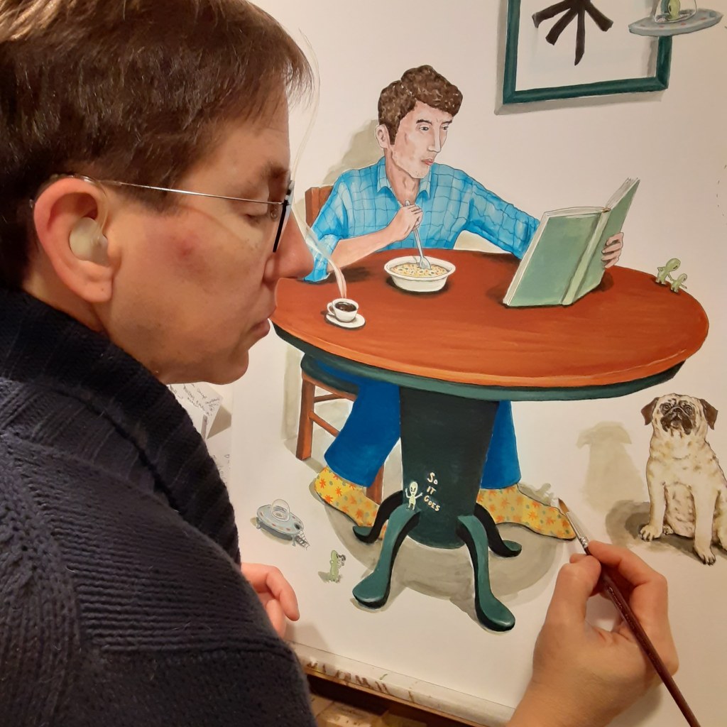
Slaughterhouse Chives or what came from my sketchbooks
My last post featured my sketchbook pages and those sketches added to my reading in Slaughterhouse Five by Kurt Vonnegut were combined in my mind becoming this fine art piece I’ve titled “Slaughterhouse Chives” If you saw my last post you may recognize the man’s gesture from my “loosey” sketchbook studies. I combined the man’s…
A Creative Life, art techniques, artistic inspirations, Authors, books, Books In Art, creative thinking, Dogs in Art, drinks in art, fine art, magic realism, Narrative Art, reading in art, sketchbook, visual thinkingbook, books, dog, fine art, fun socks, gouache, ink, Kurt Vonnegut, magic realism, painting, pug, quote, reader, reading, soup, space aliens, spaceships -
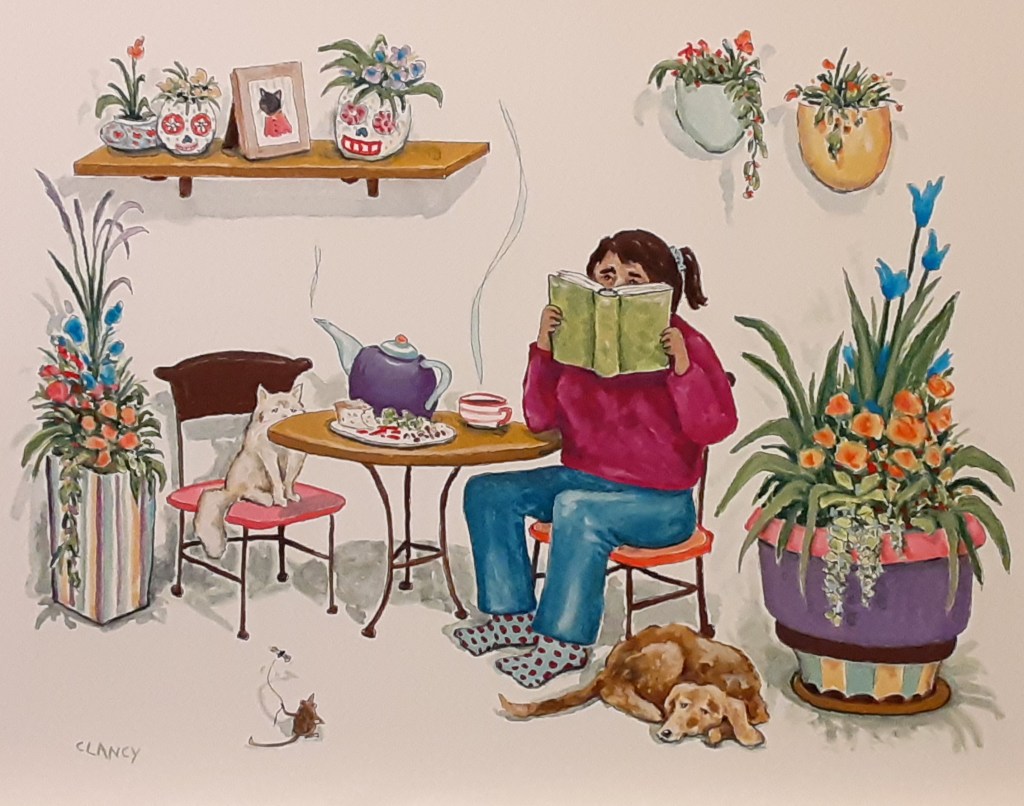
Midnight in the garden of veg and cheese
This is the fine art piece I said I was working on in my last post. It’s titled “Midnight In The Garden Of Goode And Weeval”. If you look closely at the art you can see a plate of veg and cheese. One recent evening I made a spread of assorted veggies and cheeses for…
-
the sacred stew dance
It’s finally gotten to be “soup and stew” weather here in the Pacific Northwest! When I was making a stew the other day I realized I was twirling, aka dancing, in the kitchen; popping quickly between the stove, the counter where I was chopping veg, the pantry and the refrigerator. I was so excited about…
-
absurd things on rainy days
For this new painting I’ve combined several thoughts together: rainy day activities, the contrast between rainy Pacific Northwest and the Southwestern (USA) desert region (Arizona), and the Bonneville Dam’s fish ladder. I’ve found the fish ladder fascinating – here’s a video of it – and have done some fun sketching at the Bonneville Dam trying…
-
mixing the mundane and magical
I’ve been reading “Whiskey Galore” by Compton Mackenzie. Once again I realize that I enjoy the mix of real-life and a whimsical imaginative look at real-life. Mackenzie used a real-life event as the inspiration for his whimsy and did the mix extremely well. Already I’ve been doing some of this mixing in my work –…
