Professional dogs, box project, cards, books, the first chat and some biscuits with gravy

A Creative Life, art exhibit, art gallery, art techniques, Art Word Combinations, artist book, artistic inspirations, author illustrator, books, creative thinking, Creativity Chats, food in art, greeting cards, illustrated poem, illustrated recipe, kitchen art, mental health, poetry, publications - publishing, published art, Sustainable creativity, This Rabbit, words and pictures, writing and illustrating

The Professional Dog text for my in-progress childrens book is solid enough that this week I focused on the illustrations. I’ve done about 12 of them in ink and have established a pattern for the artwork that relates to the text. I’m working on bringing the illustrations up to the same semi solid level of preparation as the text.

As per my last post I’m still looking at this project somewhat sideways. It’s more in focus and it’s now moved into my “main project” work time slot but it is still becoming itself, so rather that looking at it head on and making declarative  statements about it – it’s just a project I’m working on every day now. That attitude helps me keep it playful.

In my last post I spoke of picking up a box, a cube really, from the Caplan Art Designs gallery. The Gallery asked several of their artists to do something in their art style for what the Gallery is calling the “holiday box project”. Over this week I put 3 coats of gesso on my box. I also did some brainstorming in my sketchbook  about what I might do with the cube.

Allowing time for gesso to dry between coats gave me time to think and try stuff with The Professional Dog project as I mentioned above and also experiment with other things…

… one of the things I thought about is this: It feels urgent to me to practice patience and to encourage decency as much as I can. The selfish meaness of a small group of people during this time in U.S. history is toxic. The majority of people are generous and kindhearted but I see the kind people, particularly my friends in the medical and teaching professions, being worn out by the few meanies. Sometimes even I feel worn out. So I have taken it as a creative challenge to do whatever I can to give the kind people a bit of care.  Yes, my attempts to give care via art sometimes feels small, it feels like trying to refill a dry lake by the teacups full. But art is what I can do. And I do firmly believe this quote on my studio wall pictured below. Art is all we have. It’s certainly all I have.

Every time we’re kind, loving and supportive of each other – even in small ways – we’re enabling ourselves to not only survive but thrive. When we share art and beauty we help each others spirits – moment by moment. These moments add up. We are truly stronger together. And helping each other helps us feel better too. Self-care is community care and vice versa.

As I waited for gesso to dry I rummaged in my files, and my sketchbook for art pieces I’ve done that might encourage people. So I’m beginning a “For pleasant encouragement” art prints series on my Society 6 shop. Perhaps this series may also become a book someday? Anyway here’s one from this series.

Lighting Candles art print by Clancy – https://society6.com/product/lighting-candles424527_print?sku=s6-6943722p4a1v45#1=45

Also while gesso dried I added a few more recipe postcards and odd cards to my collections on my Zazzle shop. I have been enjoying mailing cards to friends and they’ve seemed to like getting them – so these cards fit with my overall project of encouraging people.

This week my book This Rabbit was featured on the Read Aloud by Kidz Stories And More YouTube channel! I am honored to be called a “favorite author”! Kidz Stories And More reads childrens books aloud very well and they welcome submissions from self published childrens book authors. They can be contacted via social media.

https://youtu.be/13yziUOlj6U

As I mentioned above during one of my “gotta let the gesso dry” times I set up my new video thingamajig and did my first Creativity Chat!

I haven’t figured out how to embed video in blog posts yet so to view it you’ll have to click here.

Creativity Chats: introduction – https://youtu.be/IDhodTsN_EM

I’ve written short scripts for about 15 of these chats so far and my main point of doing these is to encourage people and discuss the intersection I see between creativity and good mental health. Some time ago I had planned to do another version of Dr Bob’s Emotional Repair Program First Aid Kit and focus the new book on creativity. But other projects took precedence … so I’m excited about doing videos on this topic! I can squeeze a short chat on video into my busy life!

The yummy comfort food this week was homemade biscuits and gravy! See recipe postcards above or via these links: Judy’s Biscuits and Good Gravy. It was a fun collaborative brunch!

Some books I’m reading in the evenings: Death in D Minor by Alexia Gordon – a mystery novel with a ghost in it. (It is October after all.) I’m finishing A Swim In The Pond In The Rain by George Saunders. Both are very delightful to read and transport me to other worlds smoothly! Technically I’m rereading the Saunders – I read it first as an ebook and am rereading a print version now and making notes. Thank goodness, I say almost daily, for writers – how dismal our lives would be without good soul-satisfying books.

Temperatures here in the Pacific Northwest are now cool to cold as the sun goes down so my reading evenings often have hot chocolate or hot tea to go with a book. Last night as I returned to my chair I thought “this is one of my happy places” so I took a photo.

I hope you get to spend time this week in one of your happy places. See you next Monday.

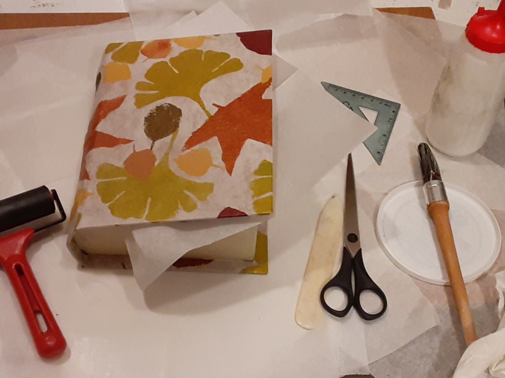
A box for Pembral Forgets

A Creative Life, art techniques, artist book, artistic inspirations, books, fine art, food in art, handmade books, handmade papers, illustration, mental health, Narrative Art, Pembral Forgets, printed books, publications - publishing, published art, sketchbook, surface design, Sustainable creativity, visual story, visual thinking, words and pictures

A horrible but predictable insurrection happened in the US last week. My book shaped box to hold the original artwork for Pembral Forgets was at the needs-to-dry stage the day before, so Wednesday, January 6, 2021, the day of the attempted coup, I nervously read a lot of news. And thought of how a seditious insurrection was the inevitable outcome of the right-wing rhetoric of the last several weeks, months, years. But I don’t want to blog on that…. after time spent on the news Wednesday I drew in my sketchbook and read fiction to give myself a mental space from the violent seditious insurrection, to calm down and think.

So on to a more pleasant topic: here’s a few photos of the printed and bound version of Pembral Forgets – you can see more on my portfolio page. The print book is available on Blurb here.

The printed book is slightly different from the original artist book. Same content just a different presentation and minor differences in the book-info pages and, most obviously, the cover. There’s several reasons for this: an original artist book can only be enjoyed in person. And we’re in a pandemic so going to galleries isn’t an option for most people. Multiple printed books can be mailed directly to someone and can be enjoyed by many.

Yet when I create a book to be printed and widely enjoyed I still end up with a physical one-of-a-kind set of paintings. Since I’m a fine artist first and foremost I gravitate towards making things that can be hung on walls or displayed on stands/shelves. But see aforementioned pandemic which has made the use of other means of art production and distribution i.e. Blurb.com or Zazzle.com or Society6.com or Spoonflower.com on-demand shops helpful.

Even so I love making handmade boxes and used to regularly make them for the artist Deloss McGraw and others. So I look for excuses to make boxes…and am loving this box for Pembral Forgets!

Below is a series of photos of the box for Pembral Forgets that you saw a bit of in my last post. In this first photo I have laid the naked box on the handmade hand stenciled paper that I’ll use to cover the box. I lay the box on the paper and try to position it so the paper will be placed well when I glue it on.

I “mark” my choice of placement by creasing the paper slightly. Pencil marks would show through this delicate paper.

Glue is applied to the paper within the crease “marks”, the open box is laid onto the glue, then the box now loosely covered with glue-y paper is gently closed. I use a roller to press the paper firmly in place, wiping away any excess glue. Next, as in the photo below, I add glue to the flaps of paper and fold them around the edges of the box using a bone folder to get the creases smooth.

Then after carefully gluing all edges I turned the box over to check the paper placement.

Inserting wax paper allows me to close the just glued box without accidentally gluing the box shut.

At this point, Tuesday evening, I let the book box dry for a few days. It will be dry to the touch within hours but I have learned the hard way that too much handling too soon can cause the paper to slip.

Then the next day saw the news of the insurrection…

Here’s the fiction book I read as a spirit restorative…

The beverage in the picture is Clancy’s Special Chocolate and here’s the sketchbook drawing I did about how to make it. Whenever I feel stressed it helps to draw whatever is in front of me.

In case you wonder: I get my archival glue and other book-box-making supplies from Twinrocker.com

A helpful technique book about making boxes by hand is by Franz Zeier titled Books, Boxes and Portfolios; binding, construction and design step by step.

There’s still more to do on this project. So I hope to see you here next Monday after, hopefully, a more quiet week – but I know it’s not likely to be quiet here in the US – but no matter what kind of week it is I wish you some calm creative moments.

Gouache and grin cycles

A Creative Life, art techniques, artist book, artistic inspirations, author illustrator, books, ebook, fine art, food in art, illustration, mental health, printed books, product design, publications - publishing, published art, Sustainable creativity

Since I’ve been asked by several people: here’s info about the art media gouache, why it makes me grin and my working cycles with it.

Gouache is a water based paint. It’s more opaque than watercolor. Using gouache feels like spreading soft butter on toast. Applied gouache dries quickly but is easily made moist and workable again. It dries to a matte non sticky appearance which makes it suitable for use in bound sketchbooks, in folded artist books as well as for fine art to be framed. Gouache also reproduces well via various printing mechanisms on fabrics, in printed books and on many other surfaces.

In the studio, because I don’t have to worry about my gouache paints becoming unusable on my palette before I can use them (as is sometimes an issue with acrylics), gouache is suited to my busy life. I call this my gouache and grin cycle.

I prefer to work on multiple art projects at a time in “short bursts” on each project. Rather than count on a long span of uninterrupted time I dash in and work a bit on an art project, then go make lunch or do whatever stuff-of-life or other work matter that needs to be done. Then I cycle back to an art project…

To borrow a sports analogy I just try to advance the ball, my various art projects, a little bit each day rather than doing a project all at once. I try to amuse myself with whimsical art making, aka spreading color, for at least a few minutes every day no matter what else is happening in life. The qualities and attributes of gouache help me to do this, to keep my creative games in play – come heck or high water.

Here’s a series of photos showing my gouache working methods in my sketchbook. (This is also my work method for fine art and other projects.) In the first photo you see my 3 x 5 inch watercolor sketchbook held open with clips. Also pictured from the top left and rotating clockwise: paper towel, peppermint candy model, graphite pencil, 3 watercolor pencils, 2 waterproof ink pens, a water brush and my lidded paint palette with its wells of various dry gouache colors.

In the photo below I begin 3 demo peppermints: the top left mint is sketched in graphite pencil and waterproof ink pens. The bottom left mint is drawn in watercolor pencil only. The mint on the bottom right page was doodled in all of the above; graphite pencil, ink and watercolor pencil. [The quote was just on the sketchbook page I chose to use for this demo.]

So you can see what they look like here in the photo below are two tubes of gouache paints. I like the Holbein Artist Designers Gouache brand best but the Winsor and Newton brand is good too. (There’s a monster called “acryla gouache” also available on the market which I avoid like a character would avoid a flesh eating zombie in a horror film.)

I begin painting by laying down the local color – the general color an item is supposed to be. At this point I don’t worry about shadows or highlights or details. I just get the color shapes down – in this case for the peppermint candies.

I did not squeeze out new paint from my tubes when I began. I got my water brush wet and put a few drops of water on the dried red gouache already on my palette so I can use the newly moistened color. I add a small amount of moisture to a portion of the dried chunk of red gouache until that portion feels like soft butter, then I paint the candy stripes.

Here’s a closer look.

Now I get the general color and shape down for the wrapper in the same method. I put a drop or two of water on my blue gouache color, get my brush damp, dab at the blue paint a second or two to get a portion of it moistened and softened – then I paint.

Now I create the cast shadows using a watery mixture of the red and blue gouache colors. To make the watery mixture on the lid of my palette I dipped my brush on the now moist blue color, dab on an area of the lid, then dab the brush clean on the paper towel, then dipping into the now moist red and adding it to the tiny blue puddle, mixing till it’s a purple color I want for the shadow. Then I add a tiny bit of plain water to the newly mixed purple till it’s a small fingernail size puddle of watery purple – this enables me to do the cast shadows in a faint shadowy way.

Now I do squeeze out a tiny amount of the white gouache from the tube and use it, fresh from the tube, to make the highlights on the candy and wrappers. Note in the photo below how the white gouache can completely obscure the darkest ink lines. This is part of what I love about gouache – any mistake can be covered with the opaque paints. If an edge in a painting needs to be softened or a color edge blended all I need is a wet brush.

Then in a few minutes, perhaps the length of time it takes for a decent sip or two of coffee, when the paint is dry I go back over the paint with ink lines or watercolor pencil lines to snap the details into sharper focus.

Now that I’ve finished painting I leave my sketchbook and my palette open and let them dry completely. I even leave the shadow color mixture on my palette lid to dry. All I will need to do to reuse the mixed color in the future is to get my brush wet and dip in.

Peppermints are one of my guaranteed-to-make-me-grin art subjects that don’t require a lot of time or planning. I’ve learned over years of painting peppermints that different candy makers have their own peppermint candy look. And I don’t mean the wrapper.

Here’s a fabric pattern I did of peppermints for my Spoonflower shop. I used the gouache techniques I describe above to create this pattern. But do you notice how these mints are different from the ones I did in the demo above? Different candy maker… yummy too!

More about my “Peppermint Candies” fabric pattern is here: https://www.spoonflower.com/en/fabric/8224417-peppermint-candies-by-sueclancy

To illustrate what I mean about working in short bursts despite life situations. A hot water pipe burst on our hot water heater recently. (Talk about heck and high water! 🤦‍♀️) After we got the immediate crisis dealt with I did little quick bouts of drawing as a self calming technique. Also while waiting for plumbers etc restoration crews I doodled and painted in my sketchbook. Gouache makes it easy for me do short bursts of spreading color which makes me smile. And having had a brief grin makes dealing with life much better.

Anyway, there’s a new artist book I’ve done for children called “B Mouse Reads A Book”. In it you can see my original ink and gouache artwork, and how the art media is on folded paper in this video on my YouTube channel. Because this book was meant to be handled in a gallery I used a spray fix varnish to make sure the gouache wouldn’t smear or run.

But since the pandemic hit there’s no going to art galleries to handle or view artist books in person. So I was lucky enough to have “B Mouse Reads A Book” published as an ebook here on Storyberries.com! They also included the book B Mouse is reading too…it’s another artist book I created as part of the B Mouse Reads A Book story…there’s a link at the bottom of the B Mouse book that you can click to see the companion book.

“B Mouse Reads A Book” by Clancy – https://www.storyberries.com/free-books-for-kids-b-mouse-reads-a-book-by-sue-clancy-bedtime-stories/

I’m sure you can recognize in the image above the ways I did my combinations of ink and gouache. The video shows how flexible gouache can be when applied on paper bound or folded as pages. The ebook shows how well the nuances of the colors show even as a digital image.

If you look at my portfolio pages you can see my ink and gouache work as both fine art framed in an art gallery setting as well as reproduced in printed books.

Most of my jigsaw puzzle designs, greeting cards and odd mugs on my Zazzle shop were also created with my combinations of ink, watercolor pencil and gouache. It’s a very versatile media.

That reminds me to tell of another practical matter: if you apply gouache too thickly it can pop or flake off. Especially in a folded or bound paper book. And when scanning or photographing gouache artwork for reproduction a too-thick gouache application can cast shadows unrelated to the artwork subject. So I apply gouache as if I were basting bread with semi melted or melted butter.

I hope you’ve enjoyed reading this and found it helpful for when you try gouache yourself.

See you here next Monday. And in case you’d like to know even more about gouache – here below are a few links to more information about painting with gouache:

COMBINE WATERCOLOR AND GOUACHE TIPS https://www.erikalancaster.com/art-blog/3-tips-to-combine-watercolor-and-gouache-like-a-pro

GOUACHE INFO (VERY GOOD)
https://www.skillshare.com/blog/learn/7-artists-using-gouache-in-gorgeous-ways

GOUACHE SKILLS
https://www.google.com/amp/s/www.skillshare.com/blog/learn/8-gouache-paint-pro-tips-you-should-know%3Fformat=amp

GOUACHE IN SKETCHBOOKS
https://juliabausenhardt.com/how-to-get-started-with-gouache-paint/

LENA RIVO – GOUACHE
https://www.lenarivo.com/guide-to-gouache and generally see
https://www.lenarivo.com

Numpurrs 20 & it sums up…

A Creative Life, art techniques, Art Word Combinations, artist book, artistic inspirations, author illustrator, books, cat portrait, ebook, fine art, food in art, graphic design, illustrated poem, illustration, math and numbers, Numpurrs, pet portraits, printed books, Sustainable creativity, visual thinking, words and pictures, writing, writing and illustrating

There now! Despite all the odds (see last post) I finished “Numpurrs”! I’ve also sent it in to Storyberries for distribution. When I sent it in this last week Storyberries said “I just LOVE it Sue!!! It has come together so nicely !!!! Thank you so much for sharing your beautiful work with us!!”

So I think it’s safe to say that they’re pleased! The book will be live on Storyberries.com very soon as they said they’ll “…schedule it for 9am Gold Coast time Australia on Monday morning.” Which works out to about 4 pm in Washington state, USA on Sunday. And I post these blog posts on Mondays but write them on Sunday morning’s… so, yes, I can have a bit of time zone confusion.

[Update: here’s the link to Numpurrs on Storyberries.com: https://www.storyberries.com/bedtime-stories-numpurrs-by-clancy-free-counting-books-for-kids/ ]

Time zone differences between where I live on the western US coast and the time where Storyberries is in Australia can confuse me even when I have help from the internet. My solution to working across continents and time zones is the same in publishing as it has been when I’ve done fine art exhibits outside of the U.S.A; get it all done early and everything into their hands as soon as humanly possible then let the people I’m working with sort the what-happens-when out at their end.

It helps that I work on the graphic design part of any book almost simultaneously with creating the fine art illustrations. This way by the time I finish creating the fine art illustrations I’ve almost finished the book design too.

The graphic design informs and affects my illustrations – in the number of illustrations needed, the size of them and so forth. But what I want to do in the first place with my illustrations/fine art at my easel (using ink and gouache on board) will also affect the graphic design.

This interdependence (and writing the poem is in there too) is related to the construction of my book idea in the first place in a which-comes-first chicken-or-egg kind of fashion. As a result of my working method the posting I do online nearly always slightly behind the action. My motto is create the thing first talk about it later.

Anyway, here’s a pic of me working on my laptop doing the book layout. I often do my computer work in the corner of my dining room near the cookbooks and am almost always cooking something on the stove. Taking breaks to stir something on the stove is so nice!

Sue Clancy creating “Numpurrs”

And here are the last poem lines in my book:

Twenty butters bread, risen with yeast

And it all sums up to a wonderful feast!

In the printed book my three panel “feast scene” will flow in sequence left to right and will line up side by side. But it worked pretty well in scroll ebook form too even tho it doesn’t line up at the edges. As I worked I had to think of both of these “flow” patterns when I was creating the images.

Even though I’m doing so much myself – which sounds like a lot of freedom – there are still constraints: page flow, number of pages allowed within the publication formats, where the blank pages must fall, printing product options, ebook construction and so forth. I see these constraints as the path, the way forward, the technical issues become part of my creative process.

When it came to creating the feast scene artwork in Numpurrs I consulted this book, Food and Feasting in Art by Silvia Malaguzzi

Many of these art historical images had the viewers eye moving left to right and or moving up and down. This served as a guide as I created my cat feast illustrations. (I love art history!)

Running into the graphic design publication constraints I mentioned earlier I only had 3 pages within which to fit my feast. When, in an early sketch, I fitted all 20 cats in – the cats were too small and the numbers couldn’t be easily read. Since the point of the book is to distinguish between cats and to recognize numbers I decided to make the cats and numbers bigger even tho it meant leaving out some cats.

Besides at almost every group photo I’ve ever participated in there were several people who declined to be in the picture. Perhaps we can pretend some of the cats in my artwork were similarly shy?

After sending everything in to Storyberries, and after being given the release schedule, I was asked to send in a new photo of all three of the feast panels as one image. There are design constraints and issues at their end too – and we’re in this project together. So I hustled (time zones remember…) and sent this photo in:

Since my book idea is about distinguishing between cats and numbers I also used 4 of my allotted pages to include the photos of real life cats that my friends had sent to me for use as reference to create my artwork. Like the feast scene artwork not every cat illustrated in the book is on the cat photo pages… again it was a case of if I fit in every photo the cats were too small to see well. And in some cases the photos my friends sent was fine for my art reference use but it wasn’t high enough resolution for a printed book. Since I’m doing both print and ebook forms I had to design for both to look the same. Perhaps it can add fun to also distinguish which cat is there and which isn’t and also to see some of the source material I worked with?

Here’s what the Numpurrs book cover looks like, and the dedication page where I thank my friends for all of their help.

Numpurrs by Clancy – https://www.blurb.com/b/10297565-numpurrs

You can see a preview of the entire book Numpurrs via this link: https://www.blurb.com/b/10297565-numpurrs

You can see all of my artwork and my blog posts containing my thinking as I developed this project on the webpage here.

Here, again, is the link on Storyberries where you can see what they ended up doing with the new feast scene photo I hustled to send in …. https://www.storyberries.com/bedtime-stories-numpurrs-by-clancy-free-counting-books-for-kids/

On my Instagram page I will tell more about Numpurrs as things on Storyberries develop. (An audiobook version is in the works etc)

Next Monday this blog will move on to my next art project…

Thanks again for reading and adding to the Numpurrs fun!

Numpurrs 8, 9, 10, 11

A Creative Life, animals in art, art exhibit, art gallery, art techniques, Art Word Combinations, artist book, artistic inspirations, author illustrator, books, cat portrait, Cats in art, creative thinking, fine art, food in art, illustrated poem, illustrated recipe, illustration, kitchen art, math and numbers, miniature art, Numpurrs, pet portraits, poetry, publications - publishing, published art, sketchbook, sketchbook suppers, Sustainable creativity, visual story, visual thinking, words and pictures, writing and illustrating

It’s been another busy week but there’s still been progress on my new artist book for children called Numpurrs. On Storyberries.com I had done a counting book titled “The Crow and the Water Jug” so Storyberries wants another book from me related to numbers and math.

Here’s my progress: the finished poem lines that fit with my next 4 illustrations for Numpurrs

Eight divides the large wheels of brie

Nine adds mice caught in the lea

Ten has a bird as big as the sky

Eleven bakes a vegetable pie

To create the illustrations I chose the cats-to-be-illustrated from the various photos of cats that my friends have shared. My happy thoughts of my friends – and their cat photos – inspired which cat to pair with which number and poem line. Life near-to-hand provides so much of my inspiration. I made these paintings with ink and gouache on board. They’re small, 3.5 x 2.5 inches. Just little savory slices of a good life…

As I wrote in my last post I’m still using the Dictionary Of Color Combinations as a playful inspiration source for my color schemes.

I’m also still reading the cat-themed book “I Am A Cat” by Soseki Natsume that I spoke of in my last post.

Speaking of slices – my last post also spoke of pizza…and I did manage to get that indulgence, and a movie worked into this busy week. It was so enjoyable! Here’s what my homemade pizza looked like

I used my simple sauce recipe from my published kitchen sketchbook “Favorites So Far” and topped it with mozzarella, gruyere and Comte cheeses. Simple pizza – sauce and cheese – but I adult-ed it, so to speak, with my homemade sauce and cheese choices. Here’s my sauce recipe:

This page is from “Favorites So Far
You can see the whole sketchbook here.

And yes, my cat shamelessly begged for bites of the cheeses.

Part of what I was busy doing this week was answering questions about my upcoming exhibit at the Caplan Art Designs gallery. One of the questions asked what inspired the artworks with birds in them. My answer: the poem from Emily Dickinson “Hope is a thing with feathers…” In these strange and interesting times maintaining one’s human spirit, hope and good mental health is crucial. So my entire exhibit is about that. You can see a virtual exhibit tour of sorts webpage here (hint: the very newest pieces have birds reading books) https://sueclancy.com/portfolio/readings-from-the-heart/

Anyway, thanks for reading. I’ll post during the week on my Instagram page and sum up here next Monday.

I wish you peace, a lap full of purrs and a plate full of good pizza.

Chapter 3: Readings From The Heart

A Creative Life, Alphapets, Alphapets Too, animals in art, art exhibit, art gallery, art techniques, artist book, artistic inspirations, author illustrator, Books In Art, creative thinking, drawing as thinking, ebook, fine art, food in art, illustrated poem, illustrated recipe, life of the mind, mental health, pet portraits, printed books, public art, reading in art, sketchbook, story, Sustainable creativity, visual thinking, words and pictures, writing, writing and illustrating

I’ve been asked how I manage projects, like my “Readings From The Heart” exhibit, over a long duration. Half jokingly I replied “one bite at a time”. My joke is in reference to this saying I have thumbtacked to my art studio wall.

Seriously though when starting I create a general big picture, a kind of map for the entire project. Or, if you prefer, an outline. When I design a long project I do a hybrid blend of the two writing techniques: outlining and seat-of-pantsing. I apply these writing technique concepts to fine art making. I described in my last post what my big picture became for this exhibit that opens this week; the exhibit statement and the exhibit catalog Readings From The Heart. Here’s a few photos of the printed catalog. An ebook version is also available.

But when I began, more than 8 months ago, my big picture for this project was extremely vague. It was akin to a map of a forest without many details. It was akin to a book jacket blurb, with barely a teaser of what might be inside. It was akin to a writer’s outline with whole sections labeled ‘more research needed’.

My big picture map/ loose outline, was handwritten on a legal pad. Vague as it was it still served as a starting point. I keep a notebook/file box for each project so I can store all of my notes in one spot for easy updating and consultation as I work by the seat of my pants and a lots of “Very Small Goals” (VSG) for the project.

Then with the vague map in hand I identified some Very Small Goals (VSG) that would help me start and proceed on my project. These VSG’s can be as small as ‘buy a new art boards by Friday’. The VSG’s change as the process develops. The trick with VSG’s is to make them absurdly small, easily achievable and very specific – including what and when. It’s important to also find some way make each VSG fun.

I think of the creative life as an Eco-system rather than an Ego-system – what’s important is participating, showing up and finding ways to keep things fun. I can’t stress enough the importance of playing and keeping things fun. That makes creativity over a long project sustainable. Here’s another saying I have thumbtacked to my studio wall.

As I proceed to work I know many changes to my big picture/exhibit design will happen. I also know I don’t live in the big picture. I move organically back and forth from big, medium and small pictures of a project. It’s okay to be uncertain, to experiment and play. I just remember to update my big picture map as I have new thoughts. Slowly over time the picture map comes into focus. A project also changes as life happens.

In this case I began my Readings series well over 8 months ago. Then the pandemic happened and threw a monkey wrenchs in my plans. For example I had to suddenly adapt the way I was artistically inspired: to change from being inspired by things I experienced out in the world to a stay-at-home life, things that I read about or only happened in my imagination.

So to think through how to cope with the pandemic and quarantine I reread Dr Bob’s Emotional Repair Program First Aid Kit, which I had created some time back, about mental health coping skills and wrote notes, drew pictures in my sketchbook in order to think.

I also worked daily in my sketchbook on the topic of how to adapt finding books to read, and the development of one’s mental life to a stay at home quarantine situation. Eventually this book was published as Another Sketchbook in order to share my entire process.

Being in quarantine meant cooking at home more so I consulted our Favorites So Far book. This is a sketchbook full of recipes that were enjoyable ways to feed body and mind. You could say that my work on these artist books/sketchbooks is the medium picture, the inset details within the bigger map, the more developed areas in the outline.

A look at the original sketchbook page which is included in Favorites So Far

All of this sketchbook work inspired my fine art, where I developed specific thoughts with ink and gouache on board. You can almost think of the fine art as the most visible leaves and fruits on the artist book “trees”. In the exhibit catalog I’ve tried to show the connections between the artist books and the fine art I created.

Sometimes, as the pandemic continued, the fine art on the topics of reading, cooking and thinking felt too serious. Needing some self comfort and to have some fun I began drawing portraits of dogs and cats. In order to organize these dog and cat drawings I decided to make them into a children’s book as a gift for some kids in our friends’ lives. Many of my adult friends enjoy my dog and cat portraits so I decided to share each pet portrait on my Instagram page as I finished it in hopes of cheering my friends as I created the kids book.

The finished artwork became an artist book titled Alphapets and was picked up by Storyberries.com. A sequel Alphapets Too followed. Many stories begin with love and an alphabet – so this portrait project felt fun, relaxed and like a small picture, a detailed map insert or a sample bit of text to be fitted into an outline. (In fact, I spoofed some of the pet portraits within my larger fine art paintings.) Here are the pages in the big picture book Readings From The Heart that tell about the smaller picture of Alphapets and how it fits in.

The original artwork for both Alphapets and Alphapets Too is on exhibit at the Aurora Gallery during August and September. More details about those projects here with lots of pictures of the artwork.

When all of the artist books and all of the artworks were finished I reread my notes and used those to create the exhibit statement I spoke of in my last post. I also used these notes to create the exhibit catalog Readings From The Heart. That was the very last thing I did for the August and September exhibits at Burnt Bridge Cellars, the Aurora Gallery and Caplan Art Designs. Well, the last thing besides the framing and art delivery.

Below is a photo of all of my artist books that relate to my Readings From The Heart exhibit. Additionally I’ve created a webpage with all of this projects more than 20 fine art pieces and details about each of the 3 exhibits here.

All 6 artist books related to the Readings From The Heart fine art exhibit

During this time period I was interviewed for a Doodlewash feature about my work in which I describe my working methods, the materials I use, how my daily work routine goes, images of my artwork, etc – you can see that here: https://doodlewash.com/sue-clancy-artist-whimsical-visual-stories/

Here’s a picture of me working in a sketchbook

Clancy at work in a sketchbook

I hope this look at how I work on long projects has been amusing for you. The exhibits open this week. Many of my upcoming Instagram posts will likely be about that. And I will update the above mentioned portfolio pages too.

Then next Monday when I post here I hope to be beginning a new long-ish project; an illustrated poem for a children’s book titled Numpurrs. I found I quite enjoyed the serialized posts I did for Alphapets and Alphapets Too. So I look forward to doing that again!

8 Free downloadable artist books from Clancy

A Creative Life, artist book, author illustrator, Authors, books, Books In Art, ebook, food in art, Kim Cooks Sue Draws, kitchen art, life of the mind, publications - publishing, published art, recipe illustration, sketchbook, visual story, words and pictures, writing and illustrating

For those staying at home (thank you!) I’ve made 8 of my artist books free downloadable ebooks. Go to this page https://sueclancy.com/shop/ scroll all the way to the bottom of the page and you’ll find them. Add the books you want to a cart, check out and that process gives you the free downloadable file(s).

Some of my books, like “The Crow And The Waterjug” are for little kids. Other books adults will enjoy on an adult level while still being able to share with kids of any age. My book topics range from drawing cats, to cooking dinner, people and places in the PNW and of course mice who author books.

Here’s some photos of the original book art from which the free ebooks came.

I hope these free ebooks give you some smiles.

On being at home and eating well

A Creative Life, art exhibit, art techniques, artistic inspirations, author illustrator, Authors, books, business of art, comfort food, drinks in art, fine art, food in art, functional art, illustrated recipe, illustration, kitchen art, life of the mind, publications - publishing, published art, recipe illustration, sketchbook, sketchbook suppers, story, Uncategorized, visual story, words and pictures

In times like these we need to do what kindnesses we can for each other so I’ve decided to release my kitchen sketchbook earlier than planned. The title of this new artist book is Favorites So Far – a kitchen sketchbook. Details follow.

I spend most of my time working at home. Now, with coronavirus, more people, especially here in Washington state, are too. Welcome to my world. There’s lots of work but also books, good meals, drinks and snacks.

So perhaps it will be kind to go ahead and share more of how cooking at home fits with my working at home life? Hope so…

I was going to wait until just before my one-person art exhibit in June 2020 to officially debut this memoir cookbook, Favorites So Far, as many of the recipes relate to my artwork. I’ve been dribbling out teaser recipes on my Instagram page especially as they relate to the artwork as I finish the art. My original intention was to build momentum toward my June exhibit, display the artwork at the physical exhibit and have this 48 page sketchbook, itself intended as artwork, available as an accessory to the exhibit. You know, big splash.

But to heck with that. It seems kinder to share this book right now because people gotta eat.

Technically this book, Favorites So Far, is a printed 48 page memoir sketchbook – with my sketches on every page. That a meal could be made from it was just bonus. It’s suposed to be autobiographical amusement. But it really is a practical book, we refer to it for our own meals regularly.

Here’s a photo of the front and back covers of the printed book Favorites So Far:

Recently my co-author, Judy Sullens, and I got to talking: in the best of times what to cook/eat is a question. Door Dash and other innovative food delivery services are super helpful – but people suddenly being at home more… perhaps they’ll find it helpful to hear how a couple of busy creatives who’re not always flush with cash, not always remembering to get stuff at the store, how do they fill their belly’s?

So we decided to release the book now rather than wait. This link to the full color printed book has the entire book as a preview – and you can purchase it there too. https://www.blurb.com/b/9759759-favorites-so-far

The book is set up to be printed, 48 pages, full color, landscape format to showcase the artwork. And, since we’re not waiting to do a big splash at the exhibit, we’ve now set it up so the printed book can be shipped directly to you from the printer.

Perhaps even more helpfully we’ve set it up as an immediately downloadable ebook viewable on any device: Google Android devices, Kindle etc. It’s still 48 pages, full color with all the artwork. You can get the ebook version here. https://www.blurb.com/ebooks/709744-favorites-so-far (preview first 15 pgs)

Speaking of previews here’s some of the pages:

The title page
Book info page…. see, drawings on all pages!
Introduction page…how this book came to be.

And here are a few of the inner pages so you can see the memoir attributes.

More generally how I handle being a busy artist while not starving: after breakfast, before getting to work in my studio, I cut up veg and etc ingredients and throw them in a pot to slow cook until lunchtime. I work for several hours in my studio, take a short break to stir the pot. Back to work for another hour or so. Then lunch!

This is a pic of my sketchbook that Favorites So Far is a reproduction of – and a pot of just assembled stew:

And, yes, since it’s so near to St. Patrick’s Day I couldn’t resist posting this Irish stew recipe!

Oh, and we showed this sketchbook to a chef friend who said “I love it that a third of the book is cocktails!”

Hope you enjoy this book and that you eat well.

Way of all fresh food

A Creative Life, animals in art, art techniques, artist book, artistic inspirations, Authors, books, Books In Art, cat portrait, Cats in art, dog portrait, Dogs in Art, fine art, food in art, kitchen art, life of the mind, reading in art, story, visual story

I’ve been working on a large painting and posted a pic of me at work on my Instagram page. A friend asked me to explain my symbolism when I finished it …so here goes:

First the painting. It’s titled “The Way Of All Fresh (Food)“. The size is 36 by 24 inches and I used ink, gouache and color pencil to make it.

The Way Of All Fresh (Food) – by Clancy

As evidenced by recent posts of my sketchbook pages I’ve been thinking a lot lately about the life of the mind. I’ve also been reading classic fiction on the topic: “Stoner” by John Williams, “The Awakening” by Kate Chopin and “The Way Of All Flesh” by Samuel Butler.

When creating fine art I like to use symbolism that originates in literature and mythology as a way to orient myself in order to create a visual story.

In this case Butler’s novel had me thinking, as I read, of the ways mental development, new learning – like love – can sneak up on us, and yet it’s something that we process daily. The challenges and necessity of purposefully participating in one’s own mental life dominated my thoughts – especially after I finished reading Butler. I thought of how the maintenance of one’s mind is similar to the maintenance of one’s physical body.

With that as a bare bones thesis I sought, and selected from literary history, symbols with which to construct my visual story:

Lizards represent inner life, taking time to reflect. (I also remembered a quote from the children’s book author Madeleine L’Engle “Love is a funny thing, shaped like a lizard, that runs up and down and tickles your gizzard.”)

Celery, in Ancient Greek writings, represents victory and a warding off of evil spirits. Parts of the celery plants were woven into garlands, crowns, and given to the winner of sporting events. They were also woven into funeral wreaths.

Parsley stands for useful knowledge, joy and feasting. (Practical stuff of life.)

Apples have a long literary history signaling love, knowledge, self-awareness, attainable joys….all elements of life that have been, in some stories, forbidden or used to trick (think Snow White and the 7 dwarves). So I see an element of good critical thinking skill development in an apple but I digress.

Bulldog represents tenacity, courage, willingness to do the right thing.

Cat represents curiosity.

In addition to playing with symbols I’ve also hidden what’s known in the movie and gaming industries as “easter eggs“. Some of the eggs I hid are:

The cat portrait in this painting is a spoof of my own artwork, i.e. there exists an artwork by me that’s similar to this painting within the painting. (There’s also a jigsaw puzzle I designed with this cat artwork.)

I’ve waved “hello” to many of my friends – the kitchen furniture waves to my interior decorator, visionary friend, Carolyn. The cutting board high-fives Kevin, a friend who’s a talented woodworker. The lizards are a shared giggle with my friend Kim. The socks are a howdy to Frank and Elaine. The purple shirt is there because of Beverly, Kris H and Erica M. The book and the heart-art are for my spouse – as always.

Since the lizards represent time to reflect I’ve included a clock near the heart and brain artwork with a special time on it. Most days by 10:40 a.m. I have spent time writing and drawing in my sketchbook. One of my methods to cultivate my own inner life. (And yes, I post these sketchbook pages on Instagram and make artist books from them. You can see some of the books here.)

Oh, almost forgot, there’s a yummy celery, apple and parsley salad recipe that goes with this painting too.

There now. I’ve told most, but not all, of the punchlines. Enjoy!

lord of the fries

A Creative Life, animals in art, artistic inspirations, books, Dogs in Art, drinks in art, food in art, visual thinking

I’ve learned that all fries are not the same; here in the Pacific Northwest the local brew pubs serve “Jojo’s”, which are often baked, not fried. From the plate of Jojo’s you could assemble whole potatoes Jenga game style and dip them in a special sauce as you eat the, ahem, game pieces. I’ve discovered that I like the Jojo’s much better than the limp, soggy with grease, loaded with salt, fries I remember from the past.

I’ve even tried cooking Jojo’s at home several times and had success! It was so easy to make I didn’t even do my usual kitchen sketchbook notes about the dish: briefly boil medium size unpeeled potatoes (one per person), let them cool. Preheat oven to 425 degrees. Cut each cool potato in half and then into thick strips. (The potatoes are still firm). Lay parchment paper on a baking sheet with a lip. (Or if only serving 2 people grease a casserole dish) Pile the cut potatoes on the pan, drizzle olive oil, garlic, and/or salt and/or pepper, and/or cheese and mix with hands. Spread out into a layer and bake for 20 to 30 minutes. Watch carefully and at the end of baking, broil to make the potatoes crispy to suit. Here’s a photo of one of my efforts (in a casserole dish, potatoes with garlic and cheese)

My growing awareness of methods of cooking potatos tumbled into current politics, as the news has been about behavior in the American White House that reminded me of William Golding’s book “Lord Of The Flies”. I checked the book out from my public library and reread sections of it. I read this book back in high school but I’ve slept since then. Yes, I was remembering the book well; the way the book depicts the conflict between savagery and civilization. I didn’t reread the whole book. Current events mirror the books conflict well enough. Let’s just say I’m in favor of civilization, rule-of-law and basic human decency. (And also in favor of good quality hot chocolate)

Anyway, my mind kept contrasting the extremely unhealthy fries from my past with the still indulgent but healthier Jojo’s here in the PNW; contrasting the horrifyingly savage qualities of the current American administration with the ideals of Democracy, civilization, human rights – and hoping things will end better than they did in Golding’s book.

Here’s the painting I did with all of these thoughts – titled “Lord Of The Fries” – I’m sure you’ll see that I made artistic use of looking closely at my homecooked Jojo’s.

“Lord Of The Fries” by Clancy – 11 x 8 inches – ink and gouache on board