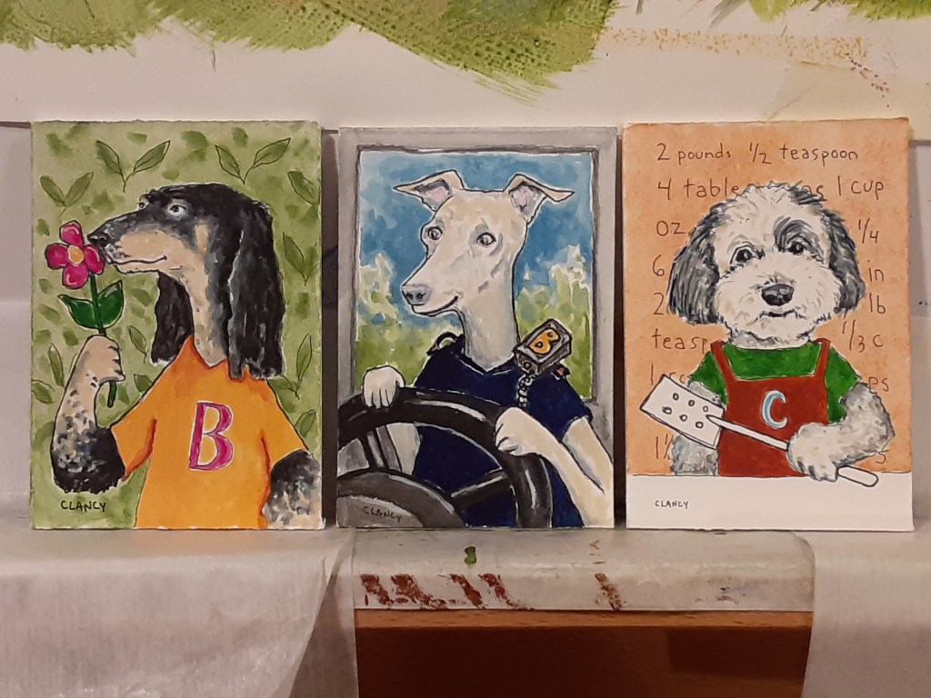
Professional dogs, box project, cards, chats, contrasting books and soup

A Creative Life, animals in art, art gallery, artist book, books, comfort food, Creativity Chats, dog portrait, Dogs in Art, fabric design, fine art, greeting cards, mental health, sketchbook, words and pictures

I’m steadily progressing on my children’s book “The Professional Dog”.  Here are three art pieces together so you can see how the colors flow from one piece to the next. This project will be both a book an art exhibit. So each piece needs to both work with the others and stand alone. My last post tells more about this project.

Below are closer looks at each of these pieces. The text for the book is below the art.

The Botanist’s dog is a beautiful dog.
The Bus Driver’s dog is a bouncy dog.
The Chef’s dog is a charming dog.

Progress is also happening at an even more rapid pace on my holiday box project for the Caplan Art Designs Gallery. I’ve been in touch with the Gallery, sharing photos of my progress privately with them and it’s been agreed that I won’t post much publicly yet about this project. It wouldn’t be good to get too far ahead in posting… the art isn’t due at the Gallery till November and the exhibit is later still… so we don’t want to give too many clues too early.

It’s hard to keep my excitement to myself but I can do this. Right? Right?

I trust it won’t be too much of a spoiler to say that doing dog paintings in black and white is helpful when I’m  also doing a series of dog portraits in color. Nothing like painting in black, white and shades of grey to sharpen my observation skills. Very carefully I made sure that both of my main projects are dog related. This way the project concepts strengthen each other. Kind of like how doing similar but different physical exercises strengthen muscles better that just doing one kind of exercise.

Anyway, here’s a few sketchbook pages related to this holiday box project that we’re very carefully not talking about too much yet. Mums the word. Shhhh…

I heard this week from someone who got one of my fabricdesigns so they could sew nice things for a teacher in their life!! This makes my heart happy that my reading, literacy, fabricpattern on Spoonflower made someone smile!

https://www.spoonflower.com/en/fabric/10048658-read-by-sueclancy

Also this week my spouse and I sent some greeting cards to friends and family. I really enjoy making greeting cards! By now I’ve done over 35 card designs on my Zazzle shop – not nearly  enough! Lol!

Another one of my Creativity Chats  is on my YouTube channel now! This one is about my strategy for picking  topics to write, draw or paint about. https://youtu.be/92Sx7Pm18Y4

Creativity Chats: picking topics- https://youtu.be/92Sx7Pm18Y4

Here’s the direct link to the emotional health book “Dr. Bob’s Emotional Repair Program First Aid Kit” that I talk about in the video. Our brains and emotions are what we create with and taking care of them can be fun as I mention in the video.

Anyway, speaking of taking care… it’s soup weather here in the Pacific Northwest! So I got out one of our favorite cookbooks “The Big Book Of Soups and Stews” by Vollstedt and made the recipe for chicken noodle soup. I used precooked chicken as a shortcut but otherwise followed the recipe. It’s so yummy and really feels kind to the soul.

Speaking of kindness – I saw this in my local newspaper and took a photo so I could save it and share it. It feels important to me. Crucial even.

One of the other ways I’ve been gentle with myself this week is knocking off work a wee bit earlier so I can spend more time reading. I finished the George Saunders title I was reading in my last post. Saunders talked about and included stories from Chekhov which I enjoyed. So I’m reading more of Chekhov’s work.

I’m also reading “A Perry Mason Casebook” by Erle Stanley Gardner. Talk about two almost polar opposite kinds of writers! Chekhov’s characters, generally speaking, consider the feelings of other characters – the stories seem emotion driven. Gardner’s characters, generally, don’t consider or respond much to the emotion of other characters – these stories seem situation driven.

My response to each book is so very different that it almost seems unfair to compare them at all. They were written in such different era’s. Chekhov wrote in the late 1800’s to early 1900’s. Gardner wrote in the 1950’s. But reading both books at the same time is a fun mental contrast – rather like the experience of contrasts that I remember from visiting the state fair; enjoying the quiet exhibits of quilts, animals, jams and jellies alongside noisy rides, carnival games, street performers and aerial acrobats.

Anyway, my spouse and I got a nice syrah wine from Burnt Bridge Cellars and had a glass of wine with our books in the evenings. Such fun!

Here’s hoping your week will give you many opportunities to be gentle and tender with yourself and the people in your life. See you next Monday.

Well well odds are it’s a gift

A Creative Life, animals in art, art techniques, artistic inspirations, books, creative thinking, fabric design, fine art, Gifts, household surrealism, illustrated gifts, illustrated shorts, magic realism, pattern design, product design, sketchbook, visual story, whimsical art

While working on my new household surrealism art series I’ve been thinking of my art as souvenirs of special moments.

For example: a friends daughter and grandkids left a cup of daffodils for us on our porch. I photographed and sketched the flowers.

Here’s one of my sketchbook pages that seemed most promising for a painting idea.

Here I am starting to paint in acrylic on board…while carefully looking at a flower model.

And so my painting progressed by building up layers of color. I chose a mouse character, a shy mouse offering gifts, because I was thinking of the emotional risk a gift-giver bravely takes. Also I was thinking of the gifts of nature, like flowers, that are there if we’re able to notice the subtleties of colors, patterns and textures as they change with the seasons. I chose yellow croc shoes for my mouse character to wear because waterproof footwear is useful for puttering about outdoors where I live in the Pacific Northwest. So there are gifts of culture too. Gifts are to be found everywhere if you remember to look.

Below is the finished painting I’ve titled “Well, well…”. I looked through my falling apart copy of Jane Austen’s Pride and Prejudice for any words that would relate to gift giving or receiving. Finding the collage text is a lot like doing Blackout Poetry – I scan the Austen pages looking for words and phrases that fit my painting topic. For this painting I chose the phrase “Well, well…” because sometimes people say, when recieving a gift, “well, well, what have we here?”

“Well, well…” by Clancy – 18 x 8 inches – acrylic, pencil and collage on board

Painting the little wrapped gift in the lower corner of my artwork reminded me of how much I enjoy making designs for tea towels…and using the towel to wrap a gift.

Using a tea towel for wrapping a gift is really a thing! It’s called Furoshiki …. and here’s a link to the general wrapping technique. And here’s one of my favorites – a link on how to use a towel to wrap a book!

My adopted mom, back in the early 1990’s, made fabric bags with a drawstring for use and reuse in gift giving. She was environmentally friendly before it was cool. So even though I don’t have Mom’s flair with a sewing machine I love designing fabric patterns and thinking of the fabric being used to wrap a gift!

Here’s a recent tea towel design I created on my Spoonflower shop … wouldn’t this be a fun gift wrapping?

Tacos Burritos Hot Sauce and Salsa- by Clancy- https://www.spoonflower.com/en/home-decor/dining/tea-towel/7816441-tacos-burritos-hot-sauce-salsa-by-sueclancy

Here’s a closer look at the art I did for the tea towel. These were drawn, over time, from real life.

Speaking of hot sauce: this week I got brave and baked hashbrowns! Yes, bacon, eggs, hashbrowns served with hot sauce! Turns out I really can imitate the not-quite-so-greasy-spoon diner at home! And keep the coffee coming! Here’s a link for the recipe I used for hashbrowns.

But back to the artwork. I have 4 more paintings that I hope to finish before mid May. I’m scheduled to have one-person fine art exhibits at Burnt Bridge Cellars and Caplan Art Designs later this year so I want to have at least 18 to 20 new works for the shows. Wish me luck?

I’m calling this new art series “Odditorium”… I chose this title because I intend the entire group of my works to be “odd” uncommon visual stories about common things. For my title I merged my thoughts of the word odd with the word auditorium. “Odd” means different from the usual. “Auditorium” means a building or space for an audience. I want to make a mental space for looking anew – or looking oddly – at mundane things.

As I work in my sketchbook I ponder things like: Perhaps those flowers, that towel, that coffee mug are really souvenirs of pleasant moments in life? What if dealing well with mundane life is itself a gift or even an art form?

In his book “Keep GoingAustin Kleon talks of making art as a gift. There’s also a wonderful book by Lewis Hyde titled “The Gift“. The message I get from both of these books is to remember the people. Both art making and gift giving are about emotionally connecting with people and sharing moments together.

Often when I’m creating I think of a person I know, or have known (even if they’ve died), and I make something they might like. Or I make something that reflects a feeling of connection. The person I have in mind is often never explicitly told that I thought of them. So, that thing you like … well, it just might be a gift for you.

So I make souvenirs of kind gentle moments in life by depicting common objects and animal characters in imaginative, surprising and whimsical ways that hopefully give a viewer pleasure. This, in my mind, is household surrealism.

I also see a visual pun in putting my artwork onto ordinary household objects like fabric or mugs. By making my objects available digitally and via mail (see my gifts here) I’m musing about objects that enable people to emotionally connect in a socially distanced pandemic safe way. My thought is that my work is not just about the stuff; the objects or books, it’s about our connections and our perceptions within our mundane lives. Can we find love, comfort and even art in the ordinary?

Anyway, lots of work still to be done to get ready for my exhibits! I hope you have a pleasant week full of the gift of kind moments with people you love! See you here next Monday?

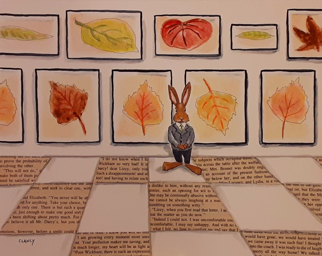
Leaf fabric, greeting cards, books and rabbits

A Creative Life, animals in art, Art Word Combinations, artist book, artistic inspirations, author illustrator, fabric design, functional art, greeting cards, illustrated recipe, kitchen art, mental health, pattern design, printed books, product design, publications - publishing, published art, rabbits in art, sketchbook, small things, surface design, visual story, visual thinking, whimsical art, words and pictures, writing and illustrating

In a prior post I showed a fabric design in progress. This week I got a fabric swatch proof, pictured below, which I approved and have made publicly available now. I like the bright colors of it.

In the most recent children’s book I illustrated, Pembral Forgets, I used a leaf motif thought the book.  The story Steve Tubbs wrote was about fall leaves. good food and a mother’s love. So as I was doing a version of the leaf motif for fabric naturally my thoughts ran towards the possibilities of the leaf fabric as napkins and table runners – things for kitchens. Anyway, the fabric is on my Spoonflower shop now as well as on the Pembral Forgets portfolio page.

https://www.spoonflower.com/en/home-decor/dining/table-runner/11145198-leaves-from-pembral-by-sueclancy

In my last post I talked of using things I enjoy as a guide for subject matter in my art.

Well, that also applies to the types of creative pursuits to which I choose to apply my artwork. For example I’ve been thinking for some time now about how much I enjoy sending and receiving greeting cards in the snail mail.

In the photo below you’re looking at my fireplace at home and the cards I’ve gotten by mail displayed there on the mantel. Some are handmade cards. Some are vintage cards. Some are postcards and folded cards found in stores. I like them all and love the connections with the people who sent them!

I have dabbled in card making most of my life. But only in the last few years have I been semi serious about it. This week, however, I had the thought “What if greeting cards are little illustrated story books?” and my dabbling is suddenly more focused.

Below are a few of my greeting cards which are now on my Zazzle shop here. Some of my cards have rabbit characters but there are other animals too.

I want to make more cards now, for many reasons. But I realized this week that there’s a big reason: my pleasant memories of whenever my adopted Mom, Dad and I met in a bookstore cafe for lunch.

In addition to looking at the books no visit was complete without a visit to the greeting card section of the store. Dad was a psychiatrist and he used to tell me that sometimes when he had a patient with depression he would prescribe weekly visits to stores that sold greeting cards. He would ask that the patient write down descriptions of the cards that amused them to share in future appointments with him. Bonus points (so to speak) if they bought a card and mailed it to someone.

So yes, I want to make more cards in addition to my other artwork – in the “Hi Mom and Dad. 👋” sense of things as well as for my “help others share their stories” sensibility with which I run my creative business.

(Btw: this reasoning is why I do my fabric designs too)

Anyway you’re the first to see the whole collection of cards I’ve done so far. Plus these below…

https://www.zazzle.com/hoppy_birthday_card-256207685042397378
https://www.zazzle.com/nurse_cat_folded_note_card-256284055535885605
https://www.zazzle.com/good_wishes_rabbits_greeting_card-256150049299175963

Needless to say I’ve been busy this week. Fortunately I made a big batch of my “Simple Sauce” and stored it in a jar in my fridge for quick easy to prepare meals. Naan bread makes such a nice pizza crust: just spread on a spoonful of sauce, chop and add desired toppings then bake in a 425 degree oven.

My “Simple Sauce” recipe is in my kitchen sketchbook Favorites So Far. The whole book can be previewed here and you’re welcome to capture my recipe below.

https://www.blurb.com/b/9759759-favorites-so-far

For one meal my spouse and I were in the mood for bell peppers, onions and olives on the Naan bread crust. Yummy!

Speaking of good things, books and rabbits: I’m starting a new children’s book. One question I get asked “which comes first the art or the words?” and in the case of this new book the art largely came first. Here’s an array of the illustrations I’ve done so far along with my legal pad on which I’m scribbling book text drafts by hand using my fountain pen. More about this project in future posts.

More too about a new painting currently in progress…

Hope your week is full of your favorites too. See you next Monday?

Linked by leaves lemons and literature

A Creative Life, animals in art, art techniques, Art Word Combinations, artistic inspirations, books, creative thinking, drawing as thinking, fabric design, fine art, humor in art, Narrative Art, pattern design, rabbits in art, reading in art, sketchbook, surface design, Sustainable creativity, visual thinking, whimsical art, words and pictures

I’m amazed at how easy it can be to change one’s perception and be inspired. For example I took these yellow lemons and set them next to a grey and cream cookie jar. Suddenly I have a color scheme I hadn’t thought of before.

The randomness of all the creative stimuli in the world can feel a bit chaotic. Making links between stimuli can be a puzzle. The challenge is devising methods to sift through the chaos to find the nuggets of inspiration that are relevant to our lives and our personal forms of creativity.

One way I find focus – or links – is to think about what I enjoy. For example hot beverages and books are reliable enjoyments for me so I often use that as a focal point when exploring color schemes, patterns or shapes.

Here’s an original drawing playing with colors using the books and beverages topic:

Then, later, after I’ve chosen a focal point and created a drawing I’m pleased with, I find ways to take my original drawings and make something that might add to the random pleasures in the world.

My entire creative process is a way of talking, listening and actively participating in the world.

Here’s what I did with the above original ink and gouache drawing of hot beverages and books: I made a fabric pattern of it for my Spoonflower shop.

https://www.spoonflower.com/en/fabric/9454398-hot-beverages-books-by-sueclancy

Yes, much of my artistic inspiration comes from my personal life. Below is one of my favorite hot beverages. I wrote the recipe in my sketchbook. A sketchbook is where I do a lot of my sifting through my thoughts and making links.

And here’s some random books I’ve been reading this week:

The Norton Reader 6th edition is a book of essays, a wide ranging freewheeling collection of essays. I like it for it’s oddness this way – most essay collections are more narrowly focused. This book was given to me back in the late 1980’s by one of my literature professors. I had gone to the professor’s office during the appointed office hours but just after I arrived the professor got a phone call. Those were the days of phones connected by cords, lines and an absence of answering machines. While my professor took the call I sat next to a table with books on it and picked up The Norton Reader. By the time my professor finished the call I had read several of the essays. The professor asked if I liked the book, I replied that I did, and she gave me the book to keep. I have read the book multiple times since those college days and this book currently lives in a place of honor on my dining room shelf with my poetry and short story book collections. It has influenced my creative thinking in ways too numerous to list here.

The other 3 titles in the stack of books in the photo below are all books that I similarly encountered randomly:

Darkness Take My Hand by Dennis Lehane was a recent gift, sent by mail, from a friend. I love a good mystery novel and this one is gripping. I’ve almost finished my first reading of it and …wow. Just. Wow. I had never heard of this author till my friend mentioned and sent the book! I’m grateful to my friend…

Given Sugar Given Salt is a book of poems by Jane Hirshfield. I love the way Hirshfield examines little things, small objects like buttons or our habits or ways we sleep. This book (along with Mary Oliver’s work) has been an influence on my own love of little things.

The Blank Canvas by Anna Held Audette is a big “you can do this” support system even though the book is small in size. I dip into it often when I need a little pick-me-up.

All of the books in the above photo were gifted to me. I relish the randomness the book-as-gift adds to my creative life!

I thought a lot this week about those yellow lemons and that grey color together. And about hot beverages. The weather here has been cold, rainy, which makes hot beverages even more pleasant. Here’s what I drew exploring the yellows and greys:

This week I’ll probably do the digital hocus pocus to turn my grey and yellow cups drawing into a pattern repeated on fabric. (This process will be much like what I described last post.)

My other technique for creative focus – for finding links – is to ask myself what would feed my good wolves today?

This page is from this book: https://store.bookbaby.com/book/Dr-Bobs-Emotional-Repair-Program-First-Aid-Kit1

Then I think of art topics and creative projects that encourage my own thinking towards kindness and the other good-wolf attributes. And provide amusement and comfort.

For example here’s an ink and gouache painting I’ve titled “The Fall Collection”

“The Fall Collection” by Clancy – 8 x 10 inches – ink, gouache and collage on board

And here’s another ink and gouache painting I’ve titled “Anyone Bring Cups?”

“Anyone Bring Cups?” by Clancy – 8 x 10 inches – ink, gouache and collage on board

In both of these paintings – in addition to yellow, grey, leaves, lemons and cups (sortof) to link my thoughts together – I used a bit of text as collage along with my ink and gouache. The text is from Pride and Prejudice by Jane Austen. I had a much used copy of that title that has pages falling out so my spouse gifted me with a newer intact copy. So I’m lovingly recycling the old falling apart book into my fine art and my perception of Austen’s writing is shifting in nice ways as I do this.

I’m sure you noticed in the paintings that in addition to my use of yellows, greys, leaves, lemons I also used my current “everyman” characters in the form of rabbits.

As I describe in my last post I use techniques for writing as my guide towards creative thinking. In these paintings and in my fabric pattern designs I am following both pieces of advice given to writers: “write what you know” plus “write about what you want to know“. I am also imitating mystery genre writers who use the same characters and themes with subtle variations over multiple books.

Randomness and changing ones perceptions are such fun creative tools to play with! I hope you’ll enjoy some pleasant randomness this week too.

See you next Monday!

Leaves books and rabbits

A Creative Life, animals in art, Art Licensing, art techniques, artist book, artistic inspirations, author illustrator, books, creative thinking, fabric design, pattern design, printed books, product design, published art, rabbits in art, reading in art, recipe illustration, sketchbook, small things, surface design, Sustainable creativity, visual story, words and pictures, writing, writing and illustrating

After finishing my Pembral Forgets project I was asked if I would make a fabric design from the leaf pattern I had created for the book Pembral Forgets which was written by Steve Tubbs and illustrated by me – (details here)

So this week I’ve been making a fabric pattern of leaves that I’m calling “Leaves From Pembral” and here’s my process…

First I cut out a 12 inch square area of the original hand stenciled paper I did for the Pembral Forgets book. Carefully I chose an area that wouldn’t have leaves touching the 4 edges of the paper. Then I used acrylic paints and created more stenciled leaves to fill in where there were gaps, trying to make the new design square balanced and interesting.

When the above was dry I “cut up my darling” – to borrow from advice given to writers about editing – and made all 4 outer edges now be on the inside of my 12 x 12 inch square paper. Basically I turn my design inside out.

Next I fill in the new gaps with more stenciled leaves.

Then when that was dry I photographed the finished design, trying to keep the soft creamy look of the original and keep the pattern square with my camera. This is easier said than done. After several attempts I was happy with this image below.

Next I uploaded my digital photos into my laptop and used the Spoonflower system to set up my pattern for a basic repeat…so my pattern will flow across any length of fabric without interruptions.

As I worked on the digital file I was thinking of leaves falling and then laying on a wet sidewalk.

What you see below is a screenshot of my finished pattern as I set it up to be repeated on a “fat quarter” an 18 x 21 inch area.

Now I’m waiting to get a proof sample from Spoonflower which I will approve – or not – before it gets added to my public shop on Spoonflower. https://www.spoonflower.com/profiles/sueclancy After that I will tell the person who requested this fabric pattern that it’s there and will hope they’re pleased. In the meantime I hope this blog post will amuse…

I enjoyed playing with leaves in my sketchbook, too, this week – with my rabbits. Another bit of advice for writers is to develop a character and use them to explore ideas and situations instead of creating a new character each time one sits down to write. This technique is most obviously used by mystery novelists who create a character (or two) that repeat over a series of books.

I’ve borrowed this concept for writing and applied it to my fine art and artist books… I have certain motifs and characters – selected species really – which repeat in various ways throughout my projects within a span of time.

In my sketchbook page below I have leaves, books and rabbits. For almost a year now rabbits have been a constant character… (previously I have done series of Dogs and Cats … click on the word Dogs or Cats to see a collection within an artist book)

I posted the above photo on my social media pages and someone asked for an art print of my sketchbook page. So I created an art print of the sketchbook page on my Society 6 shop. The unframed print looks like this (below)

In the evenings I’ve been reading about meditation and, of course, reading a mystery novel. Thinking of little things; leaves, drops of water, ones breath are ways of calming oneself for meditation. Little things; scraps of paper, drops of blood, air quality are often clues in a mystery novel. So I keep thinking of little things…

I broke up a chocolate mint and put it in my hot chocolate. It was a tasty little touch – Yum!

I know it’s not a holiday but little pleasures really do make an ordinary day feel special.

Speaking of feeling special; my artwork was featured on Louise Primeau’s website https://louiseprimeau.com/featured-artist-sue-clancy-from-vancouver-wa/ Thank you for your kindness Louise!

Hope we all have many small pleasures to enjoy this week. See you here next Monday?

A coffee a book and a bun

A Creative Life, animals in art, Art Licensing, Art Word Combinations, artistic inspirations, author illustrator, Books In Art, drinks in art, home hare care, mental health, mundane and magical moments, Narrative Art, pattern design, rabbits in art, reading in art, small things, story, visual story, words and pictures, writing and illustrating

As we fast approach the deadline for shipping presents I begin to oogle the coffee, the tea and the buns. Let the Jolabokaflod begin! Let the hot chocolate flow! Bring out the books!

Here’s a quick meme to explain what Jolabokaflod is in case you’ve not yet had the pleasure…

My family officially begins our Jolabokaflod festivities around the 13th or so of December – if not earlier. Okay, truth be told, we celebrate Jolabokaflod all December long.

We did this in the pre-pandemic Before Times because by mid December most of the art gallery exhibit openings and parties have already happened. So we could enjoy ourselves with more time to read books. This pandemic year things are, well, weird. So I’m reveling in the Jolabokaflod normalcy. Plus the whole idea of Jolabokaflod is tailor made for a pandemic.

The following books are all books that were Jolabokaflod gifts, starting in early December. These are the ones that have been opened already.

Whiskey Galore by Compton Mackenzie was a surprise in the mail gift from my spouse who knew I had wanted my own copy. I’d read the library copy several times and had listed this title as a “book to cheer up by”. This book paired well with English Breakfast tea blend and candied orange slices. And occasionally had a shot of whiskey on the side.

A friend suggested, and gifted, by no-contact dropoff, “The Strange Case of the Alchemist’s Daughter” because it was a book she really enjoyed. I paired this book with a strong French Roast coffee regularly and added this book to my “fun lighthearted reads list”. The cinnamon bread was good with it too! Now my spouse is reading this one…so we’ll not say more about the book.

And then another friend said one of his favorite authors is James Crumley and he mailed a copy of Dancing Bear to me. I opened it and was hooked right from the start. I read the first 3 chapters without hardly being able to put the book down. I did, however, at some point manage to tear myself away from the book and make a hot chocolate to go with my reading.

Naturally my sketchbook figures in prominently this time of year too. It’s a book too so I include it in the festival! And I see Jolabokaflod generally as a chance to doodle and play and share books with friends and read with no strings attached.

When reading books or sketching I like to have a coaster or Mug Mats as I call them under my cup so that my beverages don’t moisten a table or a book. Consequently my sketching practice lately has run to making coasters too… here’s a collection of my Mug Mat designs https://www.zazzle.com/collections/mug_mats-119756908126091756

Also as part of my sketchbook practice I’ve written a short story that explains what happens to beverages when you’re reading. It’s like this:

In case you’ve wondered where the coffee goes: There are tiny rabbits, who creep up while you’re busy reading, install a drain spigot on the side of your cup and dispense coffee to the entire tiny rabbit crew. When your cup has been completely drained they remove and repair the spigot hole and run away.

All of this happens so fast you usually can’t see it – you’re left with the “I swear I’d just poured myself a cup of coffee and now it’s gone” sensation.

Watch for the tiny rabbits. Here’s a new odd mug to help…

https://www.zazzle.com/where_the_coffee_goes_mug-168824736751818592

Yes, I enjoy the pun of putting artwork about books and coffee onto a mug. It seemed so right for Jolabokaflod this year. Here’s a look at the original artwork off the mug, so to speak:

And while thinking my thoughts about tiny rabbits and coffee I did a related fabric design called “coffee and a bun” on my Spoonflower shop https://www.spoonflower.com/designs/10924656-coffee-bun-by-sueclancy

Here below is a closer look at my design

Tiny rabbits like to hide in fabric things like placemats and pillows. In the photo below the tiny rabbits are somewhat hidden. They’re lounging and drinking coffee on a pillowcase. If you look carefully you can see them.

So the moral of my visual story is to watch for the tiny rabbits!

And please put a coaster under your mug in case a tiny rabbit spills a bit when siphoning out of your cup.

If I see you here next Monday there may be a book gift to you from me…

Happy Jolabokaflod in advance!

Gouache and grin cycles

A Creative Life, art techniques, artist book, artistic inspirations, author illustrator, books, ebook, fine art, food in art, illustration, mental health, printed books, product design, publications - publishing, published art, Sustainable creativity

Since I’ve been asked by several people: here’s info about the art media gouache, why it makes me grin and my working cycles with it.

Gouache is a water based paint. It’s more opaque than watercolor. Using gouache feels like spreading soft butter on toast. Applied gouache dries quickly but is easily made moist and workable again. It dries to a matte non sticky appearance which makes it suitable for use in bound sketchbooks, in folded artist books as well as for fine art to be framed. Gouache also reproduces well via various printing mechanisms on fabrics, in printed books and on many other surfaces.

In the studio, because I don’t have to worry about my gouache paints becoming unusable on my palette before I can use them (as is sometimes an issue with acrylics), gouache is suited to my busy life. I call this my gouache and grin cycle.

I prefer to work on multiple art projects at a time in “short bursts” on each project. Rather than count on a long span of uninterrupted time I dash in and work a bit on an art project, then go make lunch or do whatever stuff-of-life or other work matter that needs to be done. Then I cycle back to an art project…

To borrow a sports analogy I just try to advance the ball, my various art projects, a little bit each day rather than doing a project all at once. I try to amuse myself with whimsical art making, aka spreading color, for at least a few minutes every day no matter what else is happening in life. The qualities and attributes of gouache help me to do this, to keep my creative games in play – come heck or high water.

Here’s a series of photos showing my gouache working methods in my sketchbook. (This is also my work method for fine art and other projects.) In the first photo you see my 3 x 5 inch watercolor sketchbook held open with clips. Also pictured from the top left and rotating clockwise: paper towel, peppermint candy model, graphite pencil, 3 watercolor pencils, 2 waterproof ink pens, a water brush and my lidded paint palette with its wells of various dry gouache colors.

In the photo below I begin 3 demo peppermints: the top left mint is sketched in graphite pencil and waterproof ink pens. The bottom left mint is drawn in watercolor pencil only. The mint on the bottom right page was doodled in all of the above; graphite pencil, ink and watercolor pencil. [The quote was just on the sketchbook page I chose to use for this demo.]

So you can see what they look like here in the photo below are two tubes of gouache paints. I like the Holbein Artist Designers Gouache brand best but the Winsor and Newton brand is good too. (There’s a monster called “acryla gouache” also available on the market which I avoid like a character would avoid a flesh eating zombie in a horror film.)

I begin painting by laying down the local color – the general color an item is supposed to be. At this point I don’t worry about shadows or highlights or details. I just get the color shapes down – in this case for the peppermint candies.

I did not squeeze out new paint from my tubes when I began. I got my water brush wet and put a few drops of water on the dried red gouache already on my palette so I can use the newly moistened color. I add a small amount of moisture to a portion of the dried chunk of red gouache until that portion feels like soft butter, then I paint the candy stripes.

Here’s a closer look.

Now I get the general color and shape down for the wrapper in the same method. I put a drop or two of water on my blue gouache color, get my brush damp, dab at the blue paint a second or two to get a portion of it moistened and softened – then I paint.

Now I create the cast shadows using a watery mixture of the red and blue gouache colors. To make the watery mixture on the lid of my palette I dipped my brush on the now moist blue color, dab on an area of the lid, then dab the brush clean on the paper towel, then dipping into the now moist red and adding it to the tiny blue puddle, mixing till it’s a purple color I want for the shadow. Then I add a tiny bit of plain water to the newly mixed purple till it’s a small fingernail size puddle of watery purple – this enables me to do the cast shadows in a faint shadowy way.

Now I do squeeze out a tiny amount of the white gouache from the tube and use it, fresh from the tube, to make the highlights on the candy and wrappers. Note in the photo below how the white gouache can completely obscure the darkest ink lines. This is part of what I love about gouache – any mistake can be covered with the opaque paints. If an edge in a painting needs to be softened or a color edge blended all I need is a wet brush.

Then in a few minutes, perhaps the length of time it takes for a decent sip or two of coffee, when the paint is dry I go back over the paint with ink lines or watercolor pencil lines to snap the details into sharper focus.

Now that I’ve finished painting I leave my sketchbook and my palette open and let them dry completely. I even leave the shadow color mixture on my palette lid to dry. All I will need to do to reuse the mixed color in the future is to get my brush wet and dip in.

Peppermints are one of my guaranteed-to-make-me-grin art subjects that don’t require a lot of time or planning. I’ve learned over years of painting peppermints that different candy makers have their own peppermint candy look. And I don’t mean the wrapper.

Here’s a fabric pattern I did of peppermints for my Spoonflower shop. I used the gouache techniques I describe above to create this pattern. But do you notice how these mints are different from the ones I did in the demo above? Different candy maker… yummy too!

More about my “Peppermint Candies” fabric pattern is here: https://www.spoonflower.com/en/fabric/8224417-peppermint-candies-by-sueclancy

To illustrate what I mean about working in short bursts despite life situations. A hot water pipe burst on our hot water heater recently. (Talk about heck and high water! 🤦‍♀️) After we got the immediate crisis dealt with I did little quick bouts of drawing as a self calming technique. Also while waiting for plumbers etc restoration crews I doodled and painted in my sketchbook. Gouache makes it easy for me do short bursts of spreading color which makes me smile. And having had a brief grin makes dealing with life much better.

Anyway, there’s a new artist book I’ve done for children called “B Mouse Reads A Book”. In it you can see my original ink and gouache artwork, and how the art media is on folded paper in this video on my YouTube channel. Because this book was meant to be handled in a gallery I used a spray fix varnish to make sure the gouache wouldn’t smear or run.

But since the pandemic hit there’s no going to art galleries to handle or view artist books in person. So I was lucky enough to have “B Mouse Reads A Book” published as an ebook here on Storyberries.com! They also included the book B Mouse is reading too…it’s another artist book I created as part of the B Mouse Reads A Book story…there’s a link at the bottom of the B Mouse book that you can click to see the companion book.

“B Mouse Reads A Book” by Clancy – https://www.storyberries.com/free-books-for-kids-b-mouse-reads-a-book-by-sue-clancy-bedtime-stories/

I’m sure you can recognize in the image above the ways I did my combinations of ink and gouache. The video shows how flexible gouache can be when applied on paper bound or folded as pages. The ebook shows how well the nuances of the colors show even as a digital image.

If you look at my portfolio pages you can see my ink and gouache work as both fine art framed in an art gallery setting as well as reproduced in printed books.

Most of my jigsaw puzzle designs, greeting cards and odd mugs on my Zazzle shop were also created with my combinations of ink, watercolor pencil and gouache. It’s a very versatile media.

That reminds me to tell of another practical matter: if you apply gouache too thickly it can pop or flake off. Especially in a folded or bound paper book. And when scanning or photographing gouache artwork for reproduction a too-thick gouache application can cast shadows unrelated to the artwork subject. So I apply gouache as if I were basting bread with semi melted or melted butter.

I hope you’ve enjoyed reading this and found it helpful for when you try gouache yourself.

See you here next Monday. And in case you’d like to know even more about gouache – here below are a few links to more information about painting with gouache:

COMBINE WATERCOLOR AND GOUACHE TIPS https://www.erikalancaster.com/art-blog/3-tips-to-combine-watercolor-and-gouache-like-a-pro

GOUACHE INFO (VERY GOOD)
https://www.skillshare.com/blog/learn/7-artists-using-gouache-in-gorgeous-ways

GOUACHE SKILLS
https://www.google.com/amp/s/www.skillshare.com/blog/learn/8-gouache-paint-pro-tips-you-should-know%3Fformat=amp

GOUACHE IN SKETCHBOOKS
https://juliabausenhardt.com/how-to-get-started-with-gouache-paint/

LENA RIVO – GOUACHE
https://www.lenarivo.com/guide-to-gouache and generally see
https://www.lenarivo.com

candied fabric peppermint flavor

A Creative Life, Art Licensing, artistic inspirations, food in art, functional art, illustrated shorts, illustration, kitchen art, small things, visual thinking, writing

In between Holiday fine art commissions I’ve been reading about the writers technique of flash fiction and flash non-fiction. And I’ve realized that this is what I’ve been doing all this time – illustrated flash. Or “illustrated shorts” as I call them.  Like the short-short story writers do I take a nugget of a thought or feeling and describe it – but using visual art instead of words.

For example: I’ve sometimes looked at bowls of peppermint candies and thought of how fun it’d be to fling the mints up in the air and let it “rain” mints for a second. I’ve never done it – probably wouldn’t ever do it – but it’s fun to imagine. So I’ve been working on a fabric pattern design with that in mind.

CandyPattern72

I’ve done more of a red emphasis on the mints even though it’s not realistic to the mint examples in the photo because I had some mints recently that had more red on them. They aren’t in the photo because I ate them. All of them. And I’m not sorry I did either!

Anyway, after finishing the peppermint candy pattern artwork I scanned the artwork, took the digital file and set it up to become tea towels or napkins.  Here’s a picture of the tea towel.

By illustrating fabric, in flash-fiction style, I’m able to get across my fleeting “tossed mints” feeling/thought but in a way that’s succinct (like a short-short story) and it’s also of practical use.

It suits my sense of humor to combine both the fleeting and the practical…

Happy Holiday’s in advance!  Now I’ll go back to being one of Santa’s elves…

coffee dog art on fabric

A Creative Life, animals in art, Art Licensing, Dogs in Art, pattern design, surface design

You knew, I’m sure, that it was only a matter of time until I tried putting my dog drawings onto fabric… and you were correct!  Look what came in the mail just now – a fabric test swatch for my approval.  (I approve!!) Tea-towels and napkins here we come…

Here’s the swatch as it came out of the mail-envelope… the rulers are to show scale:


new art designs by Clancy for fabric

A Creative Life, Art Apparel, Art Licensing, pattern design, surface design

The grandmother I grew up with was a quilter. I spent many a childhood day going through Grandma’s carefully-organized-by-color fabric collection and re-sorting them into different color combos. (Not sure Grandma approved.) Later on my adopted mom was also a quilter.

In my fine art I’ve been designing the “fabric” my characters “wear” in my artwork (as well as the wall paper, the china tea cups, the clocks, chairs and whatever else is part of my visual story).

So it seems fitting that I begin doing art-designs for real-life fabric that can be available for quilters and seamstresses of all kinds. You can find my designs on Spoonflower here – https://www.spoonflower.com/profiles/sueclancy

More designs will be coming online soon – and I’m making more… I’ll keep you posted.

I figure I owe it to my grandmother – and my adopted mom – for all the times I “messed about” in their fabric collections! And I want to give my currently-using-fabric quilter/fabric artist friends something new to create with…

Here is a photo of my first test swatches (8 x 8 inches) with my designs on fabric. What you see is exactly as the swatches came out of the envelope a few minutes ago – they’ve not been ironed or anything. The ruler is there to show scale.

These designs, after I officially “approve” them in about 5 minutes, will be available as fabric cut by the fat quarter or by the yard.  Also these and other fabric designs I create – will soon be available for application on home-furnishings like chairs or tea towels via another Spoonflower related company.  But more about that another day.