Miniature art, books, dogs, a cow, a bird, a dragon and a rabbit review

A Creative Life, Alphapets, animals in art, art commissions, art gallery, art techniques, artist book, artistic inspirations, author illustrator, book design and layout, books, Cats in art, children's book, dog portrait, Dogs in Art, fine art, miniature art, poetry, publications - publishing, published art, reading in art, visual story, whimsical art, wordless story, words and pictures, writing and illustrating

This week I finished the dog painting you saw in my sketchbook and on my easel in my last post. The cow is still active in the field of my imagination as is a wee bird. More on that later in this post.

Here’s the completed dog portrait titled “Being exquisite”. Like the dog portrait in my last post this new one is 8 x 10 inches and uses that nifty new brush technique (last post)! I’m having such fun with all of these tiny details!

Like the fur between his eyes and the nose… below are two photo views so you can see.

And the details of the dandelions! Oh that was fun!!

This past week has been filled with gluing the cow artwork pages onto a piece of paper cut 4.25 inches x 4 feet long and folding it so that it zigzags  into panels 4.25 x 6.25 inches in size. Plus the week was spent making a slipcase for my book which can be called a leporello, a concertina or an accordion format. Everything was made from scratch: raw archival book binders board, white flat paper and glue. When the story pages are folded they’re almost 1 inch thick so the slipcase accounts for that. Below are photos of the slipcase and the concertina book.

For more details on the Leporello,  Concertina or Accordion style folded books here’s a good link https://wp.me/p4va0m-gU

Here’s a reference book I’ve used for years when I’m constructing books and making boxes from scratch. I altered methods described in this book to make the cow book slipcase. The book is Books Boxes and Portfolios by Franz Zeier

Behind these analog scenes I’ve been working on the digital files for a printed version of “How the cow went over the moon”. In pre-pandemic days I’d have made this one handmade book and sent it to a gallery like the 23 Sandy who would have exhibited it and sold it to a private collection or to a public collection. For example the UCLA Fine arts library has one of my books, so does the Bainbridge Island Art Museum.

Then the pandemic happened and I began making reproductions of my books available via Blurb which can print then mail my books directly to the buyer. That seemed a more pandemic safe way to share my artist books. It is also why I say that I approach self-publishing from a fine art perspective.

When I did the first printed book, Alphapets, in early 2020, I was contacted by Storyberries who wanted to distribute the ebook version. Well it’s been so much fun to make my books available in an on-demand way (my books are only printed when they’re ordered) and even more fun to share with readers on Storyberries that this fun is now factored in to my book designs.

For example: as I’ve been making the digital files for the printed book (and for Storyberries) I took the photos below of the handmade books with a piece of candy to show scale. I did this because it might amuse readers to see the original books in the printed book version. And perhaps help the younger readers be aware that books are made by people just like them.

This week I’ve also been talking with Storyberries and – dear blog reader you’re getting this news first – they’ll be making an “art experimental” story category for my work!! How fun is that? I so wanted arty quirky books when I was a kid… and now I’m making them and getting to fill a whole childrens book category with ebook versions of my artist books!!! I’m over-the-moon excited and yes that pun was intended! 🤣

As I wrote in my last post I’ve been reading The Annotated Arabian Nights and I sat up and took notice when the annotation mentioned a literary genre called “mirrors for princes”.  So as a companion to my “How the cow went over the moon” book message (?) about not being too serious and remaining down-to-earth I’ve been thinking of the importance of remembering joy.

So here’s a look at what will be the second wordless poem in the printed  book. This poem is titled “Tiny notes to the sun”

This book too is a leporello format but instead of a slip cover it’s got hardback covers. This book is 2.25 inches square when closed and opens out to 20 inches in length.

The photos below that have a peppermint candy in them are the pics I’ll put into the printed book version because it might amuse people to see them too.

As I mentioned earlier I’ve been working simultaneously on the book layout and design for the printed version of “How the cow went over the moon” … and I’m using visual elements of the original artist books … here’s a look. 👇

This week the Caplan Art Designs Gallery sent photos of my 3d box project “All the Chances” in it’s new space! And look, the client’s pet rabbit approved!!

And someone else sent me photos of their dog approving the dog portrait I painted and the way the Aurora Gallery framed the portrait! So glad their dog approved!!

Here below is the framed portrait on the dog’s “Clancy art” wall!! Isn’t that sweet?! A whole wall!! Wow!! This makes my artist heart so happy!!

In the coming days Kidz Stories plans to read my book “How to draw a dragon” out loud on their YouTube channel and, since it’s a coloring book, they’re hosting a color-along!! I’ll post a link to the video when I have it. In preparation to help kids to be able to color-along I’ve made my coloring book a free download here on my portfolio page!

I hope your week is full of your favorite colors and comforts. See you next Monday.

Dragon, an oops, a rhino and recipe postcards

A Creative Life, art exhibit, art gallery, art techniques, artist book, artistic inspirations, book design and layout, fine art, greeting cards, household surrealism, illustrated poem, illustration, Odditorium, poetry, recipe illustration, Sustainable creativity, words and pictures, writing and illustrating

Had an oops during ink work this week on my coloring book poem “How to Draw A Dragon” here’s how I fixed it. Despite the mistake all of the hand written text as well as all of the illustrations have now been completely inked!

Here’s how: first I drew the whole book in pencil which sounds straightforward but it actually means draw, redraw each page multiple times. I do a complete draft in pencil and go through it again and again redoing elements so the story flows a certain way, to make sure setting and characters are consistent and to create the foreshadowing. This is very like a writer’s process of drafting and editing a novel. I lost count of how many drafts I’ve gone through.

Before beginning this book I knew it would be a 32 page manuscript so I made sure I had at least 84 sheets of the same kind and size of drawing paper. (Now after finishing the inking I have perhaps 8 useable sheets of blank paper left – if that gives you an idea.)

After the images were more or less set in pencil I penciled in the poem text. The poem text is spaced rhythmically to rhyme, so to speak, with the illustrations. The words and the images dovetail tightly together. This requires more drafting to get the pacing right. Then after I had a complete manuscript in pencil I partially inked each of the illustrations and adjusted the word spacing of the poem on each page in pencil.

Before starting to ink the poem text I read through it looking for grammar and spelling. I asked my spouse to look critically with fresh eyes. Then I inked the text with an ink brush pen.

Even with all that drafting and all the editing and proofreading, even with a fresh set of eyes looking, there’s a mistake! Do you spot it below?

Yes, I misspelled “oops”! Of all the things to misspell!! 🤦‍♀️ Oh well! When I ink words like this I’m really focused on drawing the shapes of the letters and the spaces on the page rather than writing a word. So mistakes often happen. But 95% of being an artist is knowing how to fix mistakes! The remaining 5% is being willing to keep going!

So to fix my oops on the word “oops” I got another piece of the same paper and drew a couple of “O’s” while holding the new paper next to my mistake so I can draw it the proper size. Then I cut out the newly drawn letter as close as possible not leaving much white paper showing around the letter.

Then I paint opaque white gouache on the ink mistake as smoothly as possible.

I let that white gouache dry completely. If there’s any bump in the dry gouache I use a tiny bit of fine grit sandpaper to smooth it.

I lightly apply archival paper glue to the back of the cut out letter and affix it to the whited out mistake area. I use tweezers to place the glue-y letter.

Now it’s fixed! When I scan these pages for publication I will look closely at this area on the digital file to make sure it looks like a seamless repair. Other than possibly on that “oops” the digital scans of these pages will *not* be digitally manipulated. What you’ll see in the published book will be what I made by hand.

After all the inking is done and dry I erase all the pencil marks on the manuscript.

Foreshadowing happens on every page. There are even indications about time: at first the dragons coffee is very hot and steaming but on subsequent pages there’s less steam. These pages below are possibly the pages with the heaviest foreshadowing. Each of the “art examples” presage or refer to something in the rest of the book.

The foreshadowing is complex. Matching the characters and scenery from one page to another is complex. Matching the edges of the pages together is complex. Getting the rhythm of the poem to flow (rhyme?) with the images … it’s hard to even describe how convoluted and complex (that word again) this project is…

And then there’s that it’s a coloring book. All that I have to tell the story with is a single ink line. That line has got to be right. I can’t cover over it with other sketchy lines like I do when I draw in my sketchbook or cover a line with paint as I do when I draw lines as a foundation for a painting. The single lines I draw for this project must be clear or it ceases to be a coloring book.

This coloring book poem has been one of my most complex books and yet it is so deceptively simple to look at and read. It reminds me of one of the iceberg memes about success in that the visible part of a project is the smallest element of it and the huge part is unseen.

Anyway, also this week I worked towards the continuation of my Odditorium exhibit. The Caplan Art Designs Gallery will exhibit the Odditorium works from earlier this summer as well 7 new paintings in this series. One of the new paintings is below. It was inspired by a friends photo of her ranunculous flowers. From the flowers I thought of a rhinoceros and a dress…

His Best Respects – by Clancy – 7 x 5 inches – ink, gouache and collage on board.

Yes, my household surrealism continues…

As I wrote in my last post I hoped this week to try some of my new butterfly palette paints so I did try them in my sketchbook!!

It will be fun to try doing a painting with them next!

This week we got a few cards in the mail and added them to our mantel. I realize that I really love sending and getting cards in the mail. I’ve loved it even more so since the pandemic. Since unfortunately covid is surging again I’ve been thinking I want to make more cards.

About the time I’d had that thought I heard from Bernadette who had recently blogged on New Classic Recipes my recipe for Magic Beans along with the story of how I got the recipe. Bernadette wrote suggesting that I create some recipe cards. I thought this was a great idea and merged the recipe card notion with the idea of sending postcards. You can see all of the recipe postcards I’ve made so far here. I’m thinking these will be fun to send to friends and family.

As far as food this week goes I ate so much when family was here (last post) that this week has had small salads and bowls of cereal as the feature meals. So never mind about food I cooked this week because it didn’t happen. Oh well.

Nevertheless major progress happened on “How To Draw A Dragon” – a whole manuscript completely inked! Yippee! Next up…scanning the pages and book design! See you next Monday?

Rabbits roses cups cards meatballs and book muchness

A Creative Life, animals in art, art techniques, Art Word Combinations, artistic inspirations, author illustrator, books, fabric design, greeting cards, illustrated poem, illustrated recipe, poetry, rabbits in art, reading in art, recipe illustration, sketchbook, surface design, visual story, visual thinking, words and pictures, writing and illustrating

I’m having fun with new combinations of colors. In a recent post I tried a yellow and grey color set. After posting about that a friend said she liked pink and grey together. So I tried that combination this week.

I’ve enjoyed playing with odd sized elements so I continued that in this new ink and gouache painting I’ve titled “The Comfort Was Indeed Beyond…”. Again I used some text collage from that falling apart copy of Jane Austen’s Pride and Prejudice I’ve spoken of.

As mentioned in a prior post I’d played with yellow and grey colors while doing a cup pattern for fabrics on my Spoonflower shop… here’s how that turned out. I titled my pattern “Cups Of Comfort”

Cups of Comfort https://www.spoonflower.com/en/fabric/11145342-cups-comfort-by-sueclancy

And thinking of rabbits…I made an encouragement greeting card this week with a rabbit character. Everyone needs encouragement so by making this card I hope to help people encourage others in their life.

https://www.zazzle.com/an_encouragement_card-256714364349292219

Speaking of encouragement to keep going: we have had some serious snow in the Pacific Northwest United States. Over 18 inches! So that’s encouraged me to continue my reading, working in my studio and puttering in the kitchen. Taking everything that happens in life as encouragement to keep going seems a helpful habit of mind.

Speaking of habits of mind: I tend to blur the line between art studio work and my kitchen. Here’s my kitchen sketchbook and the meatball recipe I made this week. I make meatballs to freeze and store in my freezer to add as desired to future meals. I love having ingredients on hand that make other recipes easier.

These meatballs go well with many of the dishes in my Favorites So Far kitchen sketchbook- you can see it here: https://www.blurb.com/b/9759759-favorites-so-far

As I mentioned in my last post I’m working on a new children’s book with lots of rabbit characters. I did the illustrations first this time…mostly. Here I am working on the poem couplets to go with the illustrations. There’s a cup of tea at my side. My spouse took this photo.

I spread out my illustrations on a queen size bed to sort, resort then sort again. As I sort I’m referring to my poetry and rewriting. I have far more illustrations and poetry bits than will fit in a 32 page kids book. So I have still more sorting and winnowing to do.

This is a physical way of creating a book. With real-life illustrations laid out I’ll write the poems on index cards for sorting purposes. After I get them all sorted then I’ll start photographing the illustrations and typing the poem. Lots to be done. More about this project in future blog posts.

When I was thinking of describing, for this blog, my working process towards a children’s book I thought of my recent reading. Here’s a shelf of books I’ve been collecting on the topic of how our physical world, the objects, technology, the environment affect the ways we think. And vice versa: the ways we think affects our physical world.

When I work on a children’s book using physical elements as opposed to abstract outlines, book dummies or computer files it feels much like what I do in the kitchen. It feels like having a full pantry, a stocked freezer and refrigerator to choose from for making meals. “It” exists and all I have to do is rummage till I find it.

The work feels easier this way…and more fun!

For my pleasure reading this week – with coffee, hot tea or hot chocolate depending on the time of day – I’ve been reading a hard-boiled detective mystery.

I hope you’re snug, cozy and are able to rummage for the good things in your life. See you next Monday?

A coffee a book and a bun

A Creative Life, animals in art, Art Licensing, Art Word Combinations, artistic inspirations, author illustrator, Books In Art, drinks in art, home hare care, mental health, mundane and magical moments, Narrative Art, pattern design, rabbits in art, reading in art, small things, story, visual story, words and pictures, writing and illustrating

As we fast approach the deadline for shipping presents I begin to oogle the coffee, the tea and the buns. Let the Jolabokaflod begin! Let the hot chocolate flow! Bring out the books!

Here’s a quick meme to explain what Jolabokaflod is in case you’ve not yet had the pleasure…

My family officially begins our Jolabokaflod festivities around the 13th or so of December – if not earlier. Okay, truth be told, we celebrate Jolabokaflod all December long.

We did this in the pre-pandemic Before Times because by mid December most of the art gallery exhibit openings and parties have already happened. So we could enjoy ourselves with more time to read books. This pandemic year things are, well, weird. So I’m reveling in the Jolabokaflod normalcy. Plus the whole idea of Jolabokaflod is tailor made for a pandemic.

The following books are all books that were Jolabokaflod gifts, starting in early December. These are the ones that have been opened already.

Whiskey Galore by Compton Mackenzie was a surprise in the mail gift from my spouse who knew I had wanted my own copy. I’d read the library copy several times and had listed this title as a “book to cheer up by”. This book paired well with English Breakfast tea blend and candied orange slices. And occasionally had a shot of whiskey on the side.

A friend suggested, and gifted, by no-contact dropoff, “The Strange Case of the Alchemist’s Daughter” because it was a book she really enjoyed. I paired this book with a strong French Roast coffee regularly and added this book to my “fun lighthearted reads list”. The cinnamon bread was good with it too! Now my spouse is reading this one…so we’ll not say more about the book.

And then another friend said one of his favorite authors is James Crumley and he mailed a copy of Dancing Bear to me. I opened it and was hooked right from the start. I read the first 3 chapters without hardly being able to put the book down. I did, however, at some point manage to tear myself away from the book and make a hot chocolate to go with my reading.

Naturally my sketchbook figures in prominently this time of year too. It’s a book too so I include it in the festival! And I see Jolabokaflod generally as a chance to doodle and play and share books with friends and read with no strings attached.

When reading books or sketching I like to have a coaster or Mug Mats as I call them under my cup so that my beverages don’t moisten a table or a book. Consequently my sketching practice lately has run to making coasters too… here’s a collection of my Mug Mat designs https://www.zazzle.com/collections/mug_mats-119756908126091756

Also as part of my sketchbook practice I’ve written a short story that explains what happens to beverages when you’re reading. It’s like this:

In case you’ve wondered where the coffee goes: There are tiny rabbits, who creep up while you’re busy reading, install a drain spigot on the side of your cup and dispense coffee to the entire tiny rabbit crew. When your cup has been completely drained they remove and repair the spigot hole and run away.

All of this happens so fast you usually can’t see it – you’re left with the “I swear I’d just poured myself a cup of coffee and now it’s gone” sensation.

Watch for the tiny rabbits. Here’s a new odd mug to help…

https://www.zazzle.com/where_the_coffee_goes_mug-168824736751818592

Yes, I enjoy the pun of putting artwork about books and coffee onto a mug. It seemed so right for Jolabokaflod this year. Here’s a look at the original artwork off the mug, so to speak:

And while thinking my thoughts about tiny rabbits and coffee I did a related fabric design called “coffee and a bun” on my Spoonflower shop https://www.spoonflower.com/designs/10924656-coffee-bun-by-sueclancy

Here below is a closer look at my design

Tiny rabbits like to hide in fabric things like placemats and pillows. In the photo below the tiny rabbits are somewhat hidden. They’re lounging and drinking coffee on a pillowcase. If you look carefully you can see them.

So the moral of my visual story is to watch for the tiny rabbits!

And please put a coaster under your mug in case a tiny rabbit spills a bit when siphoning out of your cup.

If I see you here next Monday there may be a book gift to you from me…

Happy Jolabokaflod in advance!

Alphapets Too: A,B,C and D

A Creative Life, Abecedarian, Alphapets, Alphapets Too, Ambassador for Small Frames, animals in art, art exhibit, art gallery, art techniques, Art Word Combinations, artist book, artistic inspirations, books, creative thinking, drawing as thinking, fine art, illustrated poem, illustrated shorts, illustration, miniature art, pet portraits, poetry, visual story, words and pictures, writing

Here begins Alphapets Too my sequel to Alphapets by Clancy as per the request of my fans and Storyberries – the publisher/distribution house I’ve been working with! (See my last post for details)

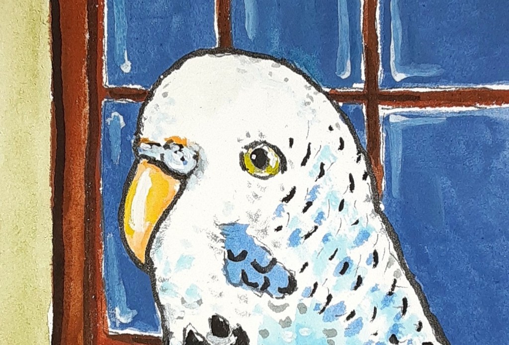
The Alphapets Too pet portrait project this week is brought to you by the letters A, B, C and D. Here’s my abecedarian poem to go with these letters and artwork :

Abby adores the window ledge

Bunny bounces into the hedge

Clark craves a wee bite of flower

Dash delights in a cool rain shower

Here’s the artwork (somewhere on each piece is an alphabetical letter):

I did portraits of a parakeet, a rabbit, a tortoise and a cockatiel.

In researching these common house pets that are not dogs or cats I realized that I’d never drawn a parakeet before. So it was fun to practice drawing them, to see how many different shades of blue parakeets there are and to create Abby. I now have a new image in mind when I think of a “blue bird of happiness.”

For Bunny I had a lot of drawing rabbits experience to work with. On my Instagram pages I’ve been doing a “Home Hare Care” series of rabbits doing self-care comforting activities at home – some are complex art pieces. So it was relaxing for me this week to pull a simple rabbit out of my drawing hat. Lol!!

Some friends have kept a happy tortoise for years in their condo patio garden. Their tortoise has a different name but shares Clark’s enjoyment of eating flowers. We know about flowers as tortoise guilty pleasures because of holiday card exchanges we have with our friends.

I’ve drawn cockatiel birds before – usually having cocktail drinks – but I learned during my research for this book that some cockatiels like to accompany their human in the shower – if the human doesn’t have the water too hot. So I had fun making dash-shaped water drops and naming the bird in my portrait Dash.

Like my original Alphapets this artwork, too, was created with ink, gouache and color pencil. I do these portraits on board, size 3.5 x 2.5 inches. The original art will be framed…eventually … and be a miniature art exhibit at the Aurora Gallery.

I will also be making an artist book titled Alphapets Too – in a format like “Alphapets by Clancy”. You can see print and ebook versions of “Alphapets” by clicking here.

And when I get it all done “Alphapets Too” will be available on Storyberries.com (Btw: there are two different stories by me currently on Storyberries.com- search the site by my name)

You can follow my progress during the week on my Instagram pages and see the nitty gritty details of my creative process in my Monday blog posts.

Thanks again for coming on this adventure with me!

Hare heritage and narrators

A Creative Life, animals in art, art commission, art techniques, Art Word Combinations, artistic inspirations, Books In Art, fine art, magic realism, Narrative Art, reading in art, visual story, visual thinking, words and pictures

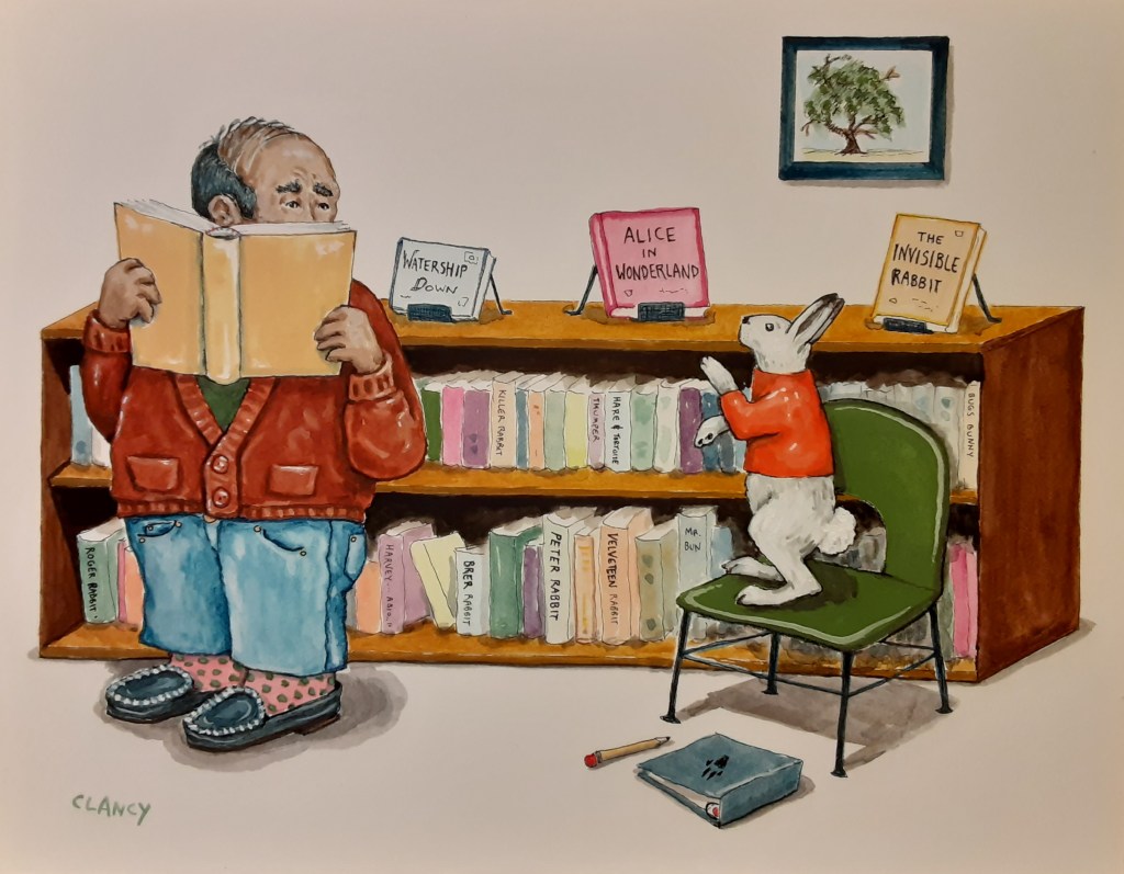
I’m finishing up a fine art commission for someone’s holiday present. So instead of talking about that – here’s a painting I finished just before the holiday rush began. Titled “Hare Heritage” and created with ink and gouache.

Hare Heritage by Clancy – ink and gouache on board

Yes, this piece is a new one within my readers series. (You can see more of the series here www.sueclancy.com/fine-art )

As I work I’m experimenting with the 3rd person omniscient narrator – and other narrator writing techniques. The viewer of Hare Heritage (the third person) can see and speculate on 2 visual story-lines within this painting.

It’s a fun challenge to apply writing techniques to fine art! And using the topic of readers and books adds to the pun.

Sue Clancy :: The Rabbit

A Creative Life, animals in art, graphic narrative, illustration, published art, visual story

Delighted that my artist book “The Rabbit” has been published in its entirety in Issue 7 of Small Po[r]tions journal!  You can see it directly here: https://smallportionsjournal.com/2017/02/10/sue-clancy-the-rabbit/

sketching while we wait

A Creative Life, illustration, sketchbook, words and pictures

I’m waiting for the varnish to dry on my “verrry big project” (see this post here) and for the org that the Verry Big Project was created for to do the publicity soooooo we’ve changed the blog-conversation to the topic of sketchbooks. Here are some verrry random pages from my sketchbooks:

IrishCoffee DinersDining72 PrayingMantis72 HomeHareCare

writing art exhibit statements or “blurbs”

A Creative Life, art exhibit, art gallery, fine art, words and pictures

As I’ve mentioned before in other posts there is a lot of writing that goes on in a professional fine artist’s career.  Exhibit statements (or “blurbs” as I call them) are written for each gallery show an artist has.  These blurbs are often less than 100 words.

When I write such statements I try to: be descriptive, interesting, and clear/concise.  It’s a tall order to fill, one that uses all of my writer’s skills and stimulates me to learn more about writing in general – because I know I’ll need to write another blurb for the next show.

This very important exhibit statement gets used by the gallery (in this case Caplan Art Designs) in flyers, on press releases, in online promotions – just to name a few uses – to help promote the exhibit.  Like most writers I submit my best draft and an editor, aka the gallery agent, edits my best draft as needed.

Here is the final blurb for my upcoming exhibit titled “Paws to Enjoy”:

Life happens and Sue’s response is to pause and think about it by cutting up one-of-a-kind hand dyed papers, smearing glue on them and putting the cut paper pieces together again. She thinks about dogs, cats, and rabbits and soup, coffee, and whiskey. Then she sums up my thoughts and transforms them into literary images. This exhibit is a collection of enjoyable thoughts.

—–

This is the “signature” image the Caplan Art Designs gallery chose to represent my exhibit in their promotions:

HareFare72

For more info about my upcoming exhibit see:

www.caplanartdesigns.com

http://dailyinthepearl.com/events.html

carrot cake inspired art

A Creative Life, art exhibit, art gallery, fine art, food for thought

24 Carrot Cake by Sue Clancy

24 Carrot Cake by Sue Clancy

New artwork destined for exhibit in October at Caplan Art Designs. See the events page at www.caplanartdesigns.com or follow on Twitter @AmyCaplan1 or @artistclancy