The secret commission now revealed

A Creative Life, art commissions, art gallery, artistic inspirations, Dogs in Art, fine art, Fine Art Commission, sculpture 3d, whimsical art

Remember the top secret commission for the Caplan Art Designs Gallery that I worked on from December 2022 to Feb 2023 and successfully kept mum about? I can reveal it now because the Gallery said the client has now gotten it as a February birthday gift!!! Wahoo!!! And happy birthday!!!

Here’s a video look at it… I titled it “The Boxer Box”. It is a 3d sculpture, an 8 inch wooden cube, that I painted with acrylic.

And here are some still photos of the box.

And here’s a look at each box face!

Here is one of the photos of Ari, the Boxer himself, that I worked from. What a delightfully handsome gentleman Ari is!!

Gosh this project was so much fun!!! Can I admit now that the hardest part of the whole thing was keeping the secret??!!

See you next Monday-ish!

New ink, new books and the importance of mucking about

A Creative Life, art commission, art gallery, art supplies, books, life of the mind, mental health, Sustainable creativity

I finished my commission for the Caplan Art Designs Gallery and delivered it. Still can’t talk about it yet but I’m pleased and the Gallery was pleased… enough said!

With the leftover paint from the commission I began working on this painting currently in progress…

As a reward for finishing the commission my wife and I took a day to visit a few of our favorite places in Portland Oregon to play and generally muck about. The first place was Powell’s City of Books where we explored many of their 5 floors of spectacular book reading goodness and other fun things…

We each came home with small book hauls. Here’s mine…

Our other favorite place is Oblation Papers and Press. We got 3 bottles of ink: two are coffee colored and named “Caffe Creama” and “Espresso”. The third ink is named “Portland Rain” and it is a grey-purple-blue color like the, um, rainy Pacific Northwest sky this time of year! I also got two dip pens because…they’re dip pens.

I wrote about using sketchbooks as time capsules in my email newsletter. Here’s a repeat of the photo of a stack of new sketchbooks I’d shared earlier when I’d just gotten them…

…and I wrote on my email newsletter about a new bent pen recently. Here’s a photo of it…

…and here below is some mucking about that I did with the new pen in one of the larger new sketchbooks.

I’ll play around with my new inks later this week! I cannot stress enough the importance of play – aka mucking about – to creativity and mental health. Wahoo!!

I hope you have fun doing your own mucking about this week. See you next Monday-ish.

Professional dogs, artist books, unmentionables and hamburger

A Creative Life, art commission, art exhibit, art gallery, artist book, artistic inspirations, author illustrator, books, business of art, children's book, creative thinking, dog portrait, Dogs in Art, fine art, Fine Art Commission, public art, Sustainable creativity, whimsical art, words and pictures, writing and illustrating

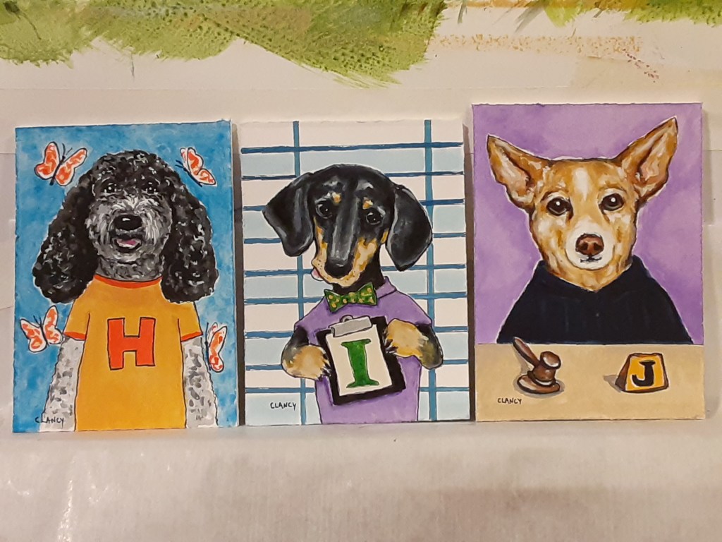
My new childrens book, The Professional Dog, is progressing nicely. I’ve been thinking of this as a fine art dog portrait album inspired by the idea of the 19th century parlor game The Minister’s Cat. My book concept is an excuse to talk to my friends about their dogs and see if I can do 40 portraits of dogs whose owners are people I know. It just so happens that I know people occupying an alphabets worth of professions! How fun is that?! Anyway, here are three of the dog portraits together.

Below the larger portrait is the text I’ve written for the book.

The Helper’s dog is a hopeful dog.
The Inventory Manager’s dog is an insightful dog.
The Judge’s dog is a jolly dog.

Besides keeping on my work schedule for The Professional Dog I’ve been working closely with two of my galleries. We’re doing fine art commissions and studio visits in prep for the upcoming gift giving season. It’s beginning to resemble Santa’s workshop around here.

For example I created, then delivered, an art commission to Aurora this week for someone’s holiday gifts (shhhh!). Then while I was in the Gallery I got to see a glorious display of my own work! That sight inspired and encouraged me to keep making my stuff. https://auroragalleryonline.com/

The Aurora Gallery does such a good job displaying my wide variety of differently sized things – artistbooks, greetingcards and fineart – I love it that someone can see my books and around the corner nearby in the art gallery they can see the original artwork in the books!

Since we’re not talking about the fine art commission I just did for the Aurora Gallery here’s the art studio dachshund keeping mum with me.

And as I mentioned in my last post we’re still very definitely not talking about the Caplan Art Designs upcoming holiday box project.

Also there’s another event upcoming at Caplan Art Gallery that… well, we’ll talk more about that later. (There is a hint on my Instagram page about that however 😉)

Suffice it to say that I was extremely busy this week, working in both short and long bursts, on several projects I can’t talk about publicly.

Thank goodness I can talk about my childrens book project The Professional Dog! The book is farther along than my posts make it appear. And I’m excited about this book! I believe kids need fine art in their lives too so I’m taking great pleasure in making an album of fine art paintings and producing the work in such a way that while being an art object itself – as in I am personally making an artistic reproduction of my original artwork – my finished book will be affordable and will also withstand little hands with grape jelly on them!

I’ve been so slowly posting about this work because when I run out of time in a day it’s the online posting that drops off my to-do list. Creative work comes first. Talking about it comes later.

Similarly there wasn’t time for one of my Creativity Chats this week. I wrote notes for it though.

Food got simplified this week too. I threw ingredients for this recipe from a blog I follow called In Diane’s Kitchen into my slow cooker, pressed buttons and went to work in my studio. The reheated leftovers were even better the next two days.

And you bet your sweet bippy that I am still taking the time, up to an hour or so every evening, to read books and have hot chocolate before bedtime. It’s the way I keep calm and carry on during busy times.

My secrets to maintaining this level of creativity? In the mornings 5 or 10 minutes daily playing around with my sketchbook. In the evenings 30 minutes to an hour playing with books – print books I own as well as ebooks from my local library. (I especially love cozy mysteries, fiction, short story collections, poetry…)

And between those daily just-for-me fun times I play with whatever project is at hand. I just charge ahead with my project in my best imitation of a child arriving enthusiastically at a playground.

Yep, those are my secrets to a sustainable creative life which could be distilled to “Play and have fun every day come heck or high water!”.

I hope your week is a playful one no matter what else is happening. See you next Monday.

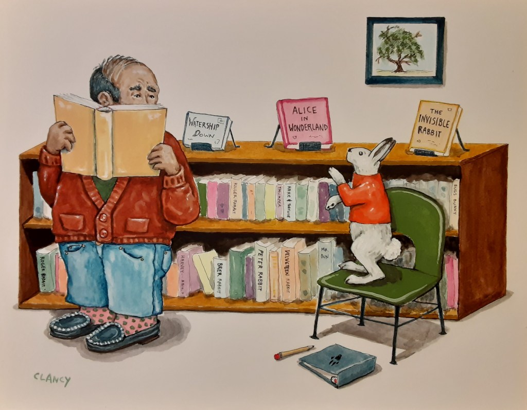
Hare heritage and narrators

A Creative Life, animals in art, art commission, art techniques, Art Word Combinations, artistic inspirations, Books In Art, fine art, magic realism, Narrative Art, reading in art, visual story, visual thinking, words and pictures

I’m finishing up a fine art commission for someone’s holiday present. So instead of talking about that – here’s a painting I finished just before the holiday rush began. Titled “Hare Heritage” and created with ink and gouache.

Hare Heritage by Clancy – ink and gouache on board

Yes, this piece is a new one within my readers series. (You can see more of the series here www.sueclancy.com/fine-art )

As I work I’m experimenting with the 3rd person omniscient narrator – and other narrator writing techniques. The viewer of Hare Heritage (the third person) can see and speculate on 2 visual story-lines within this painting.

It’s a fun challenge to apply writing techniques to fine art! And using the topic of readers and books adds to the pun.

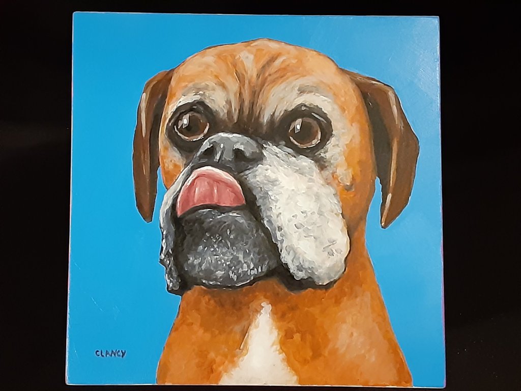
pop-up pet portraits

A Creative Life, art commissions, art techniques, artistic inspirations, cat portrait, Cats in art, dog portrait, Dogs in Art, fine art, handmade papers, public art, sketchbook

Dec 7th during my pop-up shop at Vintage Books https://www.vintage-books.net/ from noon to 4 I’ll be doing some “live drawing”; I’ll work in my sketchbook and if anyone wants a small portrait of their pet I’ll happily do one using a phone photo as inspiration.

PortraitPractice

These portraits I’ll do at the pop-up shop are what I call “quickie sketches” – less complex than the portraits I’m often commissioned to do via the Caplan Art Design Gallery or the Joseph Gierek Fine Art Gallery – more like what I do in my sketchbook and still a fun gift for the holiday.  Each portrait I do will take about 20 minutes more or less.  A command performance art piece! (What fun!!!)

Since I’ll be doing these portraits on-site at the Vintage Books bookstore I’m currently in the process of testing my portable art kit to make sure I’ll have everything I need.  A dear friend let me come to her house with my art kit and do a practice session – on her kitchen table – with a pic of her dog on her phone! (pictured in this post)

I’m using my ink pens, my Pentel Water-Brushes (to minimize the need for a water source) color pencils and my gouache colors on handmade paper. During the practice session I discovered I need to pack a few more items – like more paper towels, some wax paper… –  so I’ll practice some more between now and Dec. 7th!

specially commissioned portrait

A Creative Life, animals in art, art commission, art commissions, artistic inspirations, dog portrait, Dogs in Art, fine art, Fine Art Commission, handmade papers, Sue Draws Dogs, visual story

Most of my artwork is me telling visual stories inspired by data from my real-life. A kind of “creative nonfiction”. When I do art commissions the client provides the life-data and I tell their story. A kind of “biography”. Elements from a persons real-life are woven into the portrait of their dog or cat. I love helping people tell their stories!

Like this commission I recently finished… pictured below… the coffee cup is special to the owner, the tee-shirt logo is important… and of course the dog looks like their very special dog, Potter.

I had such fun drawing this dog – (those ears!!!) – and working with the client who commissioned this portrait. They gave me such good data to work with!

PotterByClancy72

“Potter” by Clancy (ink and gouache on handmade paper)

If you’re curious about some of my other commission work you can see them here.

personalized portraiture pleasure

A Creative Life, animals in art, art commission, art commissions, artistic inspirations, cat portrait, Cats in art, dog portrait, Dogs in Art, fine art, Fine Art Commission

I’ve enjoyed, this season, being commissioned to create several portraits of pets which included many elements that reflected the pet owners too!  Thank you for the privilege of making something special for you and your loved ones – that was the wonderful gift you gave to me this Holiday season!

You can read juicy details about one of my commissioned portraits of two cats here.

And there is a wonderful newspaper article in my local paper, The Columbian, about commissioning a portrait from an artist and how it can become a treasured family heirloom – and how a portrait by an artist is different from a photograph.  It’s true, at least by my experience, that people really do treasure portraits of pets and people that they know. Btw: portraits can be commissioned any time of the year – not just during Holidays.

As it may still be possible that some gifts have not yet been unwrapped in 2018 here, for your amusement, are a few commissioned portraits that I did in the past (and are thus safe to post!):

You can see more about my portraits, information about how to commission one, as well as more examples of my work on this page.

Thank you also for your support and encouragement of my work throughout the year! Happy Holidays and my best wishes for a Happy New Year!


portrait commission of two cats

A Creative Life, animals in art, art commission, art techniques, cat portrait, Cats in art, fine art, Fine Art Commission, handmade papers, visual story

This time of year most of my art commissions are gifts and are top secret. No blogging about them. Well this time a couple asked me to create a double portrait of their two cats and since it’s a gift to themselves they’ve let me blog about it! (Happy Holidays to all of us!) Here’s how it went:

In September Sue and Dean asked me via Caplan Art Designs, my Portland gallery, to create a double portrait of their two cats.  They were pretty sure they wanted it to be 12 inches by 18 inches and on handmade paper to be framed.

A time to meet to discuss the commission was arranged and my wife, Judy, and I went to dinner at Sue and Dean’s house.  I brought an example of the 100% cotton handmade paper that I’d use at the size they’d requested and a few other sizes just in case. I also brought my camera, a note pad and an extra pen.

After we’d been there a short while the cats came out. So did my camera. As the cats got used to me, and over the evening, I took over 41 photos of them. Here are two of the photos I took.

I asked questions of the humans about the cats favorite places, toys and habits. I asked questions about the humans favorite places, drinks and memories. On my note pad I wrote down the answers. Where possible I photographed the answers .  For example on of my questions was: “What drink do you reach for most often when you want to relax? And what kind of glass do you have it in?” Here was the answer:

Drink

Generally we just talked about one thing and another. You know, dinner party talk. I asked questions, kept my ears open, and my notepad ready for recording things that might be relevant to the commission. I like to include in any pet portrait elements from the humans’ lives: favorite objects, drinks, food, anything that sparks pleasant memories. Helpfully, Sue and Dean both volunteered lots of information about themselves such as a favorite artwork that was meaningful to them.

backgoundart

They told of past travels that were particularly memorable. Famous people they’d met in Hawaii.  All kinds of things were talked about and without interrupting flow I asked  more questions  and made as many notes as I could. Without being too obvious I also looked around their house noting colors and patterns, writing those notes down too.  This is what I call the “data dump” phase of a commission. At this point I have no idea what information will be relevant for the final artwork.

We relaxed into the evening; just talking, having a very yummy dinner with a good wine. Slowly as Sue and Dean talked I began to get ideas…  The cats got comfortable too and began doing their “normal” behavior.

Ollie likes to sit in a basket that holds magazines. Tony likes to sit on the couch and watch Nature on television.  The cats behavior prompted me to ask which human had the magazine subscriptions (Sue did) and what magazines were favorites. Dean has worked in technological fields…so technological advances (including TV) were discussed..

Later in the evening I floated a general portrait concept: Ollie reading magazines and Tony watching TV…perhaps the basket Ollie likes so much could become a “table” in the artwork, perhaps…   They both seemed to like my concept direction. They verified the size of artwork they wanted. I said I’d send them, via the gallery, a sketch for their approval before I began the finished artwork. We enjoyed a bit more conversation (and wine) – I glanced at my notes and racked my brain to make sure I had all the data I needed – and then we said our good-nights.

In the driveway pulling away from their house about 9:30pm I texted the gallery owner with the gist of what size artwork Sue and Dean wanted etc. Then my wife, Judy, and I discussed the evening in the car as we drove home. I still had my note pad out and was writing notes in the moving car by flashlight. (Judy was driving.)

Occasionally it had happened during the evening that I was talking with Sue in one room while Judy was in another room talking with Dean. So Judy filled me in on what I’d missed.  At this point I am still in “data dump” mode. I have a rough direction for my design. But the details are very fuzzy. (Over the many years I’ve done special commissions this kind of uncertainty is normal and I trust it as a part of the process.)

The next day I went over my notes and began making 4 x 6 inch size thumbnail sketches.  Over several weeks I did this; going over my notes and photos, drawing possible poses of the cats, possible objects, considering composition and colors. I also showed my sketches to Judy discussing the possibilities. At one point Judy said that they had both talked of Nova Scotia, Newfoundland and Hawaii enough that she was sure that they were important. I agreed and adjusted my drawings so that a reference to those travels was emphasized. Slowly an idea began to come together in the small thumbnail size anyway.  What works visually at a small size doesn’t always work at a larger size but it’s a place to start.

On my easel I put the 12 x 18 inch handmade paper. Then I covered that with tracing paper and drew a grid (you can see it in the photo below). Then I put tracing paper over the grid and drew one of the thumbnail ideas to that scale.  Then another tracing paper was put over that and that drawing tweaked…. And so it went, with multiple tracing paper overlays and re-draws, for a week or more. Tweak, tweak, tweak, until I had something I felt good about.  The “good drawing” I sent to the gallery and to Sue and Dean for their approval. Here is what I sent:

MorehouseCommPreApprove72

They approved the drawing! Yippee! I did a happy dance and then I got serious about colors.

Upon arriving home after the dinner with Sue and Dean I had gotten out one of my interior design color swatch books. Flipping through the pages I found a couple of color spreads that I felt had the “vibe” of Sue and Dean’s house. I showed the pages to Judy to get her input.  With those interior design book pages as a rough guide along with my photographs taken inside their house I began mixing colors and making color notes.  I used my thumbnail drawings to play with color schemes too, painting blobs of color here or there. Anyway, here’s a photo of the interior design book page as well as a few pages of my sketchbook color notes. I did 6 pages of color notes but this one photo will give you the idea.

ColorPaletteBlends

As I decided on the colors I made pencil notes on the approved to-scale drawing where the colors would go. You can see some of this in the photo above.

Then I began on the finished artwork.  The actual painting took about 10 days start to finish. As I say often – the sketching/drawing/planning is where the bulk of creation happens.  I transferred the approved sketch/drawing to the handmade paper I intended to use for the finished artwork.  Then I began to make tiny adjustments to the drawing directly onto the handmade paper in prep for painting. I also discovered gaps in my visual data base.

For example I realized that I didn’t know what the back of a vintage TV set looked like. Not well enough to paint it in detail anyway. Fortunately there are some vintage shops where I live – so a few visits downtown with my sketchbook and the problem was solved!

I also realized that I had an opportunity to make a portrait of Sue and Dean on the front cover of the “magazine” that Ollie, the cat, would be reading in the finished artwork. So I asked for, and got, a picture of the couple that I could use as a reference photo.  From the photo I did several pencil drawings on tracing paper to design the magazine cover and to get the humans to look like themselves. I drew until I had a cover design and human portrait that worked. Here it is:

MagCover

Once I had the magazine “cover” drawing ready (drawn to the scale needed in the artwork) I transferred it to the appropriate spot on the handmade paper.  At another point I realized that I could include the stain glass windows I’d seen in their house as part of the “back cover” of the magazine. But I hadn’t gotten photos of the window when we visited for dinner. And neither Judy nor I could remember the exact details of the windows. So I contacted Amy at the Caplan Art design gallery and she helped fill in the missing data! Whew!

Here’s what the finished artwork “Ollie and Tony” looks like. I’ve photographed it as it was on my easel when I finished it, so you can see the four deckled edges of the handmade paper.  I used acrylic, gouache, watercolor and ink.

OllieAndTonywithdeckles72

I sent the photo of the finished art to Amy the gallery owner to let her know it was done.  Then I spray varnished the piece with a removable varnish that has UV protection in it.

When that was dry I contacted Amy and arranged for a time to deliver it to the gallery.  The date was set and the varnish dry so I slipped the artwork into an archival plastic sleeve and into a cardboard portfolio to protect the artwork from being bent on its travels between my studio and the gallery or between the gallery and the framer.  (It rains in the Pacific Northwest – so artwork needs all the protection it can get.)

We delivered the artwork to the gallery and as a nice surprise Sue and Dean were there!  Here we all are looking at the artwork and talking about it:

artdelivery

Amy will take the artwork to the professional framer the gallery works with and have the art floated on a neutral mat, with spacers so the artwork won’t touch the glass.  It will be given a simple black frame.

What a fun project!! I love getting to make highly personal and meaningful visual stories like this! Thank you!! And thank you, Sue and Dean, for letting me share it on my blog!

Happy Holidays Everyone!!


fine art commission Bailey At The Lake

A Creative Life, animals in art, art commissions, art gallery, art techniques, artistic inspirations, Dogs in Art

Creating “Bailey At The Lake” By Sue Clancy

(this art commission project was handled by the Downtown Art & Frame gallery in Oklahoma)

Almost 9 years ago I did an art exhibit and someone saw it. Almost 9 years later they remembered my artwork and contacted me wanting me to do a portrait of their dog! (Lucky me!)  After conversation and photos were exchanged I did 2 sketches and some color samples. They selected one of my sketches and they liked the color scheme so I got started on the art!

I dyed handmade papers –  first for the color samples and then I dyed still more handmade papers for the “nuances” of color papers that would be cut up make up each element within the artwork.

Here’s a photo of me dying paper. Each handmade paper starts out white – the colors and patterns you’ll see I put onto the white paper using various processes. This paper dying process was repeated with many different colors using several different paper-dying techniques.  Only one photo of this process is here so I can keep this document brief.

DyeYellow72

Below is the “basic” color scheme that was approved.  Then I set about making dyed papers that were the same colors but shades lighter or darker than each of these.  So about 26 papers got dyed. (and a few extra)

Each paper was much larger than the area I intended to use it for because I layer multiple pieces on top of each other to build up the color.

ColorSwatches72

When all of the dyed papers were dry I cut out the overall basic shapes from each “local color”

DSC_0001 (4)

DSC_0002 (4)I glued each of those cut paper shapes to each other – and generally began the layering process….

DSC_0003 (4)

DSC_0004 (4)

Some paper layers go on top, others interlock with each other, some go behind and others on top of what’s on top – basically I design for both 2D and 3D space. To create this art work, I use an Xacto knife to cut out the shapes I need – sometimes scissors.  A tin tray holds the cut pieces – and I use a miniature spatula and several kinds of tweezers to position the paper shapes in the correct position…. Lots of archival glue and glue brushes are used… then a roller to roll it all flat.

LakeOn

Then I glue the basic cut paper shapes onto the board – layering what goes behind first and slowly building up.

Lake1on

OnBoard

When all of the “base papers” are on the board it is allowed to dry for several days.  Then I begin to layer more cut dyed paper shapes on top of what is dry on the board.  This next photo is of me starting that layering process – adding the cut paper “nuances” of color and shape.

MorePaper

StillMorePaper

And so it goes for quite some time… I’m skipping ahead now and the following photo shows how it looked when I had gotten it to a stage where it had to dry a few days before I could do more detail work.  And yes, in this photo below you can see the sketch that got approved – and some of the many photos of the real-life dog that the client sent to me for reference.

DryingStage

Once the above stage was dry – I cut and layered in more cut paper shapes.  While working I looked a lot like I did in the earlier photo: tweezers and cut paper in one hand a glue-y glue brush in the other.  I would cut the shapes I needed out of the correctly colored paper using an Xacto knife, lay those cut paper pieces in a tin tray, step to my easel use the tweezers to pick up the cut paper piece, load my brush with glue and apply … and so it went. But I’m keeping this document brief… so please repeat in your mind, a gajillion times, that earlier photo of me with tweezers and glue.

In the photos below you can see that I’ve layered on many more nuances and details since those photos above.

MoreProgressStepsProgressSteps

As you can see my dyed cut paper shapes go around all 4 edges of the board.

The above stages have to dry a while before I can do any finishing touches.

Well, I got so excited when things were dry that I got right to work and finished the artwork without taking any more progress photos. Ah well.

Here it is finished:

“Bailey At The Lake”  By Sue Clancy

6 x 6 inches – Hand dyed paper, handmade paper, handmade paste paper and acrylic on cradled board.

BaileyAtTheLake72


the art commission Innocent

A Creative Life, animals in art, art commissions, art gallery, art techniques, artistic inspirations, collage, dog portrait, Dogs in Art, fine art

A couple of clients have a Schnauzer and a Labrador retriever – they asked me (via the Caplan Art Designs gallery www.caplanartdesigns.com) to do a dual portrait while also reflecting the owners work/personal life! I have a series of questions I ask (about color preferences etc. details) – I also request photos of the dogs. I was lucky enough to actually meet these dogs in person. Earlier in this blog you got to see my “practice” sketches for the dog breeds in this commission.  After receiving the answers to my questions and photos of the dogs I created 2 pencil drawings to the scale of the proposed finished work.  I also created a number of hand dyed paper swatches to show the proposed color scheme.

Here’s a photo of me dying some paper blue.  I did several layers of this blue color on the paper in order to build up the “proper blue” that best matched the client’s preference.

DyingBlueSpray72

To keep this document brief I’ll not show photos of me creating the 20 base colors I created for the “swatch sampler” – so multiply the above photo 19 times at least.

Once the papers were dry – we met and the clients chose one of the two pencil sketches. Small adjustments were made in the color scheme and the drawings. And additional research was done. For example, I studied what vest collars are like, what wing-tip shoes look like, where cuff-links are on a cuff and gold pocket watches how they sit in a pocket and how the chain drapes.  I asked about and investigated what a “bar” in court looks like. I researched how the sleeve of a judges’ robe hangs.

I also “filled in” the other colors of hand dyed paper I’d need to produce the finished painting.  Where a section in a painting will read as “blue” there may be as many as 5 different shades of blue papers which are collaged/layered together.  Where a paper may read as “blond wood grain” there may be multiple layers of color applied to each paper that forms the various tones within the shape.  Yes, it’s complicated and takes a lot of pre-planning and research.

Once all of the papers are done and dry (there are now over 50 pieces of hand dyed paper) I begin cutting out shapes. Here I have cut out the overall shape of the Schnauzer’s head and paw out of a greyish-blue dyed paper. A light pencil marks the future placements of other pieces of darker grey paper and or lighter white-grey paper.

DSC_0001

At this point I’m cutting and gluing together all of the various shapes from the various “base” papers to form the overall characters and aspects of scenery.  With an Xacto knife I cut the needed shape positioning it using tweezers. Then I would adjust the position – often several times – before gluing it together. Then I would press the glued papers flat and let them dry.

As I constructed the Schnauzer character I got excited and focused – and I forgot to take photos of the steps of construction.  As I worked kept laughing, imagining the Schnauzer lawyer saying “My client is innocent, I tell you, innocent. My client, the Great Dane you see before you, could not have possibly reached down to such a low table to eat the 4 hams, 5 chickens and the pot roast which is alleged to have been on that table. It was beneath him to have…”

There is a lot of “back and forth” work to get the shapes and positions correct – to adjust the colors and layers. Here is a succession of photos to give you an idea of the test-adjust-test routine.

In the photos below you’ll see my original pencil drawing – which I’m using as a guide.

The Judge’s glasses are made of two pieces of paper: I cut the glasses frames out of a “gold” paper and glued them onto a white paper which acts as the “lenses”.  All elements within the artwork are cut hand dyed papers which interlock.

And so it goes – back and forth – building up each element in both 3 dimensional space as well as 2 dimensional. For example, the watch in the Schnauzer’s pocket is a complete watch – with numbers on it – even if you don’t see all of it in the finished artwork. Behind the suit coat lapels is the entire vest… the tie actually fits under the white shirt collar. The flag is several different colors of paper pieced together and actually hanging from a pole (a cut piece of gold paper).  If you could tell the Schnauzer to move over you’d see the entire “bar” he is standing in front of and behind those is the entire “bench” on which the Labrador judge sits.

Once the “base papers” have been assembled into each element needed for the overall artwork I glue them onto the cradled board.

DSC_0006

I pre-planned for how the various shapes “wrap around” the 4 edges of the board. This way the judges bench actually looks/feels like a 3D bench. All we don’t see are the witness boxes. The flag extends to the side and top edges of the painting. The judge’s arm continues on one edge. As you can see in the photo the floor extends over the bottom edge.

When these base papers are glued on they are pressed flat – and left to dry several days under weight.

Then the excess paper hanging off the edges is trimmed away with my Xacto knife and the now blocked-in painting is put on my easel. There many more cut pieces of paper layered on at my easel – many of them are very tiny pieces of paper, the size of a fingernail or smaller, others are tissue paper thin allowing the underlayment to show through – these papers are cut with my Xacto knife carried to the easel then glued into place.  More building up of paper layers until each element within the artwork has more tonal ranges and dimension. For example, the Judges glasses got more highlights and shadows glued onto them – they went from being made out of 2 pieces of paper to being made out of 6.  The Schnauzer’s eyebrows and whiskers are layered on. And so it goes…

Once again – even though it took quite a bit of time – I got so focused and excited about what I was doing that I forgot to photograph the various steps I did between the above photo and the finished artwork pictured below. (The finished artwork is protected by varnish.)

So here is the finished piece (details of size and media below the photo).

InnocentITellYou72

 “Innocent, I tell you….”

By Clancy

Size 10 x 10 x 2 inches

Media: Hand dyed paper, handmade paste paper, book cloth and acrylic on cradled board