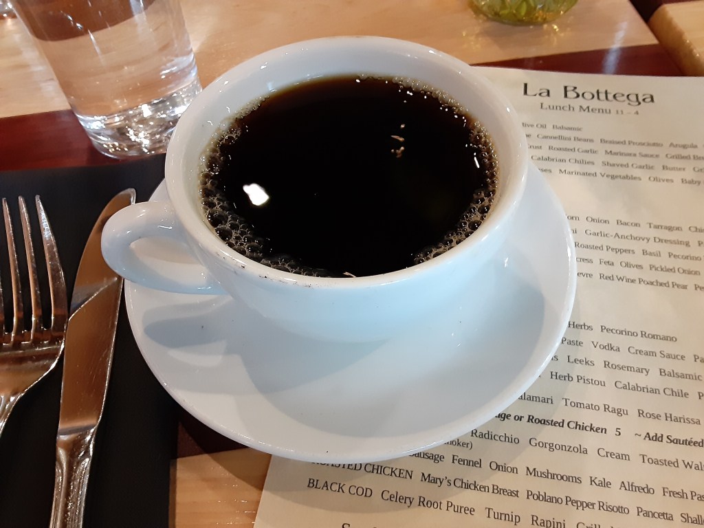
Coffee and blank books

A Creative Life, art exhibit, art gallery, art supplies, artist book, artistic inspirations, author illustrator, books, creative thinking, drawing as thinking, fine art, Patchwork Poems, sketchbook, words and pictures, writing and illustrating

This week has definitely been caffeinated. My art commission for Caplan Art Designs is buzzing nicely. The Bainbridge Island Art Museum sent news this week that my book Coffee Beans Plus H2O is included in an exhibit catalogue “Open Sesame” that will come out in March 2023!

Lots of creative things are percolating! Here’s a video look at my book Coffee Beans Plus H2O.

The portfolio page on my website has more photos and info.

In last Monday’s post I shared a pig painting I began with the excess blue paint I had as a result of the still in progress secret art commission. Well, here’s progress on the pig painting. The week has been very busy so I’m glad to have this much done on a new painting.

I still make many of my artist books from scratch – hand sewing the bindings, paper folding and all. Coffee Beans Plus H2O is one example. Patchwork Poems is another. But some time ago I got some very valuable advice from Laura Russell at the 23 Sandy Gallery (an artist book gallery I work with). Laura encouraged me to focus on my book content, my stories and illustrations, as not so much on creating complicated book bindings. So nowadays I buy and use well-constructed blank books to write and draw in. Many of the books I buy have sewn bindings and will lay flat while in use. Quality of paper and the ability to lay flat are attributes I seek in my blank books.

There’s a locally owned art supply store, not far from where I live, Columbia Art and Drafting, that regularly has good quality sketchbooks in their “buy one get one free” section. I like to go through this section like a vacuum cleaner, hoovering up sketchbooks!! 🤣

Here’s what I got: six 3 x 5 inch hardcover sketchbooks for pen and ink work, two 5.5 x 8.5 inch hardcover sketchbooks for heavy watercolor and gouache work, two 6 x 9 inch hardcover books and four 8.5 x 11 inch hardcover books all of which will accept ink, color pencil and light watercolor and gouache work! When we got home from the art supply store I started right away on a drawing in one of the new blank books… which will get shared on my email newsletter later this week and I will continue sharing as time goes.

Here’s a limerick I wrote and illustrated about blank books.

Here’s a delightful article about journaling and what’s good about keeping a journal.

And Sketchbook Skool is fun too – lots of videos with drawings in action.

Hope your blank books will soon contain your very own delights! See you next Monday or so.

Mundane magic – aka joy breaks

A Creative Life, art commission, art gallery, artistic inspirations, books, creative thinking, fine art, life of the mind, mental health, poetry, Sustainable creativity, whimsical art, words and pictures

A friend asked how I maintain creativity while doing a commission. My reply: a schedule and lots of joy breaks. I deliberately make the mundane magical. Especially via joy breaks.

Joy breaks, also called “Joy Snacks“, is purposefully taking time to recognize and savor small pleasures. Think of the old fashioned coffee breaks office workers were allowed within a work day but for me now it’s a scheduled “check in” with whatever seems pleasant to me at regular intervals throughout a day. It’s allowing myself to fully feel the pleasure I feel however small the feeling may be. I add a corollary that it’s also avoiding killjoy thoughts – including those U.S. Southern style self depreciating cynical put downs of my own pleasures. It’s taking time to make note of a memorable moment in my journal/sketchbook each day. Yes, notes of things I’m grateful for but also just things I enjoyed and the surprising things that pleasantly caught my attention during the day. It’s also taking a moment to maintain awareness of what is within my control and what isn’t – a crucial thing to remember during creative deadlines – while allowing myself to relax and let go of some things in the Stoic philosophical manner.

In a technical/physical sense while doing an art commission (my current one is for the Caplan Art Designs Gallery) there are times I need to wait for parts of the commission to dry before doing other parts. There are also times when I have extra paint that I mixed for the commission leftover. So part of the mundane creativity task is to monitor the commission as it dries – to stay on task – and yet also use up any excess paint. This week I did a painting of a pig titled “Red Eye Gravy Train”… (details of the painting, the related limerick and a view of my sketchbook is on my Substack  https://sueclancy.substack.com/p/early-starts )

Red Eye Gravy Train by Clancy

I had mixed a pink color for my commission and had a wee bit leftover so I added a bit more of the white and used it on “Red Eye Gravy Train”.

During another days work on my commission I was mixing a particular shade of light blue and the tube of blue suddenly smooged out too much color in a gush. So I had a huge amount of leftover blue color to deal with.

So I consulted my sketchbook for ideas and with a watercolor pencil quickly drew a design and filled in with the extra blue paint (and the wee bit extra green too).

Even after painting that there was still extra blue paint left so I covered two boards edge to edge with the blue till the paint was used up. No clue at this point how I’ll use these new blue boards…but that’s what creative thinking is for!

Since I’ve been so busy working we’ve had lots of beans and rice for our lunches. I have a keeper of my precooked magic beans in the fridge so I toss a scoop or two in on top of the rice in my “push here dummy” rice cooker, to quote my adopted Mom’s phrase for simple kitchen appliances.

I add spices, freshly chopped onions and other vegetables to vary the dishes from meal to meal, press the cook button and head back to the studio to work some more.

Even though these beans and rice bowls I make are simple and cooked in a busy-artist-hands-free-cooking way they still feel like homemade comfort food. (My beans and grains bowl recipe/strategy can be found in my kitchen sketchbook “Favorites So Far“)

I like handwritten works, homemade food and just about anything made by hand. So I  enjoyed this post by Austin Kleon about how AI (and algorithms) can’t kill anything worth keeping.

And I admit to getting a joy snack style chuckle from this article about today’s teenagers going luddite and ditching social media and smartphones in favor of handmade real life!

The additional poetry book title by Andrea Gibson, the new favorite poet I wrote about last post arrived this week! I love it that it looks handwritten. I know it’s a font…but I like the look. Gibson’s words feel so true to my own experiences and the semi-handwritten hand illustrated look adds a sense of comradeship for me.

Speaking of handwritten poetry… I read a fun article about a park ranger who got creative and made a free little library style kiosk for poetry in the park!

One of the most delightful joy breaks was this video of what happened when a girl gave a street musician a coin.

And I hope today’s post itself gave you a small joy break. Remember to take breaks and notice pleasant things. See you next Monday or thereabouts.

Painting, poetry, pasta, pretty cups and books

A Creative Life, art commission, art gallery, artistic inspirations, books, creative thinking, drawing as thinking, fine art, Fine Art Commission, mundane and magical moments, poetry, sketchbook, small things, words and pictures

I’m very busy working on a top secret painting commission for Caplan Art Designs. So instead of talking about that – look! Poetry! Pasta! Pretty cups! Books!

Poetry: Two books of Andrea Gibson‘s poetry came by mail from one of my local bookstores! Gibson is my latest favorite poet.

Here’s one of Gibson’s poems on page 32 of You Better Be Lightning.

Pasta: My wife got a mixer with the pasta attachments for Christmas! So we’ve been making pasta together! She makes the pasta from scratch while I make the sauce.

Here she’s making large elbow noodles.

I made a butter and parsley sauce for our first pasta attempt so we could primarily taste the homemade noodles. Yum!! Homemade noodles really are worth the effort for the flavor!!

Pretty cups: Recently we’ve been to a few special events with dear friends. There were pretty cups at each occasion. Having recently made a calendar of coffee cups perhaps I was primed to notice them. Even so the cups, and my awareness of them, added a soupecon of extra special to the time with friends.

Here’s a related-to-cup-thoughts page from my sketchbook.

Books: I finished reading this book about books and oh my! What a marvelous invention writing things down and storing them in a book format has been for us humans! And how easy it is to stand on the shoulders of giants simply by reading.

I enjoyed this video about why we should read more. This article about how reading is itself a creative act. And this article about how creativity is actually a practice of resiliency.

So here’s a photo of one of the books I’m reading now in addition to Andrea Gibson’s poetry, a book of short stories and a book of essays.

Hope your week contains good books in it. I’ll see you next Monday or thereabouts.

specially commissioned portrait

A Creative Life, animals in art, art commission, art commissions, artistic inspirations, dog portrait, Dogs in Art, fine art, Fine Art Commission, handmade papers, Sue Draws Dogs, visual story

Most of my artwork is me telling visual stories inspired by data from my real-life. A kind of “creative nonfiction”. When I do art commissions the client provides the life-data and I tell their story. A kind of “biography”. Elements from a persons real-life are woven into the portrait of their dog or cat. I love helping people tell their stories!

Like this commission I recently finished… pictured below… the coffee cup is special to the owner, the tee-shirt logo is important… and of course the dog looks like their very special dog, Potter.

I had such fun drawing this dog – (those ears!!!) – and working with the client who commissioned this portrait. They gave me such good data to work with!

PotterByClancy72

“Potter” by Clancy (ink and gouache on handmade paper)

If you’re curious about some of my other commission work you can see them here.

portrait commission of two cats

A Creative Life, animals in art, art commission, art techniques, cat portrait, Cats in art, fine art, Fine Art Commission, handmade papers, visual story

This time of year most of my art commissions are gifts and are top secret. No blogging about them. Well this time a couple asked me to create a double portrait of their two cats and since it’s a gift to themselves they’ve let me blog about it! (Happy Holidays to all of us!) Here’s how it went:

In September Sue and Dean asked me via Caplan Art Designs, my Portland gallery, to create a double portrait of their two cats.  They were pretty sure they wanted it to be 12 inches by 18 inches and on handmade paper to be framed.

A time to meet to discuss the commission was arranged and my wife, Judy, and I went to dinner at Sue and Dean’s house.  I brought an example of the 100% cotton handmade paper that I’d use at the size they’d requested and a few other sizes just in case. I also brought my camera, a note pad and an extra pen.

After we’d been there a short while the cats came out. So did my camera. As the cats got used to me, and over the evening, I took over 41 photos of them. Here are two of the photos I took.

I asked questions of the humans about the cats favorite places, toys and habits. I asked questions about the humans favorite places, drinks and memories. On my note pad I wrote down the answers. Where possible I photographed the answers .  For example on of my questions was: “What drink do you reach for most often when you want to relax? And what kind of glass do you have it in?” Here was the answer:

Drink

Generally we just talked about one thing and another. You know, dinner party talk. I asked questions, kept my ears open, and my notepad ready for recording things that might be relevant to the commission. I like to include in any pet portrait elements from the humans’ lives: favorite objects, drinks, food, anything that sparks pleasant memories. Helpfully, Sue and Dean both volunteered lots of information about themselves such as a favorite artwork that was meaningful to them.

backgoundart

They told of past travels that were particularly memorable. Famous people they’d met in Hawaii.  All kinds of things were talked about and without interrupting flow I asked  more questions  and made as many notes as I could. Without being too obvious I also looked around their house noting colors and patterns, writing those notes down too.  This is what I call the “data dump” phase of a commission. At this point I have no idea what information will be relevant for the final artwork.

We relaxed into the evening; just talking, having a very yummy dinner with a good wine. Slowly as Sue and Dean talked I began to get ideas…  The cats got comfortable too and began doing their “normal” behavior.

Ollie likes to sit in a basket that holds magazines. Tony likes to sit on the couch and watch Nature on television.  The cats behavior prompted me to ask which human had the magazine subscriptions (Sue did) and what magazines were favorites. Dean has worked in technological fields…so technological advances (including TV) were discussed..

Later in the evening I floated a general portrait concept: Ollie reading magazines and Tony watching TV…perhaps the basket Ollie likes so much could become a “table” in the artwork, perhaps…   They both seemed to like my concept direction. They verified the size of artwork they wanted. I said I’d send them, via the gallery, a sketch for their approval before I began the finished artwork. We enjoyed a bit more conversation (and wine) – I glanced at my notes and racked my brain to make sure I had all the data I needed – and then we said our good-nights.

In the driveway pulling away from their house about 9:30pm I texted the gallery owner with the gist of what size artwork Sue and Dean wanted etc. Then my wife, Judy, and I discussed the evening in the car as we drove home. I still had my note pad out and was writing notes in the moving car by flashlight. (Judy was driving.)

Occasionally it had happened during the evening that I was talking with Sue in one room while Judy was in another room talking with Dean. So Judy filled me in on what I’d missed.  At this point I am still in “data dump” mode. I have a rough direction for my design. But the details are very fuzzy. (Over the many years I’ve done special commissions this kind of uncertainty is normal and I trust it as a part of the process.)

The next day I went over my notes and began making 4 x 6 inch size thumbnail sketches.  Over several weeks I did this; going over my notes and photos, drawing possible poses of the cats, possible objects, considering composition and colors. I also showed my sketches to Judy discussing the possibilities. At one point Judy said that they had both talked of Nova Scotia, Newfoundland and Hawaii enough that she was sure that they were important. I agreed and adjusted my drawings so that a reference to those travels was emphasized. Slowly an idea began to come together in the small thumbnail size anyway.  What works visually at a small size doesn’t always work at a larger size but it’s a place to start.

On my easel I put the 12 x 18 inch handmade paper. Then I covered that with tracing paper and drew a grid (you can see it in the photo below). Then I put tracing paper over the grid and drew one of the thumbnail ideas to that scale.  Then another tracing paper was put over that and that drawing tweaked…. And so it went, with multiple tracing paper overlays and re-draws, for a week or more. Tweak, tweak, tweak, until I had something I felt good about.  The “good drawing” I sent to the gallery and to Sue and Dean for their approval. Here is what I sent:

MorehouseCommPreApprove72

They approved the drawing! Yippee! I did a happy dance and then I got serious about colors.

Upon arriving home after the dinner with Sue and Dean I had gotten out one of my interior design color swatch books. Flipping through the pages I found a couple of color spreads that I felt had the “vibe” of Sue and Dean’s house. I showed the pages to Judy to get her input.  With those interior design book pages as a rough guide along with my photographs taken inside their house I began mixing colors and making color notes.  I used my thumbnail drawings to play with color schemes too, painting blobs of color here or there. Anyway, here’s a photo of the interior design book page as well as a few pages of my sketchbook color notes. I did 6 pages of color notes but this one photo will give you the idea.

ColorPaletteBlends

As I decided on the colors I made pencil notes on the approved to-scale drawing where the colors would go. You can see some of this in the photo above.

Then I began on the finished artwork.  The actual painting took about 10 days start to finish. As I say often – the sketching/drawing/planning is where the bulk of creation happens.  I transferred the approved sketch/drawing to the handmade paper I intended to use for the finished artwork.  Then I began to make tiny adjustments to the drawing directly onto the handmade paper in prep for painting. I also discovered gaps in my visual data base.

For example I realized that I didn’t know what the back of a vintage TV set looked like. Not well enough to paint it in detail anyway. Fortunately there are some vintage shops where I live – so a few visits downtown with my sketchbook and the problem was solved!

I also realized that I had an opportunity to make a portrait of Sue and Dean on the front cover of the “magazine” that Ollie, the cat, would be reading in the finished artwork. So I asked for, and got, a picture of the couple that I could use as a reference photo.  From the photo I did several pencil drawings on tracing paper to design the magazine cover and to get the humans to look like themselves. I drew until I had a cover design and human portrait that worked. Here it is:

MagCover

Once I had the magazine “cover” drawing ready (drawn to the scale needed in the artwork) I transferred it to the appropriate spot on the handmade paper.  At another point I realized that I could include the stain glass windows I’d seen in their house as part of the “back cover” of the magazine. But I hadn’t gotten photos of the window when we visited for dinner. And neither Judy nor I could remember the exact details of the windows. So I contacted Amy at the Caplan Art design gallery and she helped fill in the missing data! Whew!

Here’s what the finished artwork “Ollie and Tony” looks like. I’ve photographed it as it was on my easel when I finished it, so you can see the four deckled edges of the handmade paper.  I used acrylic, gouache, watercolor and ink.

OllieAndTonywithdeckles72

I sent the photo of the finished art to Amy the gallery owner to let her know it was done.  Then I spray varnished the piece with a removable varnish that has UV protection in it.

When that was dry I contacted Amy and arranged for a time to deliver it to the gallery.  The date was set and the varnish dry so I slipped the artwork into an archival plastic sleeve and into a cardboard portfolio to protect the artwork from being bent on its travels between my studio and the gallery or between the gallery and the framer.  (It rains in the Pacific Northwest – so artwork needs all the protection it can get.)

We delivered the artwork to the gallery and as a nice surprise Sue and Dean were there!  Here we all are looking at the artwork and talking about it:

artdelivery

Amy will take the artwork to the professional framer the gallery works with and have the art floated on a neutral mat, with spacers so the artwork won’t touch the glass.  It will be given a simple black frame.

What a fun project!! I love getting to make highly personal and meaningful visual stories like this! Thank you!! And thank you, Sue and Dean, for letting me share it on my blog!

Happy Holidays Everyone!!


fine art commission Bailey At The Lake

A Creative Life, animals in art, art commissions, art gallery, art techniques, artistic inspirations, Dogs in Art

Creating “Bailey At The Lake” By Sue Clancy

(this art commission project was handled by the Downtown Art & Frame gallery in Oklahoma)

Almost 9 years ago I did an art exhibit and someone saw it. Almost 9 years later they remembered my artwork and contacted me wanting me to do a portrait of their dog! (Lucky me!)  After conversation and photos were exchanged I did 2 sketches and some color samples. They selected one of my sketches and they liked the color scheme so I got started on the art!

I dyed handmade papers –  first for the color samples and then I dyed still more handmade papers for the “nuances” of color papers that would be cut up make up each element within the artwork.

Here’s a photo of me dying paper. Each handmade paper starts out white – the colors and patterns you’ll see I put onto the white paper using various processes. This paper dying process was repeated with many different colors using several different paper-dying techniques.  Only one photo of this process is here so I can keep this document brief.

DyeYellow72

Below is the “basic” color scheme that was approved.  Then I set about making dyed papers that were the same colors but shades lighter or darker than each of these.  So about 26 papers got dyed. (and a few extra)

Each paper was much larger than the area I intended to use it for because I layer multiple pieces on top of each other to build up the color.

ColorSwatches72

When all of the dyed papers were dry I cut out the overall basic shapes from each “local color”

DSC_0001 (4)

DSC_0002 (4)I glued each of those cut paper shapes to each other – and generally began the layering process….

DSC_0003 (4)

DSC_0004 (4)

Some paper layers go on top, others interlock with each other, some go behind and others on top of what’s on top – basically I design for both 2D and 3D space. To create this art work, I use an Xacto knife to cut out the shapes I need – sometimes scissors.  A tin tray holds the cut pieces – and I use a miniature spatula and several kinds of tweezers to position the paper shapes in the correct position…. Lots of archival glue and glue brushes are used… then a roller to roll it all flat.

LakeOn

Then I glue the basic cut paper shapes onto the board – layering what goes behind first and slowly building up.

Lake1on

OnBoard

When all of the “base papers” are on the board it is allowed to dry for several days.  Then I begin to layer more cut dyed paper shapes on top of what is dry on the board.  This next photo is of me starting that layering process – adding the cut paper “nuances” of color and shape.

MorePaper

StillMorePaper

And so it goes for quite some time… I’m skipping ahead now and the following photo shows how it looked when I had gotten it to a stage where it had to dry a few days before I could do more detail work.  And yes, in this photo below you can see the sketch that got approved – and some of the many photos of the real-life dog that the client sent to me for reference.

DryingStage

Once the above stage was dry – I cut and layered in more cut paper shapes.  While working I looked a lot like I did in the earlier photo: tweezers and cut paper in one hand a glue-y glue brush in the other.  I would cut the shapes I needed out of the correctly colored paper using an Xacto knife, lay those cut paper pieces in a tin tray, step to my easel use the tweezers to pick up the cut paper piece, load my brush with glue and apply … and so it went. But I’m keeping this document brief… so please repeat in your mind, a gajillion times, that earlier photo of me with tweezers and glue.

In the photos below you can see that I’ve layered on many more nuances and details since those photos above.

MoreProgressStepsProgressSteps

As you can see my dyed cut paper shapes go around all 4 edges of the board.

The above stages have to dry a while before I can do any finishing touches.

Well, I got so excited when things were dry that I got right to work and finished the artwork without taking any more progress photos. Ah well.

Here it is finished:

“Bailey At The Lake”  By Sue Clancy

6 x 6 inches – Hand dyed paper, handmade paper, handmade paste paper and acrylic on cradled board.

BaileyAtTheLake72


the art commission Innocent

A Creative Life, animals in art, art commissions, art gallery, art techniques, artistic inspirations, collage, dog portrait, Dogs in Art, fine art

A couple of clients have a Schnauzer and a Labrador retriever – they asked me (via the Caplan Art Designs gallery www.caplanartdesigns.com) to do a dual portrait while also reflecting the owners work/personal life! I have a series of questions I ask (about color preferences etc. details) – I also request photos of the dogs. I was lucky enough to actually meet these dogs in person. Earlier in this blog you got to see my “practice” sketches for the dog breeds in this commission.  After receiving the answers to my questions and photos of the dogs I created 2 pencil drawings to the scale of the proposed finished work.  I also created a number of hand dyed paper swatches to show the proposed color scheme.

Here’s a photo of me dying some paper blue.  I did several layers of this blue color on the paper in order to build up the “proper blue” that best matched the client’s preference.

DyingBlueSpray72

To keep this document brief I’ll not show photos of me creating the 20 base colors I created for the “swatch sampler” – so multiply the above photo 19 times at least.

Once the papers were dry – we met and the clients chose one of the two pencil sketches. Small adjustments were made in the color scheme and the drawings. And additional research was done. For example, I studied what vest collars are like, what wing-tip shoes look like, where cuff-links are on a cuff and gold pocket watches how they sit in a pocket and how the chain drapes.  I asked about and investigated what a “bar” in court looks like. I researched how the sleeve of a judges’ robe hangs.

I also “filled in” the other colors of hand dyed paper I’d need to produce the finished painting.  Where a section in a painting will read as “blue” there may be as many as 5 different shades of blue papers which are collaged/layered together.  Where a paper may read as “blond wood grain” there may be multiple layers of color applied to each paper that forms the various tones within the shape.  Yes, it’s complicated and takes a lot of pre-planning and research.

Once all of the papers are done and dry (there are now over 50 pieces of hand dyed paper) I begin cutting out shapes. Here I have cut out the overall shape of the Schnauzer’s head and paw out of a greyish-blue dyed paper. A light pencil marks the future placements of other pieces of darker grey paper and or lighter white-grey paper.

DSC_0001

At this point I’m cutting and gluing together all of the various shapes from the various “base” papers to form the overall characters and aspects of scenery.  With an Xacto knife I cut the needed shape positioning it using tweezers. Then I would adjust the position – often several times – before gluing it together. Then I would press the glued papers flat and let them dry.

As I constructed the Schnauzer character I got excited and focused – and I forgot to take photos of the steps of construction.  As I worked kept laughing, imagining the Schnauzer lawyer saying “My client is innocent, I tell you, innocent. My client, the Great Dane you see before you, could not have possibly reached down to such a low table to eat the 4 hams, 5 chickens and the pot roast which is alleged to have been on that table. It was beneath him to have…”

There is a lot of “back and forth” work to get the shapes and positions correct – to adjust the colors and layers. Here is a succession of photos to give you an idea of the test-adjust-test routine.

In the photos below you’ll see my original pencil drawing – which I’m using as a guide.

The Judge’s glasses are made of two pieces of paper: I cut the glasses frames out of a “gold” paper and glued them onto a white paper which acts as the “lenses”.  All elements within the artwork are cut hand dyed papers which interlock.

And so it goes – back and forth – building up each element in both 3 dimensional space as well as 2 dimensional. For example, the watch in the Schnauzer’s pocket is a complete watch – with numbers on it – even if you don’t see all of it in the finished artwork. Behind the suit coat lapels is the entire vest… the tie actually fits under the white shirt collar. The flag is several different colors of paper pieced together and actually hanging from a pole (a cut piece of gold paper).  If you could tell the Schnauzer to move over you’d see the entire “bar” he is standing in front of and behind those is the entire “bench” on which the Labrador judge sits.

Once the “base papers” have been assembled into each element needed for the overall artwork I glue them onto the cradled board.

DSC_0006

I pre-planned for how the various shapes “wrap around” the 4 edges of the board. This way the judges bench actually looks/feels like a 3D bench. All we don’t see are the witness boxes. The flag extends to the side and top edges of the painting. The judge’s arm continues on one edge. As you can see in the photo the floor extends over the bottom edge.

When these base papers are glued on they are pressed flat – and left to dry several days under weight.

Then the excess paper hanging off the edges is trimmed away with my Xacto knife and the now blocked-in painting is put on my easel. There many more cut pieces of paper layered on at my easel – many of them are very tiny pieces of paper, the size of a fingernail or smaller, others are tissue paper thin allowing the underlayment to show through – these papers are cut with my Xacto knife carried to the easel then glued into place.  More building up of paper layers until each element within the artwork has more tonal ranges and dimension. For example, the Judges glasses got more highlights and shadows glued onto them – they went from being made out of 2 pieces of paper to being made out of 6.  The Schnauzer’s eyebrows and whiskers are layered on. And so it goes…

Once again – even though it took quite a bit of time – I got so focused and excited about what I was doing that I forgot to photograph the various steps I did between the above photo and the finished artwork pictured below. (The finished artwork is protected by varnish.)

So here is the finished piece (details of size and media below the photo).

InnocentITellYou72

 “Innocent, I tell you….”

By Clancy

Size 10 x 10 x 2 inches

Media: Hand dyed paper, handmade paste paper, book cloth and acrylic on cradled board

more schnauzer art practice

A Creative Life, animals in art, art commissions, dog portrait, Dogs in Art, fine art, Sue Draws Dogs

Here’s more schnauzer practice (referring to my last blog post here) – this one is bigger (15 x 11 inches) and is more like the client’s dog I’m to feature in my fine art commission (via Caplan Art Designs). The commission is being done in color, using my cut handmade paper collage method, but I gotta get the shapes right first. So I’ve been practicing… https://sueclancy.com/2017/03/08/the-art-of-practice-and-a-story-inside/

Samson72

“Samson” by Clancy – ink on handmade paper

the art of planning

A Creative Life, animals in art, art commissions, art gallery, Dogs in Art, visual story

When I work on art commissions I cannot imagine telling a prospective client that “It’s gonna be great! Just Yuge! Believe me!” and then refuse to give any details regarding the project plans. I and each of my gallery owners describe in detail what the client can expect at every phase of the art project being asked of me and when they can expect it. Questions are answered as completely as possible as soon as possible.

The ability to unflinchingly describe plans for a project in easy-to-understand terms, to outline a proposal either verbally or in writing (or both), to answer questions, to give updates and to have “how-we-will-know-we-succeed” goal markers clearly marked is the very foundation of doing business. This is basic business plan/proposal 101 and expected of any person in business.

It is all the more important when the business is creative. Fine art (and all of it’s creative cousins) are notoriously subjective, mysterious and mystical – when viewed from the non-artists point of view. This means that clear communications about plans regarding artistic projects is crucial.  If the client can’t understand what you’ll be doing, and can’t explain it to their spouse or to their organization’s board – why would they commission you do do something artistic for their home, office or organization?

Since a certain U.S. president elect has been so vague regarding his plans for the country  I’ve begun to think that doing “basic business 101” and doing it well is an art and it may also be a revolutionary act.

So to aid, support and show solidarity with my fellow revolutionaries here are questions I ask myself that influence how I communicate my art project plan/proposals:

Why are you doing it/what do you hope to achieve? 

I like to help people preserve, via fine art, the story, the memory, of their life and relationship with their pet; dog or cat.  I often say that “I help people tell their stories visually”.  When talking with prospective clients I talk about this goal and a bit about how my art-making process works, how I use elements from the real-life of the client and dog. Since I work with a number of galleries many of the clients approach the idea of commissioning me to create something special for them already knowing this about my artwork process.

I (or the gallery) asks what the client hopes to get from my work, about the size of artwork the client wants and what fits in their budget.

What exactly will you be doing and approximately when?

During the first conversation we find out if the client wants one of my ink portraits, which has a more simple project plan/process, or if they want a color portrait.  Assuming  for the purposes of this blog that the client wants a color portrait then I (or my gallery owners) tell the client that I have a list of questions and a list of photos of their dog (for example) that I will need in order to create a full color portrait (like the color artwork you see here on my website).

Once those questions have been answered and the photos have been provided I’ll take about a month to create 2 designs for their approval.  A calendar date for our sketch-approval meeting is often set during this conversation. With the gallery as a mutual point of contact the client answers my questions and provides the photos of their pet.  After all of the answers/photos are received (usually within the first week) I set about creating 2 sketches to scale of the proposed finished work along with a set of “color swatches” to give them a tactile idea of my proposed color scheme.

Then, a month later, we meet (me, client and gallery owner) and I show my sketches and talk about the proposal.  Sometimes it’s happened that I deliver the sketches to the gallery and the gallery owner conducts the meeting (without me) to get approval from the client for one of the sketched proposals.  No matter who makes the presentation/proposal, I take care to label my sketches clearly, with color swatches taped into place so that everything is fairly self-explanatory. I allow the client to take a photo of the approved sketch at this time if they desire.

When doing public art commissions I’ve even included copies of the sketches or (as per request) color mock-ups that the client could then take and present to their organizations board.

When a sketch is approved I provide a date when the finished work will be delivered to the gallery.  I set this date far in advance of when I actually think it will be done – because sometimes there is weather that slows down drying time – so I would rather deliver something earlier than a client is expecting it than have to explain why it is late. And I tell the client I’m setting the delivery date out farther than I think it will be finished – and why I’m setting it that way.

Then I get to work.

The gallery is available if the client has any questions or wishes to have updates.  As I work photos of my project’s progress are taken. Those are provided to the gallery who shares them with the client.  At the end of a project I often use those “progress photos” and write a “how I made this” document that summarizes the entire project.

As you can imagine clear communication of plans and procedures  makes the process much smoother for everyone. Clients aren’t left wondering what I’m going to do to them instead of for them.

Here’s a photo of a commission I did some time ago now. The client was very happy with it! It’s titled “Preying for Peas”.  That title seems relevant just now.

preyingforpeas72

You can download a pdf “project summary” about the “Preying for Peas” project here:  https://sueclancy.com/wp-content/uploads/2014/12/aboutpreyingforpeas.pdf