We went touristing and drove 20 minutes from our house to Camas WA independent bookstore called Its Bookish. It’s a delightful store focused on children’s books up to young adult with some adult books too. Here’s some views of what we saw on our way to Its Bookish. Not pictured, because I wasn’t able to get pics due to intermittent clouds and terrain, were fleeting views of distant snow covered mountains.
The door to Its Bookish was warmly welcoming and was a delight to see!
Naturally I made a beeline for the poetry section and then had a more general browse. Both my wife and I found books/authors that we’re always looking for that are sometimes hard to find. The store was quite crowded with lots of kids of all ages and their grownups but during a brief quiet moment in the young adult section I snapped this selfie with my wife in the background. It was a pleasant experience. No bookstore cats though which was understandable given the high level of children’s activities.
After we finished at Its Bookish we walked around downtown to a locally owned pub Grains Of Wrath. On our walk we passed by sculptures and many more locally owned businesses with welcoming to everyone signs in their windows or doors!
At Grains of Wrath we had really good beer and the best mac and cheese ever! Here in the Pacific Northwest every pub has their own version of mac and cheese and it’s fun to discover how much variety mac and cheese can have! My spouse and I split the dishes so we each got enough but not too much. We felt quite indulgent!
Back home I photographed our book haul from Its Bookish.
On my email newsletter I shared my sketchbook page of a dancing hippo … and as you can see by the above tourist play I followed the hippo’s advice
Here’s the gouache painting I finished last week titled “Pink Elephant”. More details and the sketchbook page leading up to the painting are on my email newsletter here.
Also last week I released my entire 38 page year 2016 sketchbook as an ebook download. It’s part of my “book of the month club” paid ($7) subscription series on my Substack. My 2016 “Glad to be alive” sketchbook contains drawings from walks in nature and visits to various Vancouver WA and Portland OR area restaurants libraries and other places. I hope you’ll enjoy it! https://sueclancy.substack.com/p/my-glad-to-be-alive-sketchbook
My friend Bernadette Laganella shared my Magic Beans on her New Classic Recipes blog ! Thank you Bernadette! Besides my beans recipe I shared how I learned during college women-supporting-women supperclub how to survive and thrive as an artist by knowing beans https://wp.me/pcAug8-kR
I’ve really enjoyed sharing both my art images and my stories via my email newsletter and also as a guest on blogs and other people’s email newsletters! I want to create more artist books and learn more about merging words and pictures together… and do more sharing of both my words and images… 🤔
This week, Mar 14th, Amie McGraham from Cook and Tell interviews me and includes my sketchbook pages for St. Patrick’s Day!! You’ll be able to see it here.
I hope your week contains happy hippos. See you next Mondayish.
The inside of a book is made up of pages which are called “leaves”. The handmade box I’ve been constructing holds all of the “loose leaves” for Pembral Forgets. I love the pun…a story about fall leaves housed in a box covered with a pattern of leaves, containing loose leaf pages….
Yes, I know…🤣 … Anyway…
Pembral Forgets is a story, written by Steve Tubbs and illustrated by me, about fall leaves, good food and an absent-minded boy who forgets something very important.
Below is a photo of me remembering to spray fix all of the loose pages to prevent smudges.
When I talked with the writer, Steve Tubbs, he expressed concern about the pages being properly protected. So in addition to spray fixing them I slipped each page into an archival clear sleeve.
After making doubly certain that the pages in the archive sleeves would still fit in the book shaped box I set about giving the box an “old book” trompe l’oeil effect using layered acrylic paints over handmade papers.
Multiple layers were needed to create the well-thumbed golden edged book pages appearance to the box sides. (In the background of the photo below you can see some of my character sketches for this book. I keep all such sketches until a project is absolutely finished…just in case.)
Once my book-pages effect on the edges of the box was dry enough to handle I applied the cover title. I had hand lettered, with ink, the Pembral Forgets title onto some of the same tissue-thin delicate paper I had used to make the overall leaf pattern cover paper. [See my previous blog post for details] I applied my archival book glue to the back of the handlettered bit of paper and carefully placed it onto the box.
I wanted the lettering to have a matte look and blend into the cover so that the only shiny, bold, parts to the cover are the stenciled pattern of leaves. (The photos in this post are “in progress” pics. My portfolio page has more photos of the finished project)
Because the paper is thin the applied paper with lettering on it lies flush with the cover itself. Since this box/book may be stored on a shelf just like any other book I don’t want any edges sticking up to catch on anything.
In addition to showing the flatness of the cover the photo below also shows the box edges more clearly.
While the cover title lettering was drying I applied similar lettering to the spine of the book. And worked on a colophon page… more on that in a bit.
I use various sizes of paperweights to hold just-glued papers flat while they dry. (In case you’re wondering beanbags make great paperweights.)
While things dried I created another tree scene – with ink and gouache – this one with frost on the ground and a pond. This tree image is unique to this artist book box version of Pembral Forgets and doesn’t appear in the printed book reproductions.
There are many reasons for having unique pages in the box but the main reason is I have a more flexible page count in a one-of-a-kind book with loose leaves than I do when creating book reproductions.
The photo below shows my handmade box without the loose leaf content pages in it so you can see the bottom of the box. There’s a raised area (the leaf pattern to the right) that has a recessed “valley” near the box walls to allow fingers to pick up the last loose leaf page easily. Also attached to that raised area in the well of the box is a black ribbon for the pages to rest on so they can easily be lifted out.
Here’s the bookmark ribbon with the loose leaf content pages in place
Below is a close view of the colophon page. A colophon gives info about a book authorship, publication and any information that’s relevant to the book creation. I glued it onto the inside front cover aka the inside lid of the box. Since I handmade the box I signed the colophon page.
The box lid has a “tray” which fits inside the box when closed. (Yes, that was very tricky to measure and create. Have I mentioned that I like puzzles?)
Anyway, perhaps in the photo below you can see how that brown tray edge on the box lid fits into the inside of the box. Or perhaps clicking on the video link below the photo gives you a better idea.
This week wasn’t necessarily calmer politically speaking than I wrote of in my last post but in a personal sense I stayed busier. So that in itself was calming. I was glad to see that Trump was impeached for a second time. I am nervous about the upcoming inauguration of President Joe Biden – I want his administration to be safe…
So I will do creative work, read, cook, go for walks and find solace anywhere I can while I wait and hope.
As it’s getting colder here where I live in the Pacific Northwest- and since I’ve been staying so busy – reheating a pot of soup was simply easier to manage. Here’s a link to the soup recipe I enjoyed. Lentil Lemon Orzo Soup
I finished the Theodora Goss novel that I’ve been reading during my last several posts. I liked the way Goss writes and I found her monsters a pleasant diversion.
A friend kindly sent me some books by mail – so I’m enjoying them now!
I’ve been requested to make some art prints of a few of the pages from Pembral Forgets so this week I’ll do that and will update my Pembral Forgets portfolio page with those details! What fun!
See you here next Monday. Hope your week is as good as it can be.
A horrible but predictable insurrection happened in the US last week. My book shaped box to hold the original artwork for Pembral Forgets was at the needs-to-dry stage the day before, so Wednesday, January 6, 2021, the day of the attempted coup, I nervously read a lot of news. And thought of how a seditious insurrection was the inevitable outcome of the right-wing rhetoric of the last several weeks, months, years. But I don’t want to blog on that…. after time spent on the news Wednesday I drew in my sketchbook and read fiction to give myself a mental space from the violent seditious insurrection, to calm down and think.
So on to a more pleasant topic: here’s a few photos of the printed and bound version of Pembral Forgets – you can see more on my portfolio page. The print book is available on Blurb here.
The printed book is slightly different from the original artist book. Same content just a different presentation and minor differences in the book-info pages and, most obviously, the cover. There’s several reasons for this: an original artist book can only be enjoyed in person. And we’re in a pandemic so going to galleries isn’t an option for most people. Multiple printed books can be mailed directly to someone and can be enjoyed by many.
Yet when I create a book to be printed and widely enjoyed I still end up with a physical one-of-a-kind set of paintings. Since I’m a fine artist first and foremost I gravitate towards making things that can be hung on walls or displayed on stands/shelves. But see aforementioned pandemic which has made the use of other means of art production and distribution i.e. Blurb.com or Zazzle.com or Society6.com or Spoonflower.com on-demand shops helpful.
Even so I love making handmade boxes and used to regularly make them for the artist Deloss McGraw and others. So I look for excuses to make boxes…and am loving this box for Pembral Forgets!
Below is a series of photos of the box for Pembral Forgets that you saw a bit of in my last post. In this first photo I have laid the naked box on the handmade hand stenciled paper that I’ll use to cover the box. I lay the box on the paper and try to position it so the paper will be placed well when I glue it on.
I “mark” my choice of placement by creasing the paper slightly. Pencil marks would show through this delicate paper.
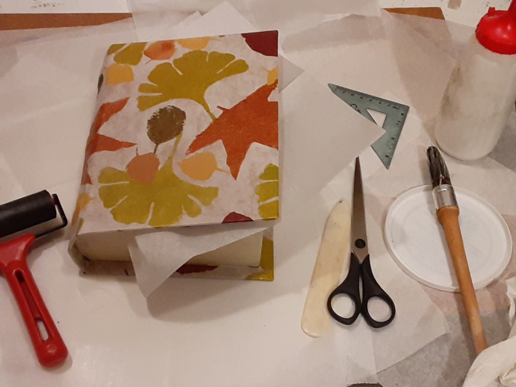
Glue is applied to the paper within the crease “marks”, the open box is laid onto the glue, then the box now loosely covered with glue-y paper is gently closed. I use a roller to press the paper firmly in place, wiping away any excess glue. Next, as in the photo below, I add glue to the flaps of paper and fold them around the edges of the box using a bone folder to get the creases smooth.
Then after carefully gluing all edges I turned the box over to check the paper placement.
Inserting wax paper allows me to close the just glued box without accidentally gluing the box shut.
At this point, Tuesday evening, I let the book box dry for a few days. It will be dry to the touch within hours but I have learned the hard way that too much handling too soon can cause the paper to slip.
Then the next day saw the news of the insurrection…
Here’s the fiction book I read as a spirit restorative…
The beverage in the picture is Clancy’s Special Chocolate and here’s the sketchbook drawing I did about how to make it. Whenever I feel stressed it helps to draw whatever is in front of me.
In case you wonder: I get my archival glue and other book-box-making supplies from Twinrocker.com
A helpful technique book about making boxes by hand is by Franz Zeier titled Books, Boxes and Portfolios; binding, construction and design step by step.
There’s still more to do on this project. So I hope to see you here next Monday after, hopefully, a more quiet week – but I know it’s not likely to be quiet here in the US – but no matter what kind of week it is I wish you some calm creative moments.
I’ve illustrated Pembral Forgets written by Steve Tubbs and in my last post I talked about my process of creating the cover and my leaf motif that flows through the book.
Well here, below, are some of the finished illustrations with the text so you can see what I mean.
Later on in the story there are some really large leaves… but as you can tell from the images above I depict leaves from a distance as well as nearer to hand.
I also use leaf shapes as logos on story related objects… for example in the photo below look for the leaf on the sugar and the market sacks. I do this in multiple places within the story in order to emphasize the fall leaves aspect of the story – and to visually bring the leaf motif and good food motifs together.
There are illustrations on every one of the 38 pages of Pembral Forgets… lots of leaves blowing through this book!
Since the author Steve Tubbs was inspired by thoughts of himself as a kid and memories of his own mother – I wanted my illustrations to have a warm soft nostalgic feeling in addition to the colors of Fall. So I used a cream colored handmade watercolor paper for my ink and gouache illustrations.
And here, below, is what the printed artist book cover looks like. My leaf pattern reproduced well and I’m very pleased with the color reproductions! You can access the printed books here https://www.blurb.com/b/10507043-pembral-forgets
Since the warm, creamy, yet fall colors are what I wanted for the pages in the artist book reproductions – I’m also making the original artist book box (talked about in my last post) have a similar cream color on the book-shaped box edges where pages are.
I still have lots of work to do on the one-of-a-kind artist book box that will hold all of the original illustrations and text. Also there’s a few more pages for the one-of-a-kind book to do…. more about that in future posts.
And I’m in the process of making a webpage about Pembral Forgets. It includes a short conversation with the author, Stev Tubbs, as well as images of more of the finished art. You can see it here: https://sueclancy.com/portfolio/pembral-forgets/
But in case you think I came up with the cover and these illustrations perfectly right from the first: Here’s a leaf motif pattern I tried before hitting upon the motif and color scheme I finished with.
I decided this leaf pattern was too green and too uniformly regular. Then I proceeded to do the pattern I showed you in my last post and what you see on the Pembral Forgets finished book cover. But as a pattern design goes this more-green autumn leaf pattern was fine – it just didn’t fit the creamy nostalgic vibe I wanted for Pembral Forgets.
I’m still happily reading “European Travel for the Monstrous Gentlewoman” by Theodora Goss – and taking things a wee bit slower but I’ll see you here next Monday! Stay safe – and here’s hoping for a better new year for everyone.
Mid November 2020 I was asked to illustrate Pembral Forgets by Steve Tubbs. It’s a story about fall leaves, good food and an absentminded boy who forgets something important.
In mid December I took a social media break in order to focus more intensely on my illustrations. (There’s 38 pages of illustrations!) I’m glad I took the break as I think my illustrations for Pembral Forgets are some of my best work so far. The story written by Steve Tubbs was great inspiration!
I finished the illustrations and uploaded the digital files for the artist book reproductions on December 21 and told the author Steve Tubbs that Pembral Forgets by Steve Tubbs was now available! (You can preview the reproductions of the artist book via this link here)
Then I shut off my screens and have since been recovering from my creative efforts. Reading books and cooking are my go-to restoration methods and it’s really helped to spend time deeply reading in a novel! And trying new-to-me recipes! Truth be told I’m still in this hibernate and recovery mode.
Still, because it may amuse, I wanted to share some of my working process on this artist book project.
Since fall leaves are a theme in Pembral Forgets I studied leaves I found in my yard and neighborhood. I both drew them in my sketchbook and photographed them….here’s two of the photos
Then out of thick mylar (a sheet of clear plastic) I drew the leaf shapes with a marker and then hand cut stencils in the shapes of several different kinds of leaves. The masking tape tabs on the edges of the mylar make it easier to lift and move the stencil when in use.
With a sheet of handmade paper taped to a board on my easel I set about using the 5 different stencils I’d made. I mixed acrylic paint colors and used a natural sponge to dab into the color and then onto the stencil. This overall leaf pattern was done over a multiple day period to allow for layers to dry.
My spouse snapped the above photos so they could be shared digitally with the author Steve Tubbs and his wife. The pandemic being what it is – the project discussions between the writer and myself were all virtual.
Here’s what the finished leaf pattern looked like while it was on my easel with still wet paint.
And here’s what the cover for the artist book reproductions looks like:
Variations of this leaf motif carries throughout Pembral Forgets….
When I create books I think of them, as an art object. With the attending artistic concerns about rhythm, balance, beauty and, in my case, pleasantness. For this project I was inspired artistically Steve Tubbs’s story Pembral Forgets and did my own artistic response to his story.
My way of working also means that most of the time my book creations have, in addition to the multiple print and ebook reproductions, a physical one-of-a-kind book-like-art-object.
Sometimes there’s a series of framed fine artworks related to the books – see my Alphapets and Alphapets Too projects for examples or my portfolio page generally.
Anyway, here’s the book-box for Pembral Forgets that I’m still in the process of constructing.
I will show pages and talk about my illustrations for Pembral Forgets in coming blog posts. My hand is still very tired so I will write more later…like next Monday.
If you’re curious: I’ve been reading the novel “European Travel for the Monstrous Gentlewoman” by Theodora Goss.
One of the meals I’ve enjoyed cooking recently is a pasta, cheese and pepper dish I’d read about on the Food In Books blog – https://wp.me/p75xYM-1bY – I don’t know if I’d read the novel talked about in that blog post but it’s fun to see the novel that inspired the blogger’s recipe. I can tell you, for certain, that the pasta, cheese and pepper recipe in the post is a winner!
Since I’ve been asked by several people: here’s info about the art media gouache, why it makes me grin and my working cycles with it.
Gouache is a water based paint. It’s more opaque than watercolor. Using gouache feels like spreading soft butter on toast. Applied gouache dries quickly but is easily made moist and workable again. It dries to a matte non sticky appearance which makes it suitable for use in bound sketchbooks, in folded artist books as well as for fine art to be framed. Gouache also reproduces well via various printing mechanisms on fabrics, in printed books and on many other surfaces.
In the studio, because I don’t have to worry about my gouache paints becoming unusable on my palette before I can use them (as is sometimes an issue with acrylics), gouache is suited to my busy life. I call this my gouache and grin cycle.
I prefer to work on multiple art projects at a time in “short bursts” on each project. Rather than count on a long span of uninterrupted time I dash in and work a bit on an art project, then go make lunch or do whatever stuff-of-life or other work matter that needs to be done. Then I cycle back to an art project…
To borrow a sports analogy I just try to advance the ball, my various art projects, a little bit each day rather than doing a project all at once. I try to amuse myself with whimsical art making, aka spreading color, for at least a few minutes every day no matter what else is happening in life. The qualities and attributes of gouache help me to do this, to keep my creative games in play – come heck or high water.
Here’s a series of photos showing my gouache working methods in my sketchbook. (This is also my work method for fine art and other projects.) In the first photo you see my 3 x 5 inch watercolor sketchbook held open with clips. Also pictured from the top left and rotating clockwise: paper towel, peppermint candy model, graphite pencil, 3 watercolor pencils, 2 waterproof ink pens, a water brush and my lidded paint palette with its wells of various dry gouache colors.
In the photo below I begin 3 demo peppermints: the top left mint is sketched in graphite pencil and waterproof ink pens. The bottom left mint is drawn in watercolor pencil only. The mint on the bottom right page was doodled in all of the above; graphite pencil, ink and watercolor pencil. [The quote was just on the sketchbook page I chose to use for this demo.]
So you can see what they look like here in the photo below are two tubes of gouache paints. I like the Holbein Artist Designers Gouache brand best but the Winsor and Newton brand is good too. (There’s a monster called “acryla gouache” also available on the market which I avoid like a character would avoid a flesh eating zombie in a horror film.)
I begin painting by laying down the local color – the general color an item is supposed to be. At this point I don’t worry about shadows or highlights or details. I just get the color shapes down – in this case for the peppermint candies.
I did not squeeze out new paint from my tubes when I began. I got my water brush wet and put a few drops of water on the dried red gouache already on my palette so I can use the newly moistened color. I add a small amount of moisture to a portion of the dried chunk of red gouache until that portion feels like soft butter, then I paint the candy stripes.
Here’s a closer look.
Now I get the general color and shape down for the wrapper in the same method. I put a drop or two of water on my blue gouache color, get my brush damp, dab at the blue paint a second or two to get a portion of it moistened and softened – then I paint.
Now I create the cast shadows using a watery mixture of the red and blue gouache colors. To make the watery mixture on the lid of my palette I dipped my brush on the now moist blue color, dab on an area of the lid, then dab the brush clean on the paper towel, then dipping into the now moist red and adding it to the tiny blue puddle, mixing till it’s a purple color I want for the shadow. Then I add a tiny bit of plain water to the newly mixed purple till it’s a small fingernail size puddle of watery purple – this enables me to do the cast shadows in a faint shadowy way.
Now I do squeeze out a tiny amount of the white gouache from the tube and use it, fresh from the tube, to make the highlights on the candy and wrappers. Note in the photo below how the white gouache can completely obscure the darkest ink lines. This is part of what I love about gouache – any mistake can be covered with the opaque paints. If an edge in a painting needs to be softened or a color edge blended all I need is a wet brush.
Then in a few minutes, perhaps the length of time it takes for a decent sip or two of coffee, when the paint is dry I go back over the paint with ink lines or watercolor pencil lines to snap the details into sharper focus.
Now that I’ve finished painting I leave my sketchbook and my palette open and let them dry completely. I even leave the shadow color mixture on my palette lid to dry. All I will need to do to reuse the mixed color in the future is to get my brush wet and dip in.
Peppermints are one of my guaranteed-to-make-me-grin art subjects that don’t require a lot of time or planning. I’ve learned over years of painting peppermints that different candy makers have their own peppermint candy look. And I don’t mean the wrapper.
Here’s a fabric pattern I did of peppermints for my Spoonflower shop. I used the gouache techniques I describe above to create this pattern. But do you notice how these mints are different from the ones I did in the demo above? Different candy maker… yummy too!
To illustrate what I mean about working in short bursts despite life situations. A hot water pipe burst on our hot water heater recently. (Talk about heck and high water! 🤦♀️) After we got the immediate crisis dealt with I did little quick bouts of drawing as a self calming technique. Also while waiting for plumbers etc restoration crews I doodled and painted in my sketchbook. Gouache makes it easy for me do short bursts of spreading color which makes me smile. And having had a brief grin makes dealing with life much better.
Anyway, there’s a new artist book I’ve done for children called “B Mouse Reads A Book”. In it you can see my original ink and gouache artwork, and how the art media is on folded paper in this video on my YouTube channel. Because this book was meant to be handled in a gallery I used a spray fix varnish to make sure the gouache wouldn’t smear or run.
But since the pandemic hit there’s no going to art galleries to handle or view artist books in person. So I was lucky enough to have “B Mouse Reads A Book” published as an ebook here on Storyberries.com! They also included the book B Mouse is reading too…it’s another artist book I created as part of the B Mouse Reads A Book story…there’s a link at the bottom of the B Mouse book that you can click to see the companion book.
I’m sure you can recognize in the image above the ways I did my combinations of ink and gouache. The video shows how flexible gouache can be when applied on paper bound or folded as pages. The ebook shows how well the nuances of the colors show even as a digital image.
If you look at my portfolio pages you can see my ink and gouache work as both fine art framed in an art gallery setting as well as reproduced in printed books.
That reminds me to tell of another practical matter: if you apply gouache too thickly it can pop or flake off. Especially in a folded or bound paper book. And when scanning or photographing gouache artwork for reproduction a too-thick gouache application can cast shadows unrelated to the artwork subject. So I apply gouache as if I were basting bread with semi melted or melted butter.
I hope you’ve enjoyed reading this and found it helpful for when you try gouache yourself.
See you here next Monday. And in case you’d like to know even more about gouache – here below are a few links to more information about painting with gouache:
It’s barely been a week and Numpurrs on Storyberries.com has been read over 3000 times! Here’s one kind comment:
“Thank you, this is exactly what teachers are looking for, online opportunities during virtual teaching makes teachers lives so much easier. That was perfect timing! And a beautifully illustrated and written book! The weird thing is, I just did a cat drawing lesson for 1st grade. Now we can read the book and learn how to draw a cat!”
So this week quickly filled with additional efforts to help teachers and parents: I also made a poster, a calendar and then a 676 piece jigsaw puzzle too.
Here’s what the poster looks like. It’s big, 23 inches square, big enough to be seen in the backgrounds of online classes.
My copies of the printed book version of Numpurrs also arrived at my studio this week! So I photographed the book and created a portfolio webpage to hold all of my work on Numpurrs in one spot – to help the teachers find things easier – here’s that page https://sueclancy.com/portfolio/numpurrs/
Below are just a few of the photos of the printed book…you can see more on that portfolio page I just mentioned
I’m pleased with how the book turned out! Of course I can nitpick and find things I could have tweaked – that’s always the case with any creation. I think of art making as similar to cooking, you do your best to create a good meal then you say “good enough, let’s eat” and you go on to the next thing. Perhaps you make a note for yourself on that recipe as to what you’d do differently in the future – but you enjoy the meal as it is and you go on.
Speaking of going on: for years now I’ve been regularly jotting short poems in a small 3 x 5 inch book with my fountain pen. Now, as per discussions with the people at Storyberries, I’m working on illustrating some of the poems for a new book. As I wrote my last post I’d thought I’d do more on this new project this week than ended up happening – so more on these illustrated poems in coming posts.
Here’s a look at my little poetry sketchbook with some of the potential to-be-illustrated poems flagged with sticky notes.
I write with a fountain pen because they’re refillable. Fewer plastic bits of discarded pens to end up in the landfill this way. Besides a fountain pen – if you have a good quality one – can be super smooth to write with.
For those who say a nice pen and hand bound book would be “too precious to use” I reply “your thoughts are precious too”. Buy quality supplies and use them with joy. It’s just stuff on Earth here to be enjoyed. (And if you just can’t bear it then buy whatever supplies you will actually use and get your thoughts written down. But remember that you really deserve the best.)
Below is the dragon poem you can see my handwritten draft of in the photo of my book above and the handwritten poem and illustration I got done this week with ink and gouache on nice paper.
More of that kind of thing here next Monday – I hope. Thanks for reading. Have a good week.
There now! Despite all the odds (see last post) I finished “Numpurrs”! I’ve also sent it in to Storyberries for distribution. When I sent it in this last week Storyberries said “I just LOVE it Sue!!! It has come together so nicely !!!! Thank you so much for sharing your beautiful work with us!!”
So I think it’s safe to say that they’re pleased! The book will be live on Storyberries.com very soon as they said they’ll “…schedule it for 9am Gold Coast time Australia on Monday morning.” Which works out to about 4 pm in Washington state, USA on Sunday. And I post these blog posts on Mondays but write them on Sunday morning’s… so, yes, I can have a bit of time zone confusion.
Time zone differences between where I live on the western US coast and the time where Storyberries is in Australia can confuse me even when I have help from the internet. My solution to working across continents and time zones is the same in publishing as it has been when I’ve done fine art exhibits outside of the U.S.A; get it all done early and everything into their hands as soon as humanly possible then let the people I’m working with sort the what-happens-when out at their end.
It helps that I work on the graphic design part of any book almost simultaneously with creating the fine art illustrations. This way by the time I finish creating the fine art illustrations I’ve almost finished the book design too.
The graphic design informs and affects my illustrations – in the number of illustrations needed, the size of them and so forth. But what I want to do in the first place with my illustrations/fine art at my easel (using ink and gouache on board) will also affect the graphic design.
This interdependence (and writing the poem is in there too) is related to the construction of my book idea in the first place in a which-comes-first chicken-or-egg kind of fashion. As a result of my working method the posting I do online nearly always slightly behind the action. My motto is create the thing first talk about it later.
Anyway, here’s a pic of me working on my laptop doing the book layout. I often do my computer work in the corner of my dining room near the cookbooks and am almost always cooking something on the stove. Taking breaks to stir something on the stove is so nice!
Sue Clancy creating “Numpurrs”
And here are the last poem lines in my book:
Twenty butters bread, risen with yeast
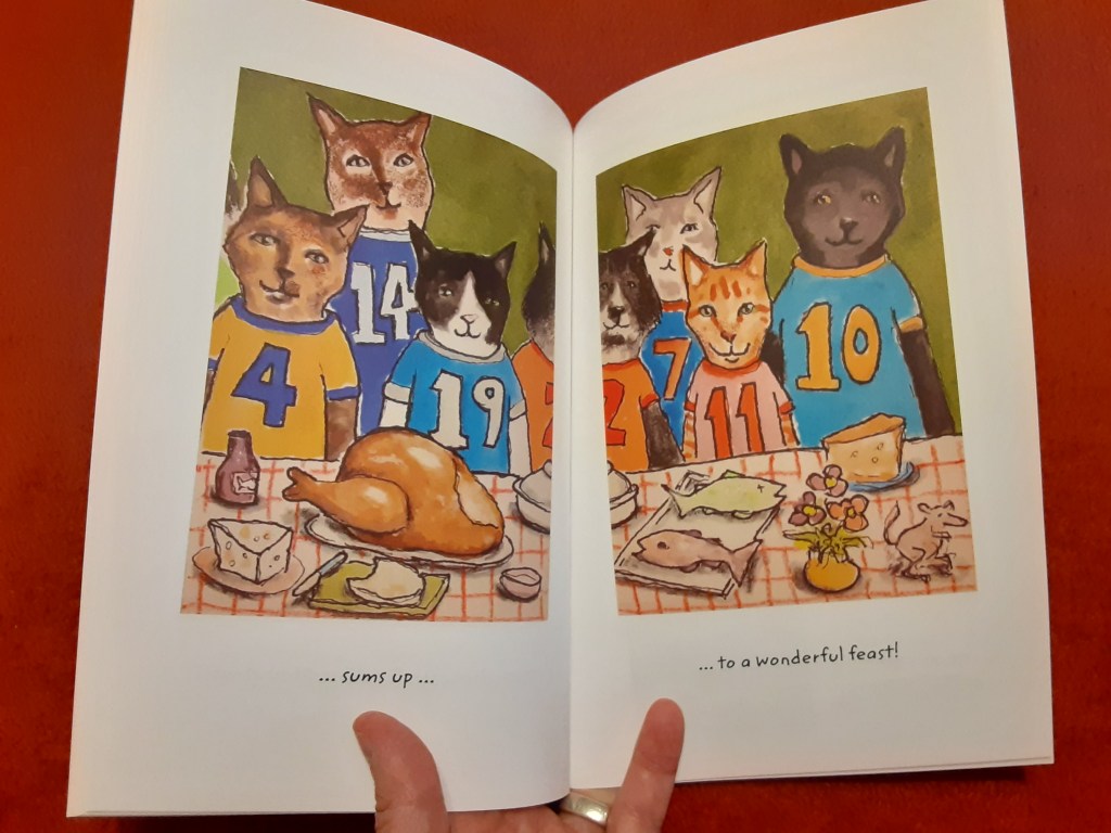
And it all sums up to a wonderful feast!
In the printed book my three panel “feast scene” will flow in sequence left to right and will line up side by side. But it worked pretty well in scroll ebook form too even tho it doesn’t line up at the edges. As I worked I had to think of both of these “flow” patterns when I was creating the images.
Even though I’m doing so much myself – which sounds like a lot of freedom – there are still constraints: page flow, number of pages allowed within the publication formats, where the blank pages must fall, printing product options, ebook construction and so forth. I see these constraints as the path, the way forward, the technical issues become part of my creative process.
When it came to creating the feast scene artwork in Numpurrs I consulted this book, Food and Feasting in Art by Silvia Malaguzzi
Many of these art historical images had the viewers eye moving left to right and or moving up and down. This served as a guide as I created my cat feast illustrations. (I love art history!)
Running into the graphic design publication constraints I mentioned earlier I only had 3 pages within which to fit my feast. When, in an early sketch, I fitted all 20 cats in – the cats were too small and the numbers couldn’t be easily read. Since the point of the book is to distinguish between cats and to recognize numbers I decided to make the cats and numbers bigger even tho it meant leaving out some cats.
Besides at almost every group photo I’ve ever participated in there were several people who declined to be in the picture. Perhaps we can pretend some of the cats in my artwork were similarly shy?
After sending everything in to Storyberries, and after being given the release schedule, I was asked to send in a new photo of all three of the feast panels as one image. There are design constraints and issues at their end too – and we’re in this project together. So I hustled (time zones remember…) and sent this photo in:
Since my book idea is about distinguishing between cats and numbers I also used 4 of my allotted pages to include the photos of real life cats that my friends had sent to me for use as reference to create my artwork. Like the feast scene artwork not every cat illustrated in the book is on the cat photo pages… again it was a case of if I fit in every photo the cats were too small to see well. And in some cases the photos my friends sent was fine for my art reference use but it wasn’t high enough resolution for a printed book. Since I’m doing both print and ebook forms I had to design for both to look the same. Perhaps it can add fun to also distinguish which cat is there and which isn’t and also to see some of the source material I worked with?
Here’s what the Numpurrs book cover looks like, and the dedication page where I thank my friends for all of their help.
This weeks work on Alphapets Too my sequel to Alphapets by Clancy at the request of my fans and Storyberries – the publisher/distribution house I’ve been working with! (See my last post for details)
The Alphapets Too pet portrait project this week is brought to you by the letters Q, R, S and T. Here’s my abecedarian poem to go with these letters and artwork :
Quinn qualifies for the fun race
Rico really likes outer space
Sailor stares right at the thumb
Toodles tries bites of the plum
Here’s the artwork (somewhere on each piece is an alphabetical letter):
I did portraits of a turtle, butterfly, goldfish and an iguana.
While I was rereading Aesop I was also thinking about possible characters for the letter Q. So Quinn is a turtle who is a foot race enthusiast.
My portrait of Rico was inspired by the expression “the butterfly effect” which, roughly, is about how we are not alone in this world and our actions, however small, affects others. Also in my mind as I painted was the idea that we are literally made of stardust, that chemically humans are no different than the rest of the natural world. We are all interrelated.
While I was reading inspirational quotes and etc spirit-lifters I read, again, this quote from Albert Einstein “If you judge a fish by its ability to climb a tree it will live its whole life believing itself to be stupid”. So here’s Sailor whose name reflects his true abilities.
Long ago on a planet far far away (or so it seems now) I worked as a biological illustrator. One of the many animals I shared an office with was an iguana. Often I would bring food scraps from home to share with my animal office mates. The iguana seemed particularly happy when I brought fruit. So Toodles is portrayed as enjoying a plum and possibly plotting to get more.
Like my first series “Alphapets” this artwork, too, is created with ink, gouache and color pencil. I do these portraits on board, size 3.5 x 2.5 inches. The original art will be framed…eventually … and be a miniature art exhibit at the Aurora Gallery.
I will also be making an artist book titled Alphapets Too – in a format like “Alphapets by Clancy”. You can see print and ebook versions of “Alphapets” by clicking here.
And when I get it all done “Alphapets Too” will be available on Storyberries.com (Btw: there are two different stories by me currently on Storyberries.com- search the site by my name)
You can follow my progress during the week on my Instagram pages and see the details of my creative process here in my Monday blog posts.
Thanks again for your support and encouragement as I work on this project!