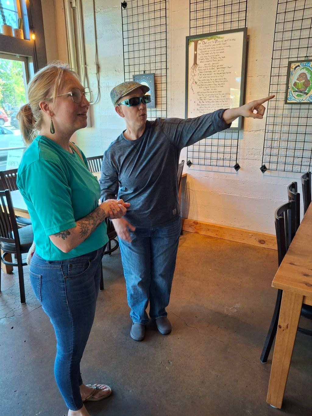
My kitchen sketchbook methods

A Creative Life, art exhibit, art techniques, Art Word Combinations, artist book, artistic inspirations, author illustrator, Books In Art, food in art, functional art, illustrated recipe, kitchen art, published art, recipe illustration, sketchbook, sketchbook suppers, Sustainable creativity, visual story

What’s for dinner? I began keeping a kitchen sketchbook years ago so I could answer that question with a reliably pleasing meal. In a blog post recently I talked of how my kitchen sketchbook, a sketchbook solely devoted to the topic of food, is “feeding” my current fine art series to be exhibited later this year. After posting someone said they’d be interested in my process of ‘kitchen sketchbook keeping’ as they’d like to create such a keepsake for their family. So my process goes like this …

I see a recipe, in a library book, a cookbook I own or online ( I follow some food blogs and Instagram accounts: Food In Books, In Diane’s Kitchen, TikiChefKim ) and I decide to try the recipe. Here’s a cookbook I found in my local library. I looked through it identifying several recipes that look possible.

Often in reading the recipe I realize that it includes an item someone at my table is allergic to, or strongly likes/dislikes, or the recipe includes an ingredient I don’t have in my cabinets. Some adaptions, adjustments, are made. In this case, pictured below, I don’t have Borlotti beans so I substitute Cranberry beans (another Italian dry bean) which I do have. I write my adjustments on my scrap of paper.

And here’s a close up of my writing on the scrap of paper.

Things I’m looking for in a recipe are: easy to make, variable when served as leftovers and yummy for the people at my table. Sometimes it can be a day or two between reading a recipe and doing the actual cooking. Whenever I do start cooking I tweek my notes on my scrap of paper.

The first meal of my Cranberry Beans and Cabbage with Rosemary Breadcrumbs was served alongside sauteed Brussels Sprouts for a vegetarian dinner. It was an easy meal for me, the cook, to prepare: I didn’t have to spend lots of time in the kitchen fussing and could work in my art studio while the beans cooked. The meal, as served, tasted yummy to both me and my spouse. So I saved my scrap of paper with my recipe notes. (If the recipe had been too fussy, or not yummy, the paper scrap would be discarded)

The next day was a busy one so just before lunch I hurridly scooped some leftover Cranberry Beans, Cabbage and Breadcrumbs into individual portion size oven safe dishes, threw a few frozen Itallian meatballs onto the beans, covered each dish with aluminum foil, put them into the oven for 30 mins and returned to my art project. When the timer went off lunch was ready.

Lunch was quite quick, yummy and got high mark’s for its ease and versatility! So the scrap of paper with the recipe got slipped in to its potential spot in my kitchen sketchbook. The next day was similarly hectic so the third re-heat of leftover Cranberry Beans and Cabbage was similar except I put an Itallian sausage in place of the meatballs.

The result was so yummy that this recipe, as adapted, earned “keeper” status, meaning it goes into my kitchen sketchbook.

During the next available 10 minutes I did a short-burst and, all at once, wrote my adapted recipe in pencil in my kitchen sketchbook.

A few days later I spent 5 minutes or so using a Micron ink pen to write over the pencil, tweeking the lettering spacing as I inked.

On still another day during another spare 5 minutes I did more inking, tweeking wording and letter spacing as I went. In the pic below you can see how different the ink work is from the original pencil.

On still another day I snuck in a moment and I erased all of the pencil marks.

Then on successive days as I worked on other art projects whenever I had a bit of color that’d also fit with something on my recipe page I’d take a minute dab the color into my kitchen sketchbook, leave the sketchbook open to dry, then I’d wash out my brush and return to my main art project.

I used color and boldness of ink to indicate ingredients and order of instructions. So in the future I’ll be able to glance through my sketchbook and easily plan dinner!

My kitchen sketchbook is 3.5 x 5 inches when closed and a half inch thick. It’s pages are a lightweight watercolor paper that takes ink and gouache fairly well if I don’t get too vigorous with it.

For my upcoming art exhibits this year, as part of my, ahem, bibliography, I’ve made artistbook copies of my kitchen sketchbook titled “Favorites So Far”. You can get a copy in advance via this link. As published the book is 8 x 10 inches, a bit larger than the original sketchbook.

And now you know how my busy, we don’t want to starve, art studio solves the “what’s for dinner” question.

Midnight in the garden of veg and cheese

A Creative Life, animals in art, art techniques, artistic inspirations, Books In Art, Cats in art, Dogs in Art, drinks in art, food in art, magic realism, mundane and magical moments, reading in art, visual story

This is the fine art piece I said I was working on in my last post. It’s titled “Midnight In The Garden Of Goode And Weeval”. If you look closely at the art you can see a plate of veg and cheese.

“Midnight In The Garden Of Goode And Weeval” by Clancy – 8 x 10 inches- ink and gouache on board

One recent evening I made a spread of assorted veggies and cheeses for a light dinner. As I assembled the plate I fondly remembered the light and yummy plates of fresh veg, fruits and cheeses that my adopted Mom would make – even late at night – during our visits. That memory merged with memories of travels to New Orleans, visits to a Portland gardening store where I marveled at the colorful planters and the novel, which I’ve read, by John Berendt titled “Midnight In The Garden Of Good and Evil”.

So as I worked with my inks and gouache paints I tried to create a riot of color to reflect these thoughts. My paintings title, a pun on Berendt’s book, also mirrors my kaleidoscopic impressions – all of which were inspired by a plate of veg and cheese.

If you’re curious about my recipe for “light and yummy…plate of veg and cheese” look here.

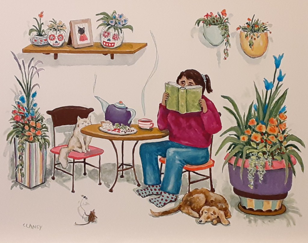
Sketching a light dinner

A Creative Life, art gallery, artistic inspirations, Books In Art, drawing as thinking, fine art, food in art, illustrated recipe, kitchen art, mundane and magical moments, Not-So-Sketchy-Food, reading in art, recipe illustration, sketchbook, sketchbook suppers, Sustainable creativity, visual story, words and pictures

Here’s a page from my kitchen sketchbook. It’s relevant to a fine art piece currently in progress; a reader having hot tea and a meal like this.

Page from “Favorites So Far”

I’ll post about the fine art when it’s finished. Stay tuned.

You can see more art from my readers series at the Caplan Art Designs gallery. www.caplanartdesigns.com

I really mint it

A Creative Life, artistic inspirations, fine art, food for thought, small things, still life, story, visual story

Typically I paint food and drinks from my memory and imagination. Sort of.  I take my sketchbook along and draw from life what I’m eating or drinking. But when I get paints out in my studio to do a “real” fine art piece I’m winging it from my sketchbook-aided memories of the food flavors and presentation.  Recently I’ve done something different.

I’ve been working from “live” models in my studio. Here are my models as they came from the store:

StudioModels72

Clancy’s art studio “models”.

You see, I’ve been thinking of that moment during a nice dinner out, when the waiter brings you some after dinner mints, and you sit with your friends munching them and gentling into the rest of the evening.  But I can eat mints pretty quickly. (Mint is one of my favorite flavors) And in such a situation I’m usually focused on the conversation. So have I ever really looked at a mint? I mean really looked?

I bought some mint candies as art models for the serious artistic meditation thereof. And while I did look at (and eat) them I still ended up somewhat “winging it” when creating these paintings:

I think as paintings they worked out okay. While I tried some different colors (the purple, the teal and the orange) I feel I conveyed the minty goodness of the candies. I also think I managed to imply a story in each of them, at least an implication of people eating the mints.

At any rate I have really looked a mint now. Really looked.

riding the PR train

A Creative Life, art exhibit, art gallery, fine art

Kurt Vonnegut once said “Use the time of a total stranger in such a way that he or she will not feel the time was wasted” and I’ve taken those words to heart. I even have Vonnegut’s statement pinned to the wall above my art studio work table. I believe that my creative out-put is not about me. Art-making is not some self-indulgent ego-trip on my part. It’s about the kind of world we are creating together; me and all my friends, pre-friends and strangers. We are all in this together.

Which is why, even after all these years of being a professional artist, I still have mixed feelings when I see PR stuff with my name prominently as the “featured artist”.  On the one hand a one-person fine art exhibit is a culmination of at least a years worth of daily work on my part – so I’m proud of what I’ve accomplished. Yet at the same time I’m very aware that while it may be my name on the marquee, so to speak,  there’s a whole host of people behind me, believing in my artwork, working hard to make the event successful; the gallery owner, the gallery director, the interns and assistants in the gallery to name the obvious ones.  When the opening reception (as it is for my October exhibit) is also a 3 course dinner with wine pairings – there is also the restaurant (Daily in the Pearl!), the chef, the winery (Hip Chicks Do Wine!) – all working hard too.  And I didn’t mention the art supply stores in my beloved Pacific Northwest that provide materials for me to work with… or my spouse, friends, neighbors…. I’ve so many people to be grateful for that I’m not sure the Internet has enough bandwidth to hold my entire list.

So let it suffice to say that while my name may be the most prominent in the PR materials being circulated currently – like this email flyer (below) that the Caplan Art Designs gallery sent out – as well as all the other stuff on Facebook and Twitter etc. This whole exhibit is really about an overall aesthetic experience we’re creating together; my artwork is just the focal point.  Still I have endeavored to use the time of my gallery owners, friends, supporters and strangers as respectfully as I know how… and now I’m riding the PR train, doing my best to support my supporters efforts, prepping for the next stop; the night of the opening. And all the while remembering; It’s not about me, it’s not about me, it’s not about me… choo chooo!!!!

Having trouble viewing this e-mail? Click here to view in your browser.
Please let us know if you no longer wish to receive these emails. You can unsubscribe instantly.
Caplan Art Designs
Cooks, Corks and Co-conspirators

Saturday, October 1st @6:30

Daily Cafe

Featured Artist

Mixed Media

View More Art

Art
Menu


 If the menu is not current, please check back, special diet needs are available upon request.
 
Wine pairings by Hip Chicks Do Wine and a special three course dinner.
 
Featured artist, Sue Clancy will be raffling a modal scarf with one of her design pattern used in her work.
Caplan Art Designs
 
1323 NW 16th #1001/entrance on Pettygrove
Portland, OR 97209
503-319-6437
Send to Friend Twitter Facebook
If you no longer wish to receive these emails, unsubscribe instantly.
Powered by Weiner Design

Upick Book Farm Art

A Creative Life, animals in art, art exhibit, art gallery, books, fine art, handmade papers

Finished a new art piece destined for the Caplan Art Designs gallery one-person exhibit I’ll be having in October!  The opening party will be a 3 course wine dinner party at The Daily in The Pearl. You can get more info about that on the Caplan Art Designs events page  – look at “Cooks, Corks and Co-conspirators”. Yep, I’d be a considered a co-conspirator. Anyway, here’s the info about this newbie art piece:

U-Pick Book Farm

By Sue Clancy

12 x 9 x 1.5 inches

Hand dyed paper, handmade paste paper, hand woven paper, found paper, acrylic on cradled board

And, if you missed my prior blog post where I told and showed about this artwork in progress here’s a bit about my thinking behind it:

U-Pick Book Farm by Sue Clancy

Combining the concepts of local u-pick fruit and vegetable farms with local libraries that have baskets for a patron’s book harvest and adding the burrowing, digging instinct of a dachshund.

UpickBookFarm72

U-Pick Book Farm By Sue Clancy 12 x 9 x 1.5 inches Hand dyed paper, handmade paste paper, hand woven paper, found paper, acrylic on cradled board


Paws to Enjoy

A Creative Life, art exhibit, art gallery, fine art

exhibitphotobyAmy

Amy Caplan from Caplan Art Designs www.caplanartdesigns.com has installed my artwork at The Daily In The Pearl http://dailyinthepearl.com/events.html for an exhibit running the month of October! The theme I’ve been creating art towards (for over a year) is “Paws to Enjoy”. This installation is a well curated collection of all of the little moments I’ve paused (ahem) to enjoy!  And I’m sure you can imagine why my art theme has been paired with a fine restaurant and why the exhibit opening is a 3 course dinner and wine event.

As seen in a previous blog post here’s the exhibit statement aka “blurb”:

Paws to Enjoy

Life happens and Sue’s response is to pause and think about it by cutting up one-of-a-kind hand dyed papers, smearing glue on them and putting the cut paper pieces together again. She thinks about dogs, cats, and rabbits and soup, coffee, and whiskey. Then she sums up her thoughts and transforms them into literary images. This exhibit is a collection of enjoyable thoughts.