
words and pictures
-

Flying pigs, pastries and doodlebugs
One pig leads to another it seems. On my email newsletter I shared a flying pig and what inspired it. The finished painting was called “The Plot”. That in turn inspired another pig with wings to appear in my sketchbook. Which then became a painting titled “Higgledy-Piggledy” which I also shared in my email newsletter…
-

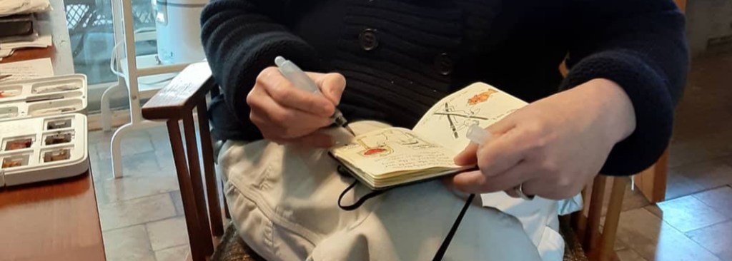
On playing with books, art and being wholly bent
I painted an unauthorized portrait of a playful cat that I’ve met courtesy of a dear friend. This portrait is titled “Wholly Bent” and is 10 x 8 inches. This is me just playing and working towards future art exhibits. Here’s a closer view of “Wholly Bent” it is 10 x 8 inches, ink, gouache…
A Creative Life, art exhibit, artist book, artistic inspirations, books, comfort food, fine art, gift books, hopepunk, household surrealism, illustrated poem, life of the mind, mental health, miniature art, pet portraits, poetry, printed books, sketchbook, visual thinking, whimsical art, words and pictures, Writing And Illustratingartist books, attention, attention development, being real, books, cat portrait, comfort, community, creativity, Dr Bobs Emotional Repair Program First Aid Kit, ethics, feed the good wolf, fine art, fine art exhibit, genres, honesty, hopepunk, kindness, kindness as a radical act, knowing yourself, mental health, play, play develops creativity, poem, poetry, potato soup, reading, reading widely, real, recipe, soup, words and pictures, writing, Writing And Illustrating -

Kids Read Aloud: Patch La Belle–And Other Playful Paintings and Poems By Sue Clancy
My regular Monday blog has been posted but I wanted to make sure people could see this fun video reading of my book Patch La Belle by Kids Stories and More ! Access to all of the fun things these long-time professional children’s educator’s have done is here: https://linktr.ee/Kidzstoriesandmore Here’s the link to the video…
-
Chapter 3: Readings From The Heart
I’ve been asked how I manage projects, like my “Readings From The Heart” exhibit, over a long duration. Half jokingly I replied “one bite at a time”. My joke is in reference to this saying I have thumbtacked to my art studio wall. Seriously though when starting I create a general big picture, a kind…
A Creative Life, Alphapets, Alphapets Too, animals in art, art exhibit, art gallery, art techniques, artist book, artistic inspirations, author illustrator, Books In Art, creative thinking, drawing as thinking, ebook, fine art, food in art, illustrated poem, illustrated recipe, life of the mind, mental health, pet portraits, printed books, public art, reading in art, sketchbook, story, Sustainable creativity, visual thinking, words and pictures, writing, Writing And Illustratinga creative life, art and life, art exhibit, artist books, artistic life, Aurora Gallery, being creative, books and art, Burnt Bridge Cellars, caplan art designs, creative life, creative project management, fine art, life of the mind, published artist books, selfpublishing, sketchbooks, Sustainable creativity, words and pictures, working on long projects, writing techniques -
cats book progress
I do better now, writing words-in-a-row, than I did once upon a time. Reading text has never been a problem for me – but speaking, and writing. Whew! Lets just say good speech therapists, theatre-acting coaches and writing class instructors are worth their weights in all the precious things in the world combined. As a…
