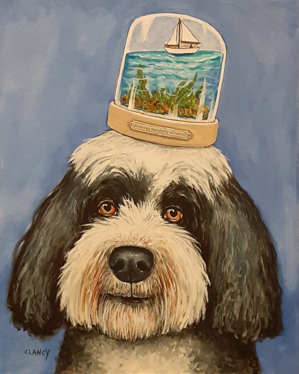
Desirous naturally of travel and Juggling Numbers

A Creative Life, art exhibit, art gallery, art techniques, artist book, artistic inspirations, creative thinking, dog portrait, fine art, household surrealism, life of the mind, Odditerrarium, poetry, psychogeography

I thought about travel this week and the newest painting in my Odditerrarium series is titled “Desirous Naturally Of Travel”. It’s a portrait of a Portuguese Water Dog who is contemplating sailing.

Here’s a closer look.

Like the other paintings in my Odditerrarium series this new one is 10 x 8 inches and was created using ink, gouache and color pencil on board. It will join its fellows at the Caplan Art Designs Gallery for exhibits later this year.

But on the topic of travel: in a variation of the curiosity game I shared in my last post -despite the pandemic- I have done a kind of travel using books, websites, Google Earth and streetwise maps.

I pick a country, a region, a culture and look for poems, prose and food preparations that originate there. As alluded above I will try as I can to look at online images of the actual places. Sometimes I’ve even looked for a hotel’s website and selected a room in which I imagine staying.

Recently I visited again some Native American Nations. I have a book of poems from a Cherokee poet in Oklahoma. A book of legends from various Native American Nations in the Pacific Northwest. A cookbook with sections covering various Native Nations in all geographic regions throughout the USA.

Here’s one of the poems I enjoyed.

From the cookbook “Spirit of the Harvest” I enjoyed the text about the three sisters: corn, beans and squash.

Inspired by the Iroqois for one of our meals I put together corn, pinto beans, zucchini, bell pepper, onion with some fresh cilantro and a bit of bacon with a tiny drizzle of maple syrup into oven safe bowls. Then I baked it all in the oven in the boat-bowls you see below. Yum!

Back in the pre-pandemic days I had a small shoulder bag I would carry when we went to locations. Since the pandemic began I used a version of my “travel kit” on a corner of our breakfast table where I write and draw in my sketchbook while we have our morning coffee.

Knowing that I enjoy “small but well made things” my wife found a new portable travel painting palette that expands and surprised me with it!

My sketchbook is 5.5 inches by 3.5 inches. The water brush is 6 inches long. The other two pens are 5.5 inches long. The new palette is 3 inches by 2.5 inches. As you can see below it will all fit easily into a small bag or jacket pockets.

The palette came with 6 empty half pans which I filled with my chosen gouache colors. In the photo below you can see the three separate parts to the small palette.

The three parts of the palette interlock together easily and securely.

The gouache colors I chose are: (top row) Primary White, Payne’s Grey, Moss Green (bottom row) English Red Ochre, Naples Yellow, Prussian Blue.

The colors are selected from my “butterfly palette” which was inspired by a scientific book called “Nature’s Palette: a color reference system from the natural world”.

I’ve been using my butterfly palette for my Odditerrarium series as well as my sketchbook. I like the soft gentleness of the colors so much that it’s fine by me if the colors I paint don’t exactly match the real life objects. I’m describing thoughts and feelings using my personal color vocabulary rather than strictly mimicking what I see in the world. What I see in the world is a starting point, a prompt you might say, for contemplation and storytelling.

In the photo below you see my new travel (ha!) palette and sketchbook at breakfast the morning after my wife gave me the portable palette.

Here’s another photo angle. See? Plenty of room for both breakfast and playing in my sketchbook without crowding the dog on my lap!

Below is another day’s sketchbook session. I had already cleaned the palette mixing areas (and the breakfast dishes) before I remembered to take a photo.

I’ve done a new book for Storyberries titled “Juggling Numbers” and like my last experimental art book “A Scoop Of Letter Soup” the new book flows up and down. The book is being released next week so I’ll talk more about it in my next post. But did you notice the unicycle in my sketchbook photo (above) and in this new book too?

I hope your week is smooth sailing or unicycling or however you travel it. See you next Monday.

pie places and mapping the mundanely magical

A Creative Life, artistic inspirations, author illustrator, food in art, illustrated shorts, maps, mundane and magical moments, psychogeography, travel art and writing, travelog, travelogue, visual thinking

In my early 20’s I worked as a graphic designer for the Center For Economic Management Research where I took business statistics and turned them into maps and all sorts of illustrations. It was fun to learn that there are magical people behind those dry lists of mundane numbers!

Well fast forward to today – and I still like maps. I think of map-making as sorting mundane information via my imagination. For example; I’ve recently taken my running around sketchbook pages that depict places where good pie can be found and have turned the accumulated info into a map titled “Pie Places in Vancouver WA”. You can find this map and my other maps here and here.

And yes, you can really go and get a yummy slice of pie from any of these real-life places:


on sustaining creativity

A Creative Life, art techniques, artistic inspirations, creative thinking, graphic narrative, illustrated shorts, psychogeography, sketchbook, Sustainable creativity, travelog, travelogue, visual story, words and pictures, writing and illustrating

Especially when I’m super busy working on a one-person art exhibit I rely even more on my sustainable creativity technique of “running around loose”.  I define “running around loose” as going about my nearby surroundings like a child or a dog in a park; poking about and exploring as if there are no time constraints in the world.  My cell phone gets turned off and shoved deep into the bottom of my bag. It is there only for emergency use on the scale of needing to call 911.  I don’t use the GPS function on my phone either. “Running loose” involves getting lost, losing track of time and generally living by-guess-by-golly (no preconceived plan) for an afternoon into the evening.

I’ll bring my sketchbook and write, draw and paint but I do it with no agenda, no particular project in mind. The idea is to play like a child or a puppy. To observe my surroundings with curious, free-associative, eyes.

This is particularly helpful as a refresher when I’m coming down to the wire on an art exhibit.  I’m to deliver all of the artwork for my upcoming one-person exhibit at the end of May – and before that there’s all the paperwork.  So I’ve got to be fresh and remember why I’ve done all this artwork – and even get excited about it again.

I’ve been working toward this exhibit for about one year. I’m a bit tired by the time the exhibit nears. But it wouldn’t do to have a “well whatever” attitude here at the finish line.  Thus my mega-recharge session.

Here’s what I did in my sketchbooks when I “ran around loose” recharging my batteries for a whole day in Vancouver Washington and Woodland WA :

OldAppleTree300

I was particularly struck by the various colors of purple that I saw on the grapes I ate for a snack – and the many different colors of purple in the tulip gardens and lilac gardens in Woodland WA. Here are some sketchbook pages:

After running loose for a day I felt pleasantly tired but like I’d had a mini-staycation. Great recharge session!!

Links for where I “ran loose”:

https://www.cityofvancouver.us/parksrec/page/old-apple-tree-park

http://www.lilacgardens.com/

https://www.hollandbulbfarms.com


four topic sketchbook keeping

A Creative Life, art techniques, artist book, artistic inspirations, creative thinking, drawing as thinking, ebook, kitchen art, psychogeography, sketchbook, sketchbook suppers, Sustainable creativity, travel art and writing, travelog, travelogue, visual thinking

Oh I’ve had an excellent question asked of me! Here’s the question: “Do you keep separate sketchbooks for different subjects/projects/media or do you use one sketchbook for all sorts of art experiments and ideas?”

My answer:  I used to keep one sketchbook but I found it hard to find the bit of research I needed because I’d have to flip through the whole book to find something.  Now I keep sketchbooks by topic.

Here is one of my “kitchen sketchbooks” – recipe inspired art – where I am inspired to draw by a recipe I’m cooking. This book is 5 x 4 inches in size, sewn binding and paper that can handle ink and water-media.  This way my favorite recipes are all in one spot – and when I have an ingredient I can flip through this one book to find a recipe that I know works and that my family likes.  This sketchbook, additionally, is my “testing ground” for ways to combine food, drink and art together – ways to interpret food/drink artistically.  This sketchbook is also a place where I’ll try new-to-me art media or methods. I’ve been trying gouache lately and I posted a few pages from this book the other day https://sueclancy.com/from-my-kitchen-sketchbook/ – Here’s what the outside of my current kitchen sketchbook looks like:

MouthpieceFourCover72

I have been working on a new series of fine art paintings with Cats as the main characters. So I have one sketchbook that collects my cat related painting practice and research. In it I’ve been studying cat shapes and experimenting with lines, colors. I’ve also experimented with combinations of collage, ink and water-media. This sketchbook is called “Various Cat Sketches” and is 8.5 x 11 in size, with a sewn binding. Here, below, is what the outside of it looks like. I’ll post more of it’s pages on this blog soon because it will contribute to an upcoming fine art exhibition

VariousSketchesCover72.

Another current sketchbook is my “Running Around Loose” book. This is the sketchbook that fits in my small go-sketching bag and is 3 x 5 inches, with a sewn binding, water-media ready paper in a landscape format. In this book I record my observations of the world around me; places I go, people I see, food or drink I have. It could easily be called a travel sketchbook  but I call it my “running around loose” book because that’s what I try to do as I run around town with this book – be loose and free with my lines, colors and thoughts. Here, below, what this book looks like. I’ll post more of it’s pages here too.  (I’ve posted my last sketchbook like this as an ebook titled “Glad To be Alive” available for download here)

RunningLooseCover72

And the 4th topical sketchbook is called “The Forked Tale: thoughts about creative life”.  This one is a hardback book 6 inches tall by 8 inches wide and over an inch thick. In it I’ve collected my thoughts, readings, quotes etc. about this business of being creative.  I’ve shown pages from this book to friends before who enjoyed it and found it helpful. But recently my friend Liesl was over for dinner and asked me a question about art-studio furniture. We kept talking about aspects of living a creative life and eventually I got out this book and shared it with her. She very strongly encouraged me to publish this book. So I will. After all she’d brought a very good wine to dinner. Here, below, what the outside of this sketchbook looks like.

ForkedTaleCover72

Yes, this method of sketchbook keeping helps me to organize and find things but keeping topical sketchbooks is also helpful when I only have a short span of time to work. I can select a topic and can get right to it because I don’t have to wonder what topic to paint/work on. 

Thanks for the question! I’d not thought to do a blog post outlining this method of mine before!

coffee sketches become fine art

A Creative Life, animals in art, art exhibit, art gallery, artistic inspirations, dog portrait, Dogs in Art, fine art, psychogeography, sketchbook, Sue Draws Dogs, travel art and writing

As you know I’ve been doing “coffee/tea cup research” lately. Here is a recent fine artwork I just finished titled “Café Paix”.  Paix is French for “peace”. I’m sure you’ll notice the cup.

cafepaix72

Café Paix by Clancy – hand dyed paper, handmade paste paper and acrylic on cradled board

One day my sweetie and I were on a busy urban street and we ducked into a café for a late brunch. There I was enchanted by the variety of people in the café – as well as outside on the street – and I thought “How wonderful it is to live in a such cosmopolitan region!

In my head I used the word “cosmopolitan” in the sense of “at ease with many different cultures”.  That dovetailed with the café menu (in front of me) which featured coffee drinks and foods from many different areas of the world.  So I made notes in my pocket sketchbook.

Later when I was back at the studio I did this finished sketch – which was a preliminary study for “Café Paix”:

pierre72

Pierre by Clancy (ink on handmade paper)

The sketch is currently at Caplan Art Designs http://www.caplanartdesigns.com and “Café Paix” will be there too for future exhibits after it has fully dried.


just looking and artist details

A Creative Life, animals in art, artist book, artistic inspirations, books, dog portrait, Dogs in Art, psychogeography, published art, Sue Draws Dogs, words and pictures

I’ve recently read a book about Balthus, a Polish – French artist painting in the late 20th century. He was convinced that the biographical details about a painter were not essential to the study of art. He objected to the wordiness of art books and said that a book about his artwork should be a book of pictures not a book of words about pictures.

When someone asked Balthus for biographical details he replied in a telegram:  “No biographical details. Begin: Balthus is a painter of whom nothing is known. Now let us look at the pictures. Regards. B.”

In many ways I share his viewpoint; let the pictures stand alone! Just look! Let each viewer’s own thoughts become the words attached to the art. This is part of why my most recent art book “Dogs by Sue Clancy” is largely wordless. Only 245 words and most of those words are in the very back of the book.

And yet I’m very aware that most people when looking at art also look for something that gives them a clue about what they are looking at – who created this? why? how?

I think some biographical details about the artist can also be helpful clues about the artwork. Art creation is a product of living one’s life and processing it via ones artwork – that includes an artist’s geographical location and era.  For example I came to the art genre of “animals/dogs in art” because of living for a time in Oklahoma where many people assume that climate change is a hoax. Many in Oklahoma have an anthropocentric view of the world, meaning that they see human culture is separate from, above and the whole point of the existence of nature. Humans are the most important being, nature is not important, nature is only for human use.

I did not and do not share that view. I see humans and nature as co-relational. Humans, animals and plants need each other. We are bringing forth the world together.

So I began, over 20 years ago now, to create anthropomorphic artworks depicting a merger of animals and human culture. All species and breeds are included.  Though I have periods when I focus on one species, like I’m doing now with my dogs, my work generally includes a range of life forms.  Even as I’ve worked within the “dogs in art” genre I’ve carefully tried to include a wide diversity of colors and sizes of dogs.  Metaphorically I’m illustrating that we are all in this life together.

Now that I live happily in the Pacific Northwest my artwork has taken on a joy that it didn’t have before. I am still doing my anthropomorphic art-style but my colors, shapes, lines, patterns have changed, my compositions have expanded, there’s more variety/diversity, more humor, there are even more dogs in my artwork and more pleasantness. Here in the culture of the Pacific Northwest there is a celebration of and careful care given to the co-existence of humans and nature. I’ve been learning even more about the relationship between humans and the natural world.  I think some of my thinking is reflected in my new book. In fact I’m not sure I would have created this book if I still lived in Oklahoma…

But enough with the words! Let us now look at a few of the artworks in “Dogs by Sue Clancy” https://store.bookbaby.com/book/Dogs-By-Sue-Clancy :


looking during lunch

A Creative Life, art commissions, artist book, ebook, psychogeography, sketchbook, travel art and writing

Doing some sketching on location for 2 different projects; one is a fine art commission project that has water and a sailboat in it (and a dog!). The other is a possible new artist book (maybe ebook?) that I spoke of in this “alive and sketching” post. Anyway… here are today’s sketchbook pages …

warehouse2372

“Warehouse 23” sketchbook page by Sue Clancy

sailboatonriver72

“sailboat on water” sketchbook page by Sue Clancy

alive and sketching

A Creative Life, art techniques, artist book, artistic inspirations, books, ebook, psychogeography, sketchbook, travel art and writing, travelog, travelogue

I have an ancient Sufi saying posted on my studio wall “Stay close to anything that makes you glad to be alive”.  So when I go sketching I’m looking for things in the world that catch my eye, gives me an artistic thought or two – and yes, makes me glad to be alive.

Which dovetails nicely with the Thanksgiving season. I’m glad to be alive and to be able to be an artist – and thankful for living in the Pacific Northwest surrounded by so much natural beauty and so many artistically inspiring places, people, dogs, cats and things… food and drink too…

So I’m flirting with thoughts of publishing my sketchbook as an ebook/artist book. Here are two of the potential pages about a place I hiked called “Hamilton Mountain”.

What do you think?  To publish or not to publish. That is the question to take up after the holiday.

hamiltonmnt72

Sue Clancy’s sketch on Hamilton Mountain (pen, ink and watercolor)

hamilton372

Sue Clancy’s sketch of things found on Hamilton Mountain


animals in my art

A Creative Life, animals in art, art commissions, art gallery, art techniques, artistic inspirations, Authors, psychogeography, visual story

Last evening I was looking up something in a book called “Drawing Masterclass” and I read this (again): “Animals as subject matter for the visual arts have a longer history than any other subject. The first images drawn by the human race depicted the animals that were hunted for survival [cave paintings]…. There is no period in art when animals have not played a major role.”

In my fine art animals become characters; my creative process is much like the way a novelist creates a character, a compilation of authorial thoughts and observations  – a “collage” of them you might say – merged into one person/character within their story. I create anthropomorphic animal characters because I see humans as part of the natural world and the natural world as part of humanity.  I’m inspired by both nature and culture.

So when I do animal portraits, people are there too.  When I do a portrait of a particular dog, for example, a particular person (someone, or several someone’s I saw in real life) is also reflected.  It becomes a visual story of that animal and that person. I define “story” as a plot where there is some surprise. The surprise in one of my visual stories might be the realization of how a human can be like a dachshund.

For example in my artwork titled “Happy Hour” (see image below) inside I sometimes feel happy and excited like my dachshund Rusty looks when he is bouncing around wagging his tail and dancing for his supper. (Places and objects enter in to my visual story creation too but that’s another discussion.)

My gallery agents often explain to clients that I create (as special commissions) portraits of pets as their pet owners; an imaginative merging of pet and person.  And that’s true.

Here, so you can see what I’m talking about, are some of my animal portraits currently available at either Caplan Art Designs www.caplanartdesigns.com and at Joseph Gierek Fine Art www.gierek.com  – please contact each gallery for more details.

chic chicory pattern design

A Creative Life, Art Apparel, Art Licensing, art techniques, artistic inspirations, psychogeography, travel art and writing

Recently, end of September or early October my wife and I went on one of our wander-walks – I had my sketchbook in hand. On Officer’s Row in Vancouver WA I walked through a field full of blue-purple flowers… here are some of the sketches I did that day.

officersrow72

Sue Clancy’s sketchbook page of the overall view of the field on Officers Row.

wildflowers72

Sue Clancy’s sketchbook page – details of flowers seen on Officers Row

The field was full of flowers; a patch here was full of blue ones, a patch there was white, another one there was magenta….it reminded me of curling up under/on a color-block quilt having a hot chocolate and reading a good book with a comforting lap cat/dog.

Then my work and life in general went on at a very busy pace and all the while in the back of my mind I was remembering that cozy quilt-like pattern of flowers seen on our walk…and thinking of how best to re-create that comfy feeling within pattern design and how that could be used in my fine art, or as a scarf or…???

Probably after the last chicory flower had faded from the real-life field I finally found time to create a pattern. In my studio I played around, designing several patterns using the chicory flower as a motif. As I worked I thought of several of our friends who garden, who like to go for walks/hikes and the upcoming winter season so I decided to make my pattern design into a scarf. I’m thinking it might be cozy to be able wear “end of summer” flowers during winter.

I used some paper I’d previously dyed and cut out the flower shape with an Xacto knife and glued it together. Then I cut up that just-created flower and re-glued it together in such a way that my finished design will digitally replicate as an overall pattern on fabric.  The last step is to do a bit of detail here and there on the flower petals with my color pencils. Here are photos of two of my multi-step process of pattern design creation:

Here’s what the finished scarf design looks like -and it is available via this link http://www.shopvida.com/collections/sue-clancy :

58140f3968d98ec04b814792_grande

Scarf pattern design “Chic Chicory” by Sue Clancy http://www.shopvida.com/collections/sue-clancy

The pattern seems a bit lighter on the fabric – but that is because it is on a white/sheer type of fabric and the fabric type affects the “look” of the design. I do my best to keep in mind that this will happen when I’m creating my pattern design.

My Chic Chicory pattern turned out nicely … what do you think?